Why you need mobile-first approach to web design
A successful website build requires web agencies to work closely with the clients. Since websites are a complex asset, explaining the core practices to the business owners is crucial to avoid costly delays and misunderstandings. To help with that we have prepared a write-up on the mobile-first approach to website design. Written by Dawid ZimnyWhat is mobile-first design?
When mobile devices gained popularity, the first signs of “optimisation” were removing content that didn’t fit on the smaller screens. This concept alone should raise a red flag in your head.
Why would we strip some users of the full experience? What
The natural next step from this approach was mobile-first design. Isn’t it better to deliver the best experience to mobile users and then add on to it as the screen size increases? We think everyone will agree that this sounds much better. Let us show you why.
Mobile traffic is overtaking desktop traffic
Let’s address the elephant in the room first. Even if we exclude the mobile-heavy eastern markets, mobile traffic is thriving around the world.
The exact numbers vary depending on the industry. Our desktop traffic is in line with Adobe’s 2015 Digital Index research, which showed that 84% of visits to tech sites are on the desktop.
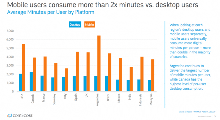
But mobile visits can be as much as 60% of your total traffic – and it doesn’t end at this percentage. Multiple studies have shown that mobile visitors consume more than double the minutes desktop visitors do.
This trend hasn’t gone unnoticed among marketers. In 2015, mobile ad spend already accounted for 49% of digital ad spending. The figure is steadily growing ever since and ignoring that trend will cost you a lot.
What is the percentage of mobile visitors on your site?
Is that higher than the Internet and your industry averages? Let me know in the comments.
People browse the web on multiple devices
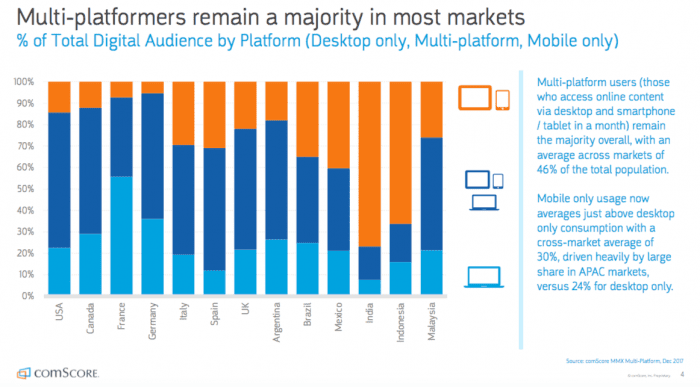
Mobile traffic might overtake desktops, but that doesn’t make PCs and laptops obsolete. In fact, visitors will often research your business on mobile and then complete a purchase on a desktop.
Why are they doing that?
In most cases, it’s just more convenient. Websites are often not optimised for mobile devices and people would rather swap to a bigger screen. Another red flag! That’s exactly what mobile-first design aims to root out.
Mobile-first design is more cost-effective
The old-fashioned approach of cutting down elements on mobile devices isn’t efficient.
While it’s easier to implement, most of the time it meant that you were ending up with multiple designs.
Your site was responsive and displayed well on all devices, but when you took a deeper look at it, you would notice that the designs are different.
Working with limited space forces designers to distinguish the important aspects of your business. Every approach aims to deliver a practical design, but creating your website for mobile devices first forces you to focus on the most important aspects.
With that being said, mobile devices become more and more powerful each year. Google’s efforts to deliver augmented reality to Chrome on smartphones are the best proof
In the years to come, the mobile-first approach will become less and less limited. The line between mobile and desktop will blur and the cost-effectiveness of this approach will skyrocket.
Mobile-first design forces the content-first approach
If you look at our process of building websites, you’ll notice that we’re the advocates of the content-first approach to web design. We won’t get into the details of the content-first approach in this article.
However, mobile-first design forces you to focus on the content right away and it‘s a huge benefit.
Similarly to the way mobile-first design affects designers, creating content for mobile devices forces you to get rid of any superfluous copy and resources. This way you’re making sure that the core of your site provides a consistent user experience across all devices.
Why do GOV.UK, Google and IBM have a design system
Read the article
Originally published Apr 04, 2019 11:55:48 AM, updated June 1 2023.


Join the conversation
Looking to share your feedback and join in on the conversation?