


Are wireframes dead? Exploring their role in modern web design processes
Wireframes are a core component of modern web design, helping teams visualize layouts and user journeys early on. While evolving technology offers new design possibilities, wireframes remain essential for clear communication, cost-effectiveness, and user-centric results.
Written by Tomasz LisieckiKey takeaways
- Wireframes are an essential tool for team alignment and cost control. Designing them early ensures the project starts in the right direction.
- The best wireframes are low-fidelity and communicate the concept, rather than any design choices.
- Involve stakeholders directly in the wireframing process to speed up sign-offs.
Did you know that the concept of wireframing originated in 3D design? Designers used metal wires to visualise ideas before committing resources, allowing for quick feedback, error spotting, and significant cost savings. This method of building mockups soon spread to other design disciplines, becoming a cornerstone of creative processes. But the world has changed.
Technology has become cheaper, design systems are more accessible, and AI is handling tasks we never imagined. It raises the question: do we still need wireframes? Let’s put on our curiosity goggles and find out what wireframes mean in 2025. Are they essential, or just an outdated web design practice?
What is a website wireframe in 2025?
It’s a loaded question.
On the surface, the definition hasn’t changed. Wireframes in web design are sketches of products, typically user interfaces, stripped of details to focus purely on functionality. They help teams plan, test ideas, and identify issues before investing heavily in the final product.
We still categorise wireframes by their fidelity. High-fidelity wireframes are detailed and polished but cost more to create. That’s why creative teams often stick to basic shapes, black-and-white colours, and default fonts. It’s efficient. It’s cheap. It avoids wasting resources too early.
With the rise of AI, design systems, and low-code platforms, however, we see a shift. Interactive prototypes, which can be built just as quickly and affordably, are starting to replace wireframes. Many designers argue they’re faster, easier, and more practical – a sentiment backed by communities like Reddit, where users report a shift toward high-fidelity tools that serve the same purpose.
It’s worth noting that not all wireframes are created equal. A website wireframe differs significantly from a mobile app wireframe, or even a desktop application wireframe. The depth, complexity, and user flows vary drastically, and each requires a tailored approach.
As the term “wireframe” evolves, it becomes increasingly ambiguous – much like “web design.” For clients, this grey area can be confusing. For experts, it’s an opportunity to guide stakeholders through the nuances, helping them choose the right type of wireframe at the right stage. After all, the devil is in the details.
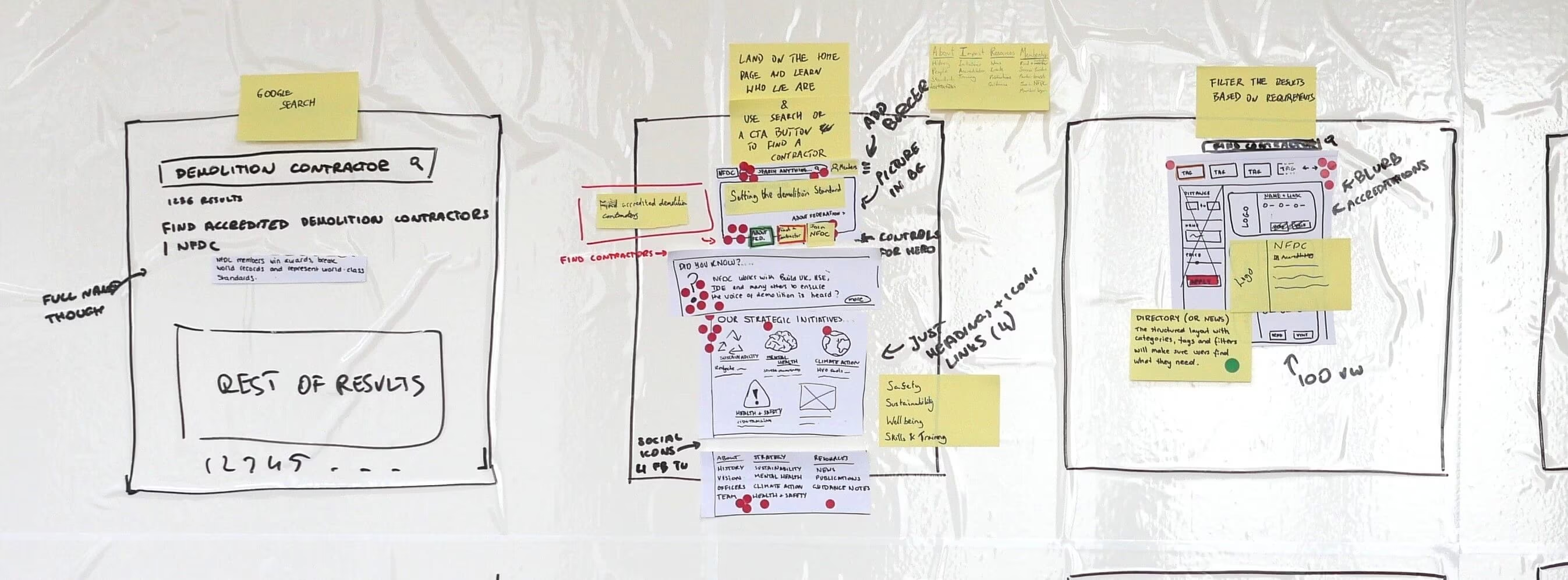
Hint: I’d recommend involving stakeholders in the website wireframing process. We found that despite their busy schedules, they’re more than happy to contribute. That leads to less iterations and faster turnaround times. For example, as part of our process, we sketch a concept of a website with all stakeholders in a room, using a piece of paper and a sharpie.
The indisputable benefits of website wireframes across all fidelities
Despite the shift in practice, wireframes still offer value as bridges between concept and final design. They facilitate communication between designers, developers, and stakeholders, ensuring that user journeys align with both business goals and user expectations.
Why marketers should care
“Wireframes aren’t just for designers – they’re a tool for everyone in the team. They provide the first step in creating a Minimum Viable Product (MVP), ensuring that the team focuses on delivering the right thing, not just delivering things right.” says Nadeem Khan, Senior Scrum Master.
For marketing professionals, wireframes are more than just a design tool – they’re a strategic asset. By visualising a website’s structure early, marketers can ensure alignment with brand messaging, lead generation, and user engagement strategies. Wireframes also enable better planning for content strategy and SEO, integrating these crucial elements from the outset.
A visual blueprint for website features
Wireframes provide a high-level overview of features and layouts. Words alone often fail to communicate design choices clearly. A wireframe locks in decisions early:
- Designers understand the layout requirements.
- Developers can estimate the effort required.
- Stakeholders can ask informed questions.
It’s a win-win-win.
This clarity eliminates the guesswork, saving time and resources. Without wireframes, miscommunication about basic concepts like “what even is a hero section?” can lead to delays and frustration. (Trust me, been there.)
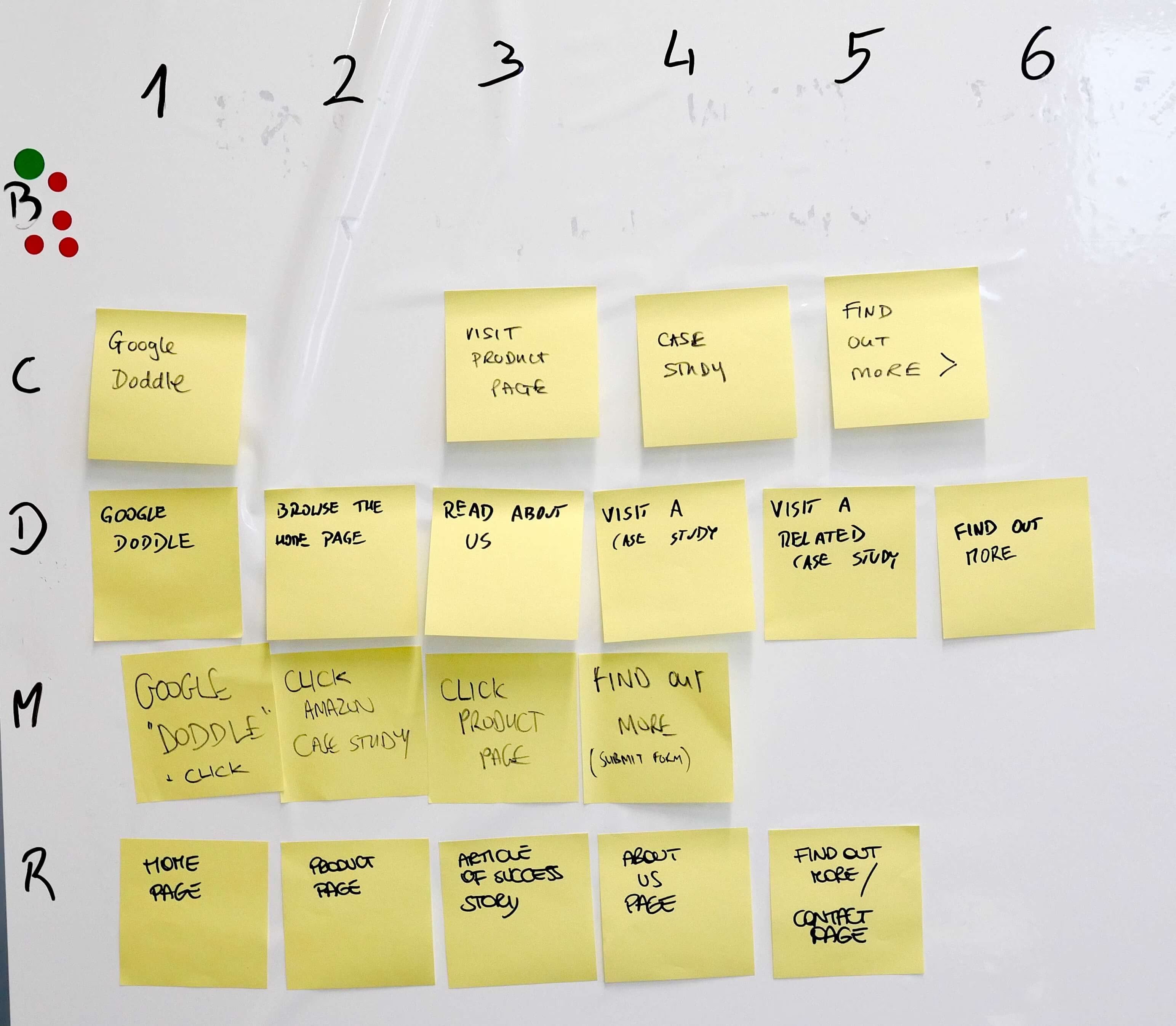
Wireframes help with user journey design
Wireframes – whether drawn on a whiteboard, sketched on paper, or created digitally – are invaluable for designing user journeys. Digital wireframes, especially interactive ones, allow for early navigation testing, identifying potential issues long before development begins. Digital wireframes, especially interactive ones, allow for early navigation testing, identifying potential issues long before development begins.
Prototypes often get the spotlight, but wireframes have a unique strength. Their stripped-back simplicity keeps the focus on usability rather than aesthetics. Feedback at this stage centres on layout and functionality, not fonts or colours, which is precisely what’s needed early on.
Hint: It’s hard to design a website user journey without the stakeholder alignment. Every person has their own preferences and expectations, so before focusing on the user experience, make sure your team sings off the same page. What we do is ask participants to individually write as many concerns as possible, then we vote as a group on the top ones.
Do wireframes improve cost-effectiveness of web design projects?
Absolutely. Designing a website without feature clarity inflates budgets. Wireframes streamline the process, ensuring creative teams don’t waste time iterating on fully fleshed-out designs. Without them, designers juggle feature evaluations alongside aesthetics, leading to costly delays.
For stakeholders, the lack of website wireframes can turn the creative process into a chaotic, expensive chore. Wireframes simplify communication, reduce iterations, and focus everyone on what matters most: creating a website that meets expectations without breaking the bank.
The technology changing wireframing practices
Wireframing hasn’t stayed static. Modern tools, driven by AI, have transformed how we create and use wireframes. Consider these trends:
- AI-driven wireframe generators: Tools powered by machine learning allow designers to rapidly prototype ideas with precision, streamlining workflows.
- Interactive high-fidelity wireframes: These advanced tools bridge the gap between wireframes and prototypes, enabling robust user testing and clearer visualisation.
- Automation: AI tools increasingly shift focus from manual creativity to metrics-driven efficiency, potentially reducing reliance on traditional wireframing practices.
- Low-code applications: These drag-and-drop builders allow anyone to quickly create a usable demo of a website or any other software.
The wireframing software market is projected to reach $15 billion by 2032, driven by innovations in AI. These tools are becoming indispensable for modern teams, blending creativity with efficiency
“Low-code and no-code tools have reshaped the role of UX/UI for certain cases, especially for early-stage startups. They enable you to go straight to building, and as a result test, for example, web apps (or whatever you are building), go to market faster, gather feedback, and pivot efficiently.
From personal experience, back in 2020, we launched a web app by working with a designer for the UX/UI (which was very good). The back and forth though were adding delays and weeks, so we ditched perfectionism and went straight to experimenting live – testing, tweaking, and evolving without wasting resources (time or money). Pixel-perfect wasn’t the goal – validation and progress were. Low code makes this fast, fun, and efficient. This was already possible 4 years ago.
And this mindset kind of upgrades when and how static wireframes can be used, e.g. for more mature projects or implementations.”

Spyros Tsoukalas @ NoCodeMentor
Are wireframes in web design still relevant?
Yes – but they’re evolving. Wireframes remain critical for aligning teams, reducing costs, and creating user-centric designs. However, their role is changing, and understanding how to adapt is key.
Whether you’re a designer, developer, or marketer, the takeaway is clear: wireframes are as much about communication and clarity as they are about design. Ignore them at your own risk-but embrace their evolution, and they’ll become a powerful tool in your process.
Originally published 26th September 2019, updated 3rd July 2026.

