How to improve website accessibility
With the ever-advancing technology, we now have more accessibility tools at our disposal than ever. People struggling with different types of sensory impairments can effectively browse websites, under one condition - the site has to be accessible. Unfortunately, the majority of the Internet is not friendly to the disabled. Written by Dawid ZimnyWe can all agree that everyone deserves equal access to the Web – but that’s not the case. A study has shown that over 70% of websites in the UK have serious accessibility issues. This makes the majority of the Internet unapproachable for over 12 million Brits suffering from various disabilities. One in four disabled adults in the UK has never browsed the Internet.
This has been confirmed in our 2020 British e-commerce report, where we’ve tested the 100 biggest digital retailers in the UK. Every single website was reported as “unusable to some”.
9 Website Accessibility Tips
1. Write alternative text for images
Images that are essential to telling your story need to have descriptive alt attributes. Screen reader software scans the code of the website and announces the text in alt tags. Leaving alt text empty is the equivalent of removing the images for everyone – you would only do that for decorative images.
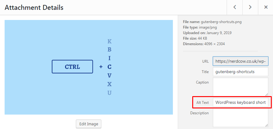
In the age of Content Management Systems, everyone can set alt attributes for images. Most of the time you don’t need to know anything about the code. It’s incredibly easy and you should make it your habit to include an alternative description for every descriptive image. Here’s an example of how to do it in WordPress:

2. Be mindful of colour contrast
Colour contrast isn’t something you can fix without a designer but it’s helpful to be aware of contrast rules before approaching a web agency. In fact, this aspect is far bigger than web design and you need to pay attention to contrast with your branding.
Businesses often approach web designers with pre-made colour palettes and are reluctant to change. There’s one major problem with that – the palettes are sometimes prepared by branding agencies that didn’t consider accessibility criteria.
Web Content Accessibility Guidelines contain detailed information about minimum contrast ratios for different text formats. You don’t need to read them thoroughly, and they’re not always perfect for real-world scenarios. But being aware of the accessibility guidelines matters.
There are fantastic online tools that check whether your colour scheme is compatible with legibility standards. A few minutes of experimenting with Contrast Checker is enough to realise that the subject is delicate.
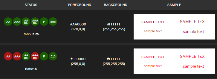
It’s easy to name a website that uses a white background. We are also used to red being the colour for errors. But does a white background go well with pure red? The answer might surprise you.
Pure red (second row in the picture) does not meet the WCAG standards for contrast with a white background. You should use a different shade of red in this case.

3. Make sure your content has a logical structure
Structuring the page in the code used to be exclusively the developer’s task, but these days WYSIWG editors and content management systems enable editors to make their articles and pages user-friendly.
Increasing the font on a headline and making it bold makes its function visually obvious. But it doesn’t work like that for screen readers. If you don’t explicitly include the text in a heading tag, they won’t be able to properly structure the content for the impaired visitor.

At the same time, content structure benefits every user of your website.
4. Avoid PDFs when feasible
PDF files are convenient, but they’re not accessible. Locking important information inside of a PDF can prevent a big part of your audience from accessing that information.
At the very least, you should use accessible, tagged PDFs.
5. Focus on readability and legibility
Making your website easy to read is important even for people without disabilities. But those that struggle to read – and that number can be as high as 14% of adults over 16 years of age in the US – will appreciate it a lot.
You can easily test the readability of your website by measuring the Flesch Reading Ease score of your content. The test takes into account the length of sentences and the number of syllables in each word. The target score for web copy is 60 or higher.
In terms of legibility, avoid using narrow and decorative fonts. Here’s a helpful list of the most accessible fonts with additional guidelines.
6. Include labels in your contact forms
Screen readers need labels for contact forms. It might look modern and fancy to use placeholder text and just ditch the labels, but it’s the wrong choice for two reasons.
First is, of course, accessibility. Your vision-impaired visitors may not be able to understand the context of your forms without labels.
But the second reason applies to virtually anyone. People have low attention spans online. Many of them browse websites in the middle of other activities. They frequently pause, go away from their device and return back at a later time.
It’s impossible to know the context of a field if you start typing and the placeholder disappears. This will make users delete their input to find out what was the purpose of that field and it’s terrible for the user experience.
7. Be generous with white space
I get it, your website is your marketing/sales “real estate”. You want to show people a lot of things to help them understand your business. But don’t overdo it. Reducing white space because of personal preference or in an attempt to boost conversions might detract from the user experience.
8. NEVER use pictures of text
And I mean never. If you can write it down, use text. Showing pictures with content that is critical to understand the context should be avoided at all costs. If you have to, make sure to include a descriptive alternative text. But generally, just don’t do it.
9. Embrace mobile-first web design
On average, more people browse websites on mobile devices. Going mobile-first with your designs is not only more efficient but also improves accessibility. If you design and develop for the “small guys” first, you will have to test them first as well.
Why you need a mobile-first approach to web designWhy website accessibility is important
We are all aware that a website should be functional, but we often get lost in making sure it “looks good” above everything else.
Why not both? When approaching web agencies for a new website, make accessibility one of your priorities. It’s the developer’s job to make the website accessible, but yours to keep it that way.
If your previous project resulted in a poorly optimised website, you’re going to need help from a web agency to fix it. But with the above tips for your marketing team, you can address at least some of the accessibility issues right away.
Why do GOV.UK, Google and IBM have a design system
Read the article
Originally published Jan 31, 2019 9:11:40 AM, updated May 8 2024.


Join the conversation
Looking to share your feedback and join in on the conversation?