Irresistible newsletter headlines and email optimisation tips
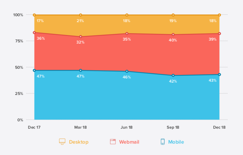
Mailing lists are still one of the best digital marketing channels. According to some sources, over 50% of email opens happen on mobile devices. They're the first point of contact for many of your subscribers. However, adjusting email design to accommodate to smart devices is often overlooked by digital marketers. An optimal newsletter title length or even a single emoji can boost your open rates drastically. Here are our quick design tips for your email marketing campaigns. Written by Dawid ZimnyGoogle is encouraging mobile optimisation because that’s what the visitors want. We browse more and more on smart devices and poor mobile user experience will negatively impact your SEO and conversion rate.
So how is email different? Actually, it isn’t. After all, Google also owns the most popular mobile email client, Gmail.
Research shows we open from 43% to even way over 50% of emails on mobile devices.

However, users often open the email multiple times before converting. In that case, a second or third open comes with a switch to a desktop device about 30% of the time – and visitors that switch to a desktop from mobile convert better.
It’s not an argument against optimising email for mobile devices though. Even with slightly lower conversion rates, the sheer amount of opens from mobile devices will drive more traffic than desktop devices.
It’s fair to say that one reason the mobile emails convert worse is the lack of attention-grabbing headlines and content optimisation. Here’s how you can improve that.
Mobile newsletter optimisation
Before we get to the tips, we want to address one thing. Just like with responsive web design, optimising emails for mobile doesn’t neglect desktop.
Most of the practices won’t hurt the performance on the desktop. Quite the contrary: neglecting some aspects we mention below might hurt your email marketing.
The best email headline length
You have very little space to work with when you try to grab the attention of your subscribers. Newsletter headlines are the most important part that many get wrong.
The highest performing email headlines are 6-7 words long. It’s shocking that going from 7 to 8 words is a 50% performance loss.

Avoid spam words in your newsletter titles
Back in the day using one of the words on this comprehensive SPAM word list was sending your email straight to the SPAM folder. Even though currently the algorithms are much more sophisticated, people might frown upon headlines that include any of them.
If you’re looking for inspiration for your newsletter subjects, Buffer has prepared a list of nearly 200 words and phrases that convert.
Include Emoji in your subject line
According to Campaign Monitor, only 2% of emails sent to private clients include Emoji in the subject line. That statistic on its own is a lightbulb moment.
If nobody does it, your business will most likely stand out – not only from the competition but from almost every single email in your subscribers’ inboxes.
You can use Emoji to make your headlines shorter, taking advantage of the performance report mentioned above. And there’s even more – Campaign Monitor also cited that over half of the brands using Emoji in their subject lines have reported higher conversion rates.
Like with everything, there are some drawbacks. Some older email clients don’t support Emoji. Sending a headline that replaces “love” with a heart might confuse these subscribers and prevent them from opening your mail.
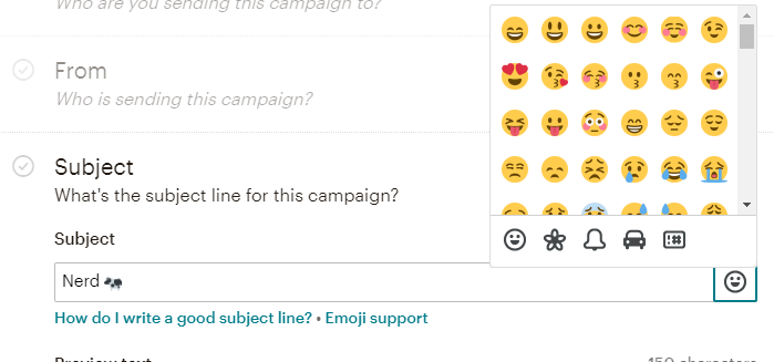
We highly recommend testing your subject line Emoji before sending the campaign. You can also use newsletter services that support Emoji, such as Mailchimp.

Use preview text, also known as preheader
Subject lines are the first things that capture our attention, but what’s next? The preview that follows rarely helps the case of the sender.
What you often see after the title is a basic “View this email in browser” message and an automatically generated snippet of the email.

Thankfully, preheaders allow you to control the preview text. This gives us more space to work with when trying to encourage our readers to open the email – usually, your preheader can be as long as your subject line. Mailchimp allows up to 150 characters for both.
Email fonts
There are a few fonts considered as web-safe fonts, including Arial, Times New Roman, Verdana and Georgia.
Several reputable brands use them, but what if you’ve invested in stunning branding and your guidelines include amazing fonts you’d like to use in your newsletters?
Importing web fonts isn’t hard but requires some effort. You also need to keep in mind that using multiple fonts can hurt the user experience. As a rule of thumb, stick to no more than two fonts.
Campaign Monitor has a comprehensive guide on importing web fonts and here are the key points you need to consider:
- some email clients won’t support them and you have to match your custom font with a default replacement that doesn’t interfere with your design
- importing multiple fonts can increase the load time of your newsletter and hurt its conversion rate
- most custom fonts are free to download but require licensing fees to use them online
Less is more
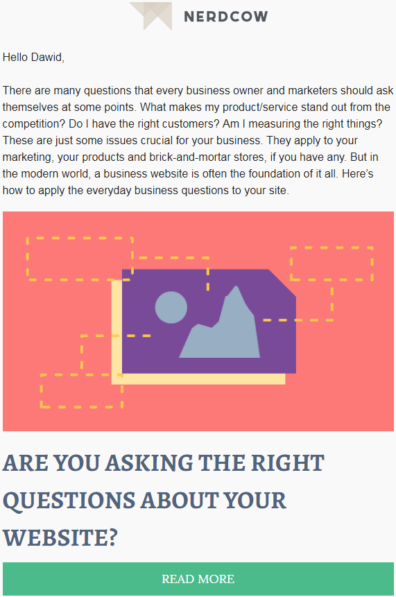
Newsletters share many characteristics of a website. At its core, an email campaign is an equivalent of a landing page that’s sent directly to your customers’ inboxes. That’s why writing short, scannable newsletters will increase your conversion rates.
Carefully include compelling imagery
Following up on the previous point, imagery is as important in emails as it is on your website. But why should you be careful about it in your newsletter?
Unlike websites, many people read emails with images turned off. In 2014, 43% of Gmail users had images blocked. So how can you design your campaign around it?
Don’t create image-only newsletters. These campaigns won’t work for a big portion of your subscribers. Even if they did, the next major drawback is that they’re not searchable. If your visitor remembers a piece of your email and wants to find it in the future, having the text in your images won’t let him do that.
Keep the images decorative. As mentioned above, this makes your newsletters searchable, but what’s even more important, your message won’t be blocked if it does not display the images. Use them to complement your message while keeping the important bits as plain text.

Use alternative text. Even though using alt text for decorative images isn’t necessary, having it removed might disrupt the structure of your email. Leaving a short description in the form of alternative text will fill the void.
Create smart call to action buttons. You could use an image as your CTA but if the subscriber has them blocked, the best-case scenario is that your CTA looks very basic. You can fix that by creating buttons using plain text and background colour instead.
Test your newsletters
Our last tip is perhaps the most important one. As you might’ve noticed, a common denominator for several of the issues with newsletters is compatibility. Your font might not work in Outlook, half of your visitors might disable images, and so on.
Test your newsletters before sending but also A/B test them. A/B testing is displaying different content to a part of your audience to benchmark which version is more effective. Does an emoji in the subject line help your open rates? Does your audience prefer shorter headlines? Will adding a preheader encourage more people to click on your email?
You can easily answer these questions using A/B tests. The tools are out there, and now you also have the knowledge on what to test and how to adjust your campaign to improve its performance.
Give it a go and let me know how it went.
The difference between collaboration and “design by committee” – FREE PDF
Learn how the perceived collaboration of “design by committee” hurts your website, and what you can do to improve it. We give you immediate access to the PDF – no personal data needed.
Originally published Jul 11, 2019 11:05:11 AM, updated August 20 2024.


Join the conversation
Looking to share your feedback and join in on the conversation?