Are popups bad? Website popup design best practices
Popups - perhaps the most hated feature of websites. This has been the case for at least a decade now, but what can you do to turn it around? Can you implement a popup that won’t hurt the user experience? The answer is our favourite “it depends”. And because it depends, we’ve decided to dive deep into the topic and help you decide for yourself. Written by Tomasz LisieckiThe animosity towards popups is deeply engraved in people’s minds. However, certain design and feature choices can help you salvage some of their usability.
So let’s take a different spin on the title.
People don’t hate popups – they hate how we implement them
The fact is that most popups interrupt the user’s journey, appear at the wrong time and distract the visitors. And they often don’t offer nearly enough of an incentive to justify being so intrusive.
Third-party services have made it incredibly easy to create a popup. While we firmly believe that democratisation of the Internet is a desired process, it led to an increased number of inexperienced people implementing poor popups on websites.
Democratisation of technology refers to the process by which access to technology rapidly continues to become more accessible to more people. New technologies and improved user experiences have empowered those outside of the technical industry to access and use technological products and services.
Source: Wikipedia
Dismissing popups became a habit because of their intrusive nature. And honestly, I can’t blame anyone. I dismiss them all the time.
But before I tell you why this happens and how to make the most out of your popups, we need a little bit of context.
The types of website popups
We can single out four general characteristics:
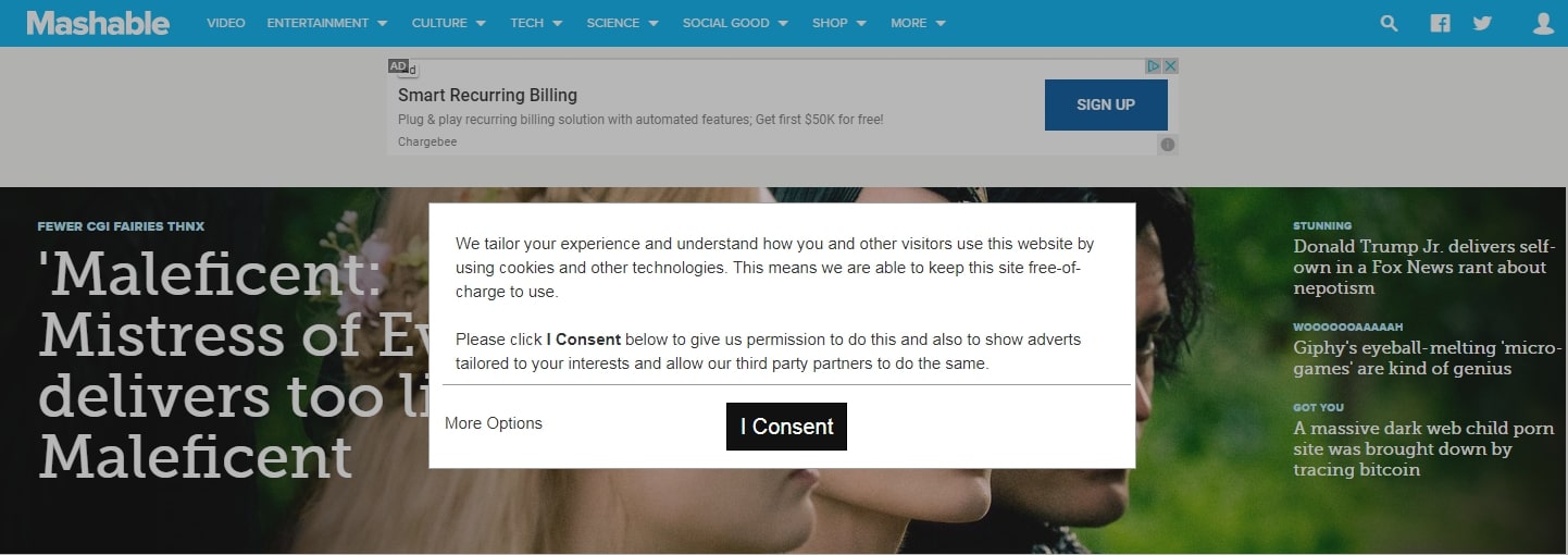
- Modal – one of the culprits of the animosity towards popups. Modal popups are ones that block the user from interacting with the content of the website until he dismisses the popup.
- Nonmodal – the opposite of modal popups; a more user-friendly variation.
- Lightbox – popups that don’t use dimmed background, meaning the content appears “as is” to the visitor, even though there is an overlay on their screen.
- Dimmed – dimmed popups disrupt the visual appearance of the website but not only displaying an overlay but also “hiding” the body of the site.
If you think about some of the popups you’ve encountered recently, you’ll find out that modal and dimmed ones were the most annoying. Unfortunately, they aren’t necessarily losing popularity among website designers.
Give us your hot take on website popups 🔥
Do you hate them, or do you actively search for them to get those ecommerce discounts? Let us know in the comments.
The user experience of popups – the common issues
When researching the examples for this article, queries like “block popups”, “popup blocker chrome” or “allow popups” were some of the most popular ones. They illustrate the problem perfectly.
People search for ways to disable popups all the time. Alternatively, they want to enable them again, which means something prompted them to block popups in the first place.
Popups interrupt the user journey
The idea of popups is intrusive enough. If you consider they can be modal and dimmed on top of that, it becomes unbearable.
It’s almost as if you’ve opened a new tab in the visitor’s browser without their consent. The path to close a popup is slightly shorter, but the concept is virtually the same. You’ve interrupted their interaction with your website.
Considering an average session duration on websites is between one and three minutes, the traditional popup display is unacceptable. You’re definitely familiar with retail employees approaching you at the store.
They have good intentions (and your popup might too), but more often than not it’s an interruption to which you reply “no, thanks”.
Of course, there are exceptions. One of our clients has an average session duration of over 7 minutes in 2019 so far. This gives them more time to show a popup at a reasonable time. But for most websites, full-blown overlays are not only intrusive, but it’s almost never a good time to show them.
The UX aspect of displaying a popup over a popup
This issue is more common than you might think. Many websites display a popup when the visitor has just started browsing – sometimes even asking for personal details already.

They didn’t even get time to get to know your business. Whether you’re asking them to sign up for a newsletter or offering a discount, 30 seconds in they haven’t consumed any content yet nor had the ability to browse your store. That popup is not only deemed to fail, but it will also annoy the visitor.
Popups feel like advertisements
Here at NerdCow, we’re advocates for the content-first approach. Writing for the Web is different from traditional marketing. Most popups are created by marketing teams struggling to truly understand the difference.
Your visitors can’t feel like you’re selling to them, rather than solving their problems. Especially if it’s an unwanted interaction, such as an intrusive popup.
Nowadays people understand that an email offer isn’t really a “free” gift. It doesn’t mean they’re not willing to “pay”, though. But if the first thing they see on your website requires payment and it isn’t something they wanted, you can imagine how they’ll feel.
Which popups should you avoid?
Here’s a list of the worst popup practices:
- modal, dimmed, and the combination of the two
- popups interrupting user journey, i.e. right after logging in or before any interaction
- forcing medium change, i.e. asking the visitor to download your app rather than showcasing its advantages as a better alternative
- showing multiple popups in quick succession
Popup design & UX best practices
We started on a negative note but popups aren’t doomed just yet. It will take a collective effort of web agencies and website managers to revert the damage that has been done over the years, but good popups can still deliver results.
And it’s easier than you may think:
- Keep them relevant – websites were always about the user experience. Ensure your popup, its design and copy are consistent with the current page.
- Give value to the visitors – after ensuring it’s relevant to the context, give your visitors value before asking for personal data.
- Be mindful of screen space – popups can’t get in the way of your visitors, especially on mobile devices. Opt for smaller, modal tooltips rather than full-blow overlays.
- Don’t show multiple popups – ideally at all. If you absolutely need to, esure they aren’t showing up at the same time. Exit-intent popups can be an example of a secondary popup.
Don’t assume you need a popup
You really don’t. Your visitors are being attacked by them on most websites already. They’ll be relieved.
Think of alternative methods. Test, test, test. You might find that your popups work – that would be great news!
But never assume a popup is the way to go. Just because everyone is doing it doesn’t mean you have to blindly follow the crowd.
Do you agree?
Are popups bad?
The short answer is that they’re not inherently bad. It’s the way they are implemented that gives popups a bad rep. Please refer to our popup UX best practices to learn how to make them work for your website.
USEFUL WEBSITE & MARKETING TIPS DELIVERED ONCE A WEEK
Includes tools to maximise your website potential.
Originally published Oct 17, 2019 12:58:39 PM, updated December 12 2023.


Join the conversation
Looking to share your feedback and join in on the conversation?