The colour and how it affects your sales
Have you ever wondered why Amazon uses a particular colour for their “Add to cart” buttons? Like with every other website, there’s more to their colour palette than just a couple of colours that work well together. Here’s a brief introduction to how it could affect your conversions and sales. Written by Dawid ZimnyArticles about the importance of the first impressions of a website are a plague. They’re right to say that it’s an important matter, but they often lead to wrong conclusions. Grabbing the attention of a user takes much more than just bold colours, big fonts and calls to action everywhere.
However, when you put it in the context of colour psychology, everything changes.
This is not about colour psychology in marketing
It’s likely that you know the emotions evoked by colours. Some of them are well-known, and there is an abundance of fantastic resources that explain it all. Just take a look at the amazing colour psychology in marketing infographic by HubSpot.
This article is all about colour psychology in web design. There are just a few caveats that will add value on top of your knowledge about the psychology of colours.
The primary colour trap
Every brand has a dominant colour. It’s common to see it overused on a website.
When you think Coke, you think red. But you won’t see an overwhelming amount of red in the layout of Coca-Cola websites. They use the primary colour where it matters, without undermining its importance.
It should guide your visitors to crucial parts of your website – navigation, buttons, important content, and hyperlinks.
Making sure your dominant colour is not overused is vital.
If red is everywhere, how are they supposed to quickly find the primary call to action if it’s also red?
But there’s also a workaround for bold brands in the next section 👇
Accent colours
Nobody wants a plain website. Clean, yes, but not plain. That’s where a few accent colours will help – usually 2 or 3.
They can also be extremely helpful for bold brands, which we’ve mentioned at the end of the last section. A vibrant accent can be a great way to complement a primary colour.
Accents are going to highlight many attention-worthy elements, like buttons. Have you ever wondered why Amazon uses a yellow “Add to cart” button?

Or why Dell’s white and blue online shop has the green call to action buttons? The white and blue palette is present across the entire website. Their blue buttons almost always target informational pages. It’s only natural that when you land on a page with a transactional call to action, the buttons are of a different colour – in this case, green.
Colour psychology of website backgrounds
Background colour can make or break your website. In a way it’s very similar to the dominant colour – the colour of your background dictates where your visitors are looking. It’s closely bound to the purpose of your site. In general, you can divide background colours into three groups corresponding to the type of your business.
Neutral backgrounds are great for eCommerce, promoting services, and websites focusing on content. Your visitors shouldn’t be distracted by a bright background colour. Instead, you want them to buy your product or browse your content. For that, you will need a white or very light background, while keeping the attention on the bold primary colour and accents.
“Dominant background” can be a great way to promote your brand identity based on the psychology of colour. You might quickly find that some colours can be a bit too bold and bright for a background. The Adobe tool comes in handy in that case. The monochromatic colour harmony provides you with the best shades of your primary colour. You can use them interchangeably as a background for different sections of your website.
Graphics-intensive, colourful backgrounds work pretty well for the creative industry, restaurant websites and similar businesses. Here the sky is the limit – as long as your site is legible.
Accessibility and colour psychology
If you get the gist of colour psychology in web design by now, there’s one last caveat – accessibility. Not every colour combination is easy to read, even if you think it is. We work with websites on a daily basis and we still frequently encounter pages that are hard to read, even with perfect eyesight. Our perception of colour varies, and people with disabilities struggle with using most websites. Accessible colour contrast is crucial.
Red is a common colour for error messages, but pure red is not accessible on a white background. It doesn’t meet the minimum WCAG standards for fonts under 18pt (24px), and it barely meets the standard for larger text.
Why do GOV.UK, Google and IBM have a design system
Read the article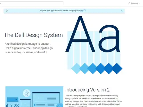
Originally published Aug 22, 2018 2:46:09 PM, updated January 31 2024.


Join the conversation
Looking to share your feedback and join in on the conversation?