Digital Psychology: How to Use It to Optimise Your B2B Web Design
Explore how web design psychology impacts B2B SaaS marketing. Learn how principles like anchoring, cognitive biases, and social proof shape decision-making.
Written by Tomasz LisieckiThis isn’t another article about the best digital psychology tricks for your website. You won’t find tips on the pricing table design or navigation structure here. Instead, we’re diving deeper into digital psychology – the parts of the human psyche that influence behaviour in online spaces. When you understand the psychology of digital marketing, the tools for the job follow naturally.
While we’re all unique, we’re also predictable in the same ways. No one, no matter how self-aware, is immune to the mental shortcuts and biases that shape decisions. From cognitive heuristics to herd mentality, these principles bridge behavioural economics, psychology, and digital marketing.
In B2B, decisions aren’t made in isolation. They’re the result of committee dynamics, where different stakeholders bring unique priorities, biases, and fears. Understanding how cognitive biases shape group decision-making is key to designing a website that builds consensus and drives conversions.
Primacy bias
Why first impressions matter
If I had to guess, the home page probably consumes the lion’s share of your website revamp budget. All stakeholders seem to have strong opinions about how it should look. Conflicting preferences, time constraints, and lofty expectations often turn home page design into a battlefield of ideas. In every project we’ve worked on, thorough stakeholder interviews inevitably reveal the same thing: misalignment.
These strong feelings come from a good place. People care. They want the home page to represent the business in the best possible way because it’s more than just a page – it’s the store front. Everyone knows how important that is. The user experience here doesn’t just matter – it casts a shadow over the rest of the journey. But why? Why do users judge the entire website experience based on the first few seconds?
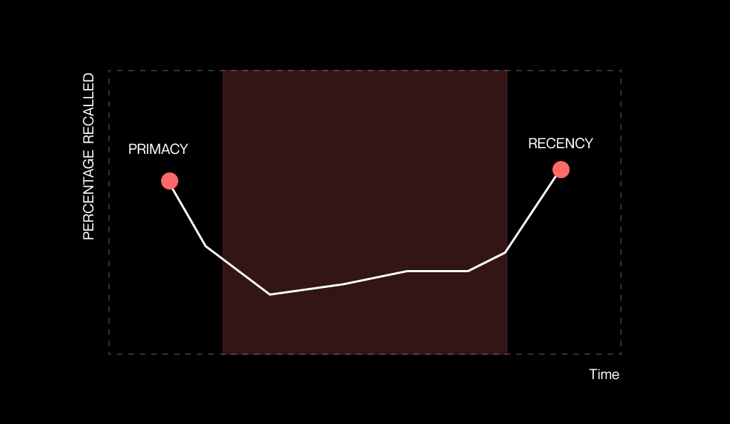
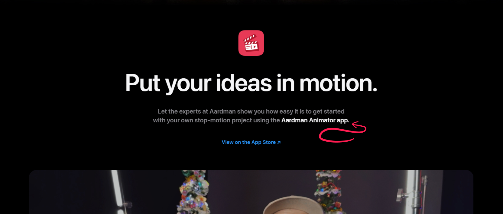
The home page is critical in web design psychology because of primacy bias – a psychological principle where we tend to remember the first thing we encounter. This bias shapes how users perceive your site and influences their overall experience. Think of it like a shopping list – you’re most likely to recall the first few items. Conversely, the recency bias means we also remember the last thing we see, which is why Apple often places bolded words either at the start or end of a paragraph. These biases shape how users perceive your home page – and your entire site.

The pressure is real. Studies show that it takes just 0.05 seconds for users to form an opinion about your website, and 94% of those first impressions are design-related. What’s more 75% of your website’s credibility is tied to its design. In B2B, where buying decisions are slower and involve multiple stakeholders, that snap judgement can make or break your funnel. What will you use that fraction of a second for?
Application
This principle applies across all levels of detail. The home page sets the tone for the user journey. Within the home page, the first section establishes expectations. Even at the paragraph level, the initial line can set the stage for how the rest of the content is received. So how can you use these insights to make a great first impression?

Your home page should present a clear, universally appealing value proposition that resonates with all stakeholders—whether they care about ROI, scalability, or ease of implementation. Listen to a pod on how to do it.

Use the top of the home page to create immediate alignment by addressing the shared goals of the committee, such as reducing inefficiencies or meeting KPIs.

Use strategic contrast in your design to guide attention to critical elements, like CTAs. Learn how to write better buttons.
By crafting a home page that respects these psychological principles, you’ll set the stage for deeper engagement throughout their journey. You should note that these applications can be used for any landing page that acts as an entry point to your website.
Anchoring bias
Setting the stage for better decisions
People love to latch onto the first bit of info they see – especially when it comes to pricing. Even if you don’t have a pricing page, how you frame the value of your product sets the tone for how buyers think about cost.
Contrast anchoring
This concept is rooted in the anchoring effect, where the first piece of information (the anchor) heavily influences decision-making. In pricing, a high anchor price makes subsequent prices seem more reasonable.
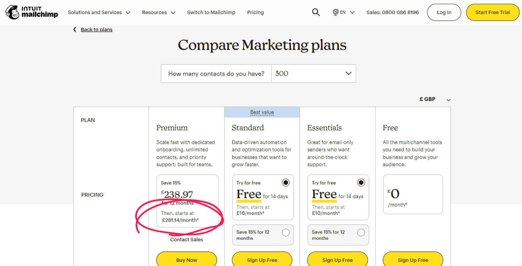

Even for sales-led companies without a detailed pricing page, anchoring can work to your advantage. Mentioning ranges or starting points like “Solutions from £1,000/month” establishes a baseline for discussions. The psychology of digital marketing shows that the way you present information, like pricing or features, shapes how people perceive value. Anchoring bias allows a higher-tier option showcased first to set a reference point, making other choices feel more accessible.
It all has started with Tversky and Kahneman’s seminal study on anchoring bias (1974). They revealed how people’s decisions can be influenced by irrelevant initial information.
In one experiment, participants spun a wheel with random numbers between 0 and 100. Then, they were asked to estimate the percentage of African countries in the United Nations. Surprisingly, their answers were heavily influenced by the arbitrary number on the wheel. For example, participants who saw a higher number on the wheel gave significantly higher estimates than those who saw a lower number.
To no one’s surprise, the anchoring principle has made its way from the offline world. In the video fragment below, Andrew Nicholson, founder of Kulea.ma, goes through 3 examples that drive the point home.
Pricing decoy
Another approach that benefits from the principle of anchoring is called decoy pricing. Instead of establishing a reference point to shape perceptions of value, it introduces a strategically less attractive option to steer buyers towards a specific choice.
The decoy is designed to be clearly worse than one option but similar to another. This makes the better option look like a much smarter choice.
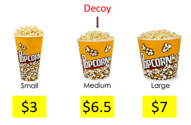
The medium option is the decoy, making the large popcorn seem like a better deal.
While both anchoring principles leverage behavioural psychology, contrast anchoring focuses on the framing of price ranges, whereas pricing decoy is more about shaping the structure of choices.
How does this principle apply to a pricing page on a B2B SaaS website?
Application

For committees, anchor your messaging to shared metrics, such as expected ROI or cost savings. This provides a common starting point for discussions.

Mentioning starting prices, such as “Solutions from £1,000/month” establishes an initial anchor while maintaining flexibility.

Anchor perceptions around value rather than cost by showcasing the premium aspects of your solution.
Confirmation bias
Challenging beliefs with the right content

Buyers gravitate to information that validates their current beliefs – this is confirmation bias. In the context of B2B, it means decision-makers may seek out reasons to stick with their current approach while overlooking evidence that favours your solution.
You should consider the complexity of a buyer’s journey in B2B. Stakeholders that visit your website will hold different beliefs and powers within their organisation. Your website needs to support their worldview and not give them a reason to veto the deal.

“Confirmation bias isn’t an occasional bug in our human operating system. It is the operating system. We are designed by evolution to see new information as supporting our existing opinions, so long as it doesn’t stop us from procreating. Evolution doesn’t care if you understand your reality. It only cares that you reproduce.”
– Scott Adams, Win Bigly: Persuasion in a World Where Facts Don’t Matter
Our home page starts off with a section that fights the confirmation bias. But, we consciously and proactively sympathise with the reader across the site.
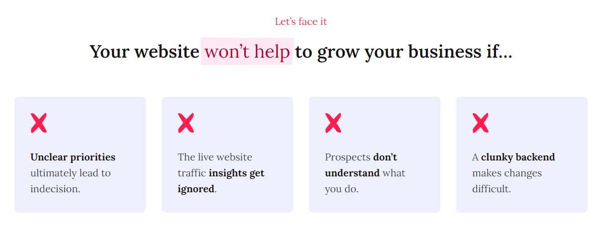
It’s important to us that the prospect sees it. We’re challenging the web design industry and everyone’s approach to building websites. By presenting facts that the reader believes in, we become relatable and open up a discussion.
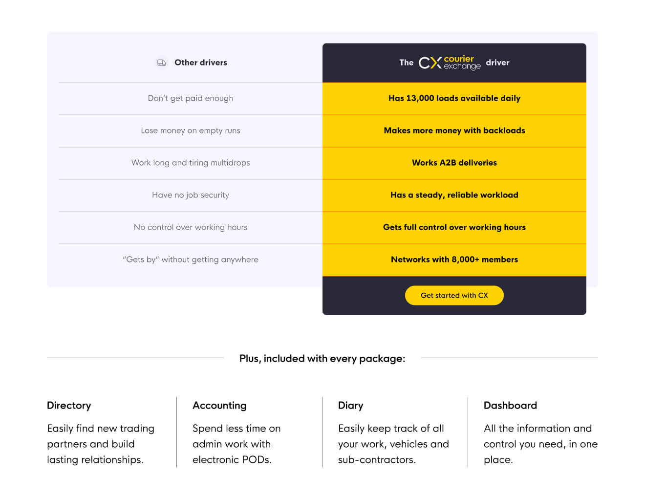
We ran a preference test for a client’s home page. Our theory was that if we contrasted using their product and status quo, the engagement rate would increase. The results indicated that 60% users find the new information better. Feedback included, “I liked […] a comparison section at the start” or “It has stats and numbers to back up the claims.”
Application
To combat this, your website should pre-emptively address objections and doubts.
Present case studies, white papers, or any pieces of information that align with a CFO’s priorities (cost savings) or a CMO’s (lead quality).
Also, a “Why switch?” section or “Before and after” page can lay out clear, data-backed reasons for moving away from the status quo.

Your website should present evidence that speaks to each stakeholder’s priorities while gently challenging existing assumptions.

Include role-specific case studies, such as cost-saving examples for CFOs and lead metrics for CMOs, to address individual biases within the group.
Familiarity bias
Overcoming resistance to new solutions
“If it ain’t broke, don’t fix it” – sound familiar? Companies often stick with what feels safe, even if there are better options. There are many reasons for this. One of those is the familiarity bias blended together with the risk aversion.

Remember how I said earlier that in B2B we’re selling to a committee? B2B buyers often default to what feels familiar, even when better alternatives exist. This is the familiarity bias at work.
Buyers compare your product to their current setup, often overestimating the comfort of sticking with the status quo while undervaluing potential gains from change.
Building trust with social proof
Social proof plays a key role in easing the fear of the unknown.
If you talked to me about entrepreneurship, you must have heard me saying that “we’re in the trust-building business.” I mean it. Everything we do as a service provider relies on the fact that the customer trust us to do the job right.

“Trust is a fundamental element of any successful B2B relationship. Social proof helps you and your company establish that trust with prospects by demonstrating that your product or service has a proven track record with real customers.” (source)
– Michael Valade, Chief Client Officer at Maestro Group
Another study shows that 92% of B2B buyers are more likely to purchase after reading a trusted review or testimonial. If you pair those together with value statements or objection handlers, you’re increasing your chances of converting that prospect.
Pro tip: If you’re including testimonials, I find matching the reviewer’s job role with the target persona more impactful. You’ll score extra points if you incorporate video testimonials. A study from Forbes highlights that viewers retain 95% of a message when watched in a video compared to 10% when reading text.
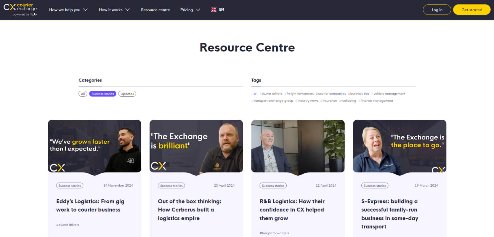
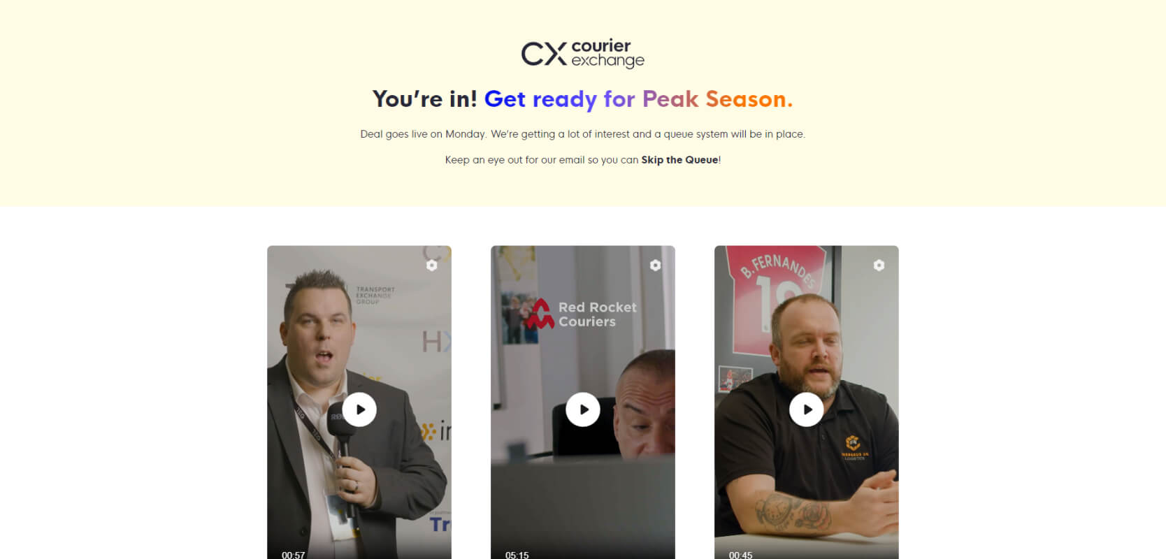
Our client has been investing in publishing video success stories of their customers. You can see the implementation in the screenshots below. The first one fights objections before the website conversion. The last one serves as an extra reassurance post sign up.
Application
Your website can counter this by showcasing stories of successful transitions. Case studies, testimonials, and logos of industry peers build credibility and make your solution feel safer. By demonstrating that others have successfully made the switch, you ease the fear of the unknown.

Emphasise how your solution has helped organisations with comparable challenges, building collective confidence in your offering.

Highlight the safety of your solution with social proof, including industry awards and testimonials from clients in the same sector.

Use language that focuses on what they’re missing out on:
“Every month without automation costs your team 20+ hours in manual work.”
IKEA effect
Engaging stakeholders through interaction
Harvard Business School ran four studies to demonstrate the power of the IKEA Effect, proving that people value things more when they feel involved in creating them. In B2B, this translates to buyers feeling more invested in solutions they understand and help shape. It’s a principle we’ve embraced in our web design process by incorporating collaborative workshops that align stakeholders and foster a sense of ownership.

“By collaborating on the creation of a solution or service, not only are you likely to offer a more customized and tailored solution, but you’ll also create a positive emotional connection with the customer.” (source)
– Job Thomassen, Partner at Tricycle Europe
Interactive tools like product tours, ROI calculators, or configurable pricing pages allow buyers to input their own data and see value tailored to their needs. For sales-led companies, collaborative sessions – such as co-creating dashboards over a shared screen – deepen engagement by involving prospects in the process.
Even well-crafted copy can evoke ownership. Messaging that positions the buyer as the hero of their story, paired with free trials or personalised recommendations, strengthens emotional investment. By turning buyers into active participants, you create trust and drive conversion.
Application

Provide interactive product tours or ROI calculators.

Offer tailored discovery calls where buyers co-create solutions with your team.

Build configurable pricing tools that let users get a rough cost estimate.
Cognitive dissonance
Making decisions easier for committees
In B2B, even smart people or committees can make seemingly irrational choices due to cognitive biases like cognitive dissonance. This bias arises when people feel uncomfortable holding conflicting beliefs, often rationalising decisions to resolve the tension. For buying committees, this means favouring solutions that are easiest to defend internally.

“There are perfectly rational-looking things which are actually stupid. And, there are things which appear stupid which are actually clever.” (source)
– Rory Sutherland, Vice Chairman at Ogilvy UK
Post-purchase rationalisation is equally important. Reinforcing the rationality of a decision after the fact can reduce churn and build trust. Phrases like, “Our solution aligns with best practices for CFOs, COOs, and CMOs alike,” help buyers feel confident in their choice. Following up with case studies or implementation guides cements their satisfaction. Social proof can also reinforce a buyer’s confidence after purchase, ensuring long-term trust.
We can use Apple as an example, again. We all doubt if it’s the right moment to purchase a new iPhone. What if a new one is around the corner? We fear regretting the choice. Apple addresses this with their trade-in programs.
Even seemingly unrelated behaviours have parallels in B2B. For example, Sweden and Norway lead Europe in ice cream sales, not due to hot climates, but because sunny days there feel rare enough to justify indulgence. Similarly, buyers often need a specific “justification trigger,” like social proof or ROI data, to feel comfortable choosing your solution.
Application

Send case studies and guides to reassure buyers they’ve made the right choice.

Offer guarantees, warranties, and positive customer testimonials.

Position your solution as meeting the priorities of multiple stakeholders to ease internal alignment.
Availability heuristic
Making your value impossible to ignore
Heuristics are cognitive shortcuts that help people make decisions quickly, often based on the most easily recalled examples. As we discussed earlier, social proof plays a key role in easing the fear of the unknown. The availability heuristic drives decision-makers to ask themselves: “Can I see this working for me?”
Visual content is particularly effective here. The brain processes visual information 60,000 times faster than text, which is why videos, infographics, and visually engaging statistics are so powerful. You can find examples of product screenshots from SaaS companies here.
A short testimonial video showing how your platform saved a client hours of work each week is far more persuasive than a lengthy written case study. Similarly, bold, data-driven visuals like “Save 20+ hours weekly with our platform” grab attention and stick in memory.
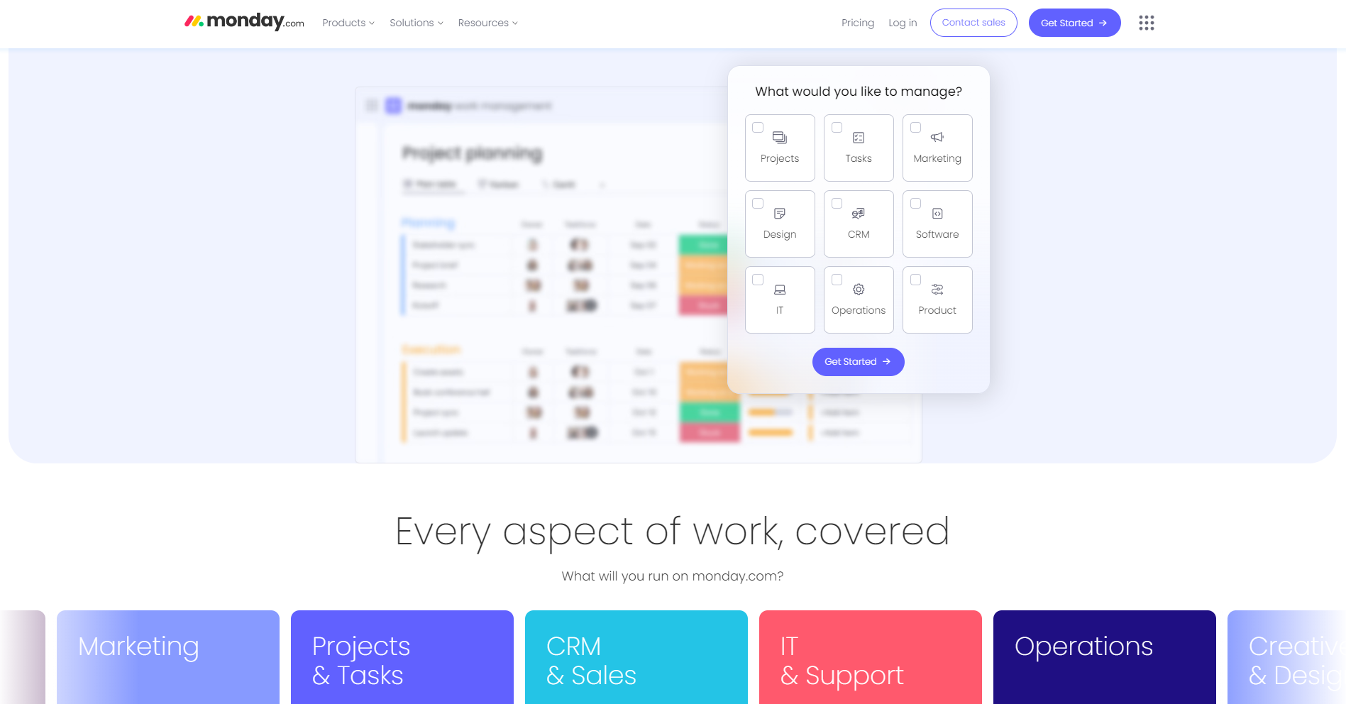
If product serves multiple horizontals, then make sure to attach use cases. CRMs or project management tools face this challenge. So, you’ll often see practical application examples tied to personas, departments, or functions. It allows the prospect to imagine their life with the software.
Application

Include short testimonial videos or interactive case studies.

Highlight key stats visually (e.g., “Save 20+ hours weekly with our platform”).

Add specific use cases if your solution is universal.
Design websites that are stakeholder-aligned
Brains can’t process the constant stream of information. They rely on habits to make decisions. By understanding our psyche, tech companies can make their websites more effective. But there over 150 scientifically recognised cognitive biases. Unless you’re a psychologist, it’s unreasonable to demand from modern marketers to know them all. So, website strategists need to focus on those which make the most difference.
In this article, I’ve outlined 6 key biases that influence committee decisions in B2B. By understanding these psychological principles, you can design websites that are not just user-friendly but stakeholder-aligned.
Originally published Jun 06, 2022 4:27:05 PM, updated November 4 2025.

