The 7 types of website navigation that improve UX and search rankings
Three out of the seven types of website navigation are frequently overlooked. This negatively reflects the user experience, and even lowers your visibility in search engines. Written by Dawid ZimnyBefore listing them all, I just want to make an important distinction. In this article, we’re covering types of website navigation – not their styles. You can think of it as a higher-level categorisation.
I will sometimes mention the styles (e.g. dropdowns or popups) but the focus is on the types, e.g. the navigation bar.
Website navigation types
- Global navigation bars
- Footer
- Inline links
- Breadcrumbs
- In-page navigation bars
- Sidebars
- Sitemap
What should be in the website navigation?
Virtually every website uses the primary navigation bar and a footer. The H in HTML stands for “hypertext”, so it’s rare to find websites without inline links. Even single-page websites have them! Those links just scroll to the relevant part, rather than opening a new page.
Many of you will also know that websites use sitemaps, which collect links to all the pages on your site. It’s generally a tool for search engines to better understand your website, but it’s entirely possible to make sitemaps appealing to users. In that case, they double-down as an index of your website – just like the index at the end of books.
However, the other three types on our list aren’t as common. They help with user experience, increasing conversions, and SEO. Let’s cover all seven types of website navigation to understand them better.
Navigation types summed up
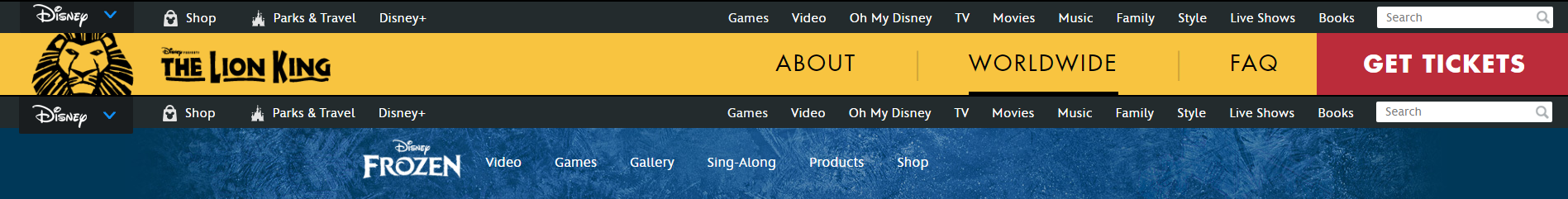
Global navigation bars

I use plural here because some companies use two menu bars. (It’s rare to see three or more but if you have such examples, let me know in the comments.)
There are various reasons for this:
- a secondary navigation bar can serve a different user persona
- enterprises use a second menu to help users navigate between their brands
Navigation bars are one of the primary ways users interact with websites. They should be optimised for the user experience and include the most important elements. Testing methods such as card sorting and tree testing allow us to learn which links are crucial for visitors.
As the old rule says, important pages should be a maximum of three clicks away at any point in the user journey. Menu bars help with that.
Did you know…Links have lower weight for SEO in repetitive types of navigation, such as the global navigation bars or the footer. Don’t be tempted to turn these into spammy features for search engines – it won’t do you any good.
How to make big dropdown menus intuitive – a case study of Hotjar.
Finding the right link to click among dozens of option in a big dropdown can be disheartening. If you’ve ever tried to find something in the Amazon menus, you’ll know.

There’s an easy way to fix this, and the Hotjar website is one of the best examples.
We covered that and more in Webabunga!, where we expose the secrets of B2B websites to inspire your team.
The footer
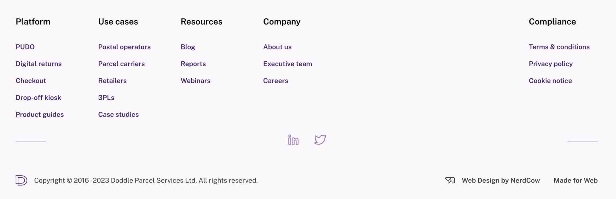
Marketers often underestimate how much visitors scroll these days. It’s not uncommon to see people go straight to the footer looking for pages they expect to find there. This is the case with common compliance pages, such as the Privacy policy or the T&Cs.
Footers allow you to show more content to the visitors. Someone who has scrolled this far shows signs of higher engagement, so they’ll be glad to see more options here. On the contrary, the global navigation bars I talked about before often benefit from a leaner structure.
And as mentioned in the tip at the end of navigation bars, don’t obsess over putting SEO pages in the footer. Your priority is to keep it usable and relatable. The next type will matter the most for your organic reach.
Inline links
Internal links exist on every website. These links carry a lot of weight both for the users and search engines, as they help everyone put your website in context. This paragraph is a perfect example. I have linked to our guide about internal links in the first two words. I highlighted that we also talk about a related topics of internal links on our website. It makes sense to everyone, since links are a subset of website navigation.
By doing so, we signal to Google that we’re knowledgable in the niche of website navigation. This builds topical authority, which is essential for organic rankings. If there are no other trust factors you can consider, would you rather learn from someone who talks just about the high-level concept, or the person that covers multiple layers of the topic? We’d go for the latter, and inline links help with that.
The reason it works is because both people and robots (to an extent) can understand text. Linking to an article from several paragraphs of relevant content is more natural than a lonely button without context in a navigation bar. Even though SEO is still mostly “robotic”, intuitive behaviours like internal linking also contribute to your rankings.
Breadcrumbs

They do what they say on the tin. It’s a trail which helps your visitors go back in their journey. At the same time, it helps them (and search engines, duh) visualise the information architecture.
You see them all over ecommerce websites and some content pages. They’re useful for quickly tracing your steps back to a category of products or articles.
In terms of SEO, properly configured breadcrumbs can potentially enrich your search results. Google sometimes shows related links under the main page:
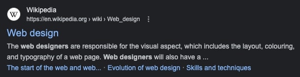
Breadcrumbs aren’t exclusively responsible for the appearance of these links. Sometimes, the links in the results are simply anchors to a relevant section on the website. But in general, the rich snippets come from the signals your website sends about the information architecture – and breadcrumbs are one example.
In-page navigation bars
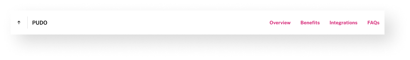
Visually, in-page navigation bars can be similar to secondary or even primary menus. The distinction is that most of the time, in-page navigation is unique to a single webpage. Most of the time, the links only scroll to relevant sections on the page – often with a dedicated button that goes back to the top.
This improves the usability of your site. People can get a better idea of what to expect at a glance and in-page navigation serves as a table of contents for them. If it’s in a “sticky” position, meaning that it always scrolls with the user, it’s accessible at any time.
Sidebars
If you’re reading web design & marketing content online, it’s almost guaranteed that you’ve seen sidebars on blogs. They appear on desktop devices… you guessed it, to the side of the content. Heck, we have one just to the right of what you’re reading right now! It has a comment section inside and we’d love to hear from you about this article. Let me know if it’s helpful.
On mobile phones, sidebars are either hidden or appear at the bottom of the content. On our blog, we use the latter option.
They’re great to promote relevant content that is a bit more “premium”. We collect newsletter subscribers in our sidebar, and HubSpot often advertises their free PDF downloads that help you learn even more about the subject. It’s a valuable piece of digital estate since it’s usually visible to your visitors at all times.
The sitemap
Last but not least, the sitemap is an important SEO tool. It tells search engines which pages are important on your website. These days, sitemaps are not required on smaller websites, granted your overall information architecture is good. Internal links are enough for Google to understand your website.
For users, some demographics will find sitemaps infinitely more intuitive – especially if you have many types of users on your website. Showing a comprehensive navigation for everyone might not be user-friendly but enabling people to see a nicely formatted sitemap would solve that issue.
Let your navigation help your visitors
People always visit your website with a goal. But even then, many marketers have a very superficial understanding of website navigation.
We’re used to navigating websites a certain way, so make sure to not reinvent the wheel. This will help you keep the user experience in check, while also raising your conversion rate and getting more organic search visibility.
Quick ways to analyse your navigation with GA4
Discover the GA4 reports and filters that will help you:
- Find out how people enter your website,
- Learn more about the demographics of your visitors,
- See the paths people take to reach the “money” pages,
- Check how your navigation performs on mobile devices.
Originally published May 30, 2023 11:44:12 AM, updated May 6 2025.