


What’s a good SaaS website navigation structure?
The top menu on a SaaS website doesn't need to exceed 3-4 elements. Here's our framework for the MVP SaaS website navigation, alongside with five micro-optimisation tips for more advanced use cases.
Written by Dawid ZimnyRecommended menu structure and length for SaaS websites
The perfect SaaS website navigation follows these rules:
- up to five top-level menu items
- multi-layered megamenus that go from generic to specific information
- content dropdowns using logical clusters, rather than categorising them by type
- an overall structure that benefits both new and existing users of your software
Keep in mind there are also other types of website navigation, which follow slightly different rules.
But when it comes to the navigation bar, we explain these below, along with extra tips, examples, and when to break the rules. But first, here’s a visual summary of the above.
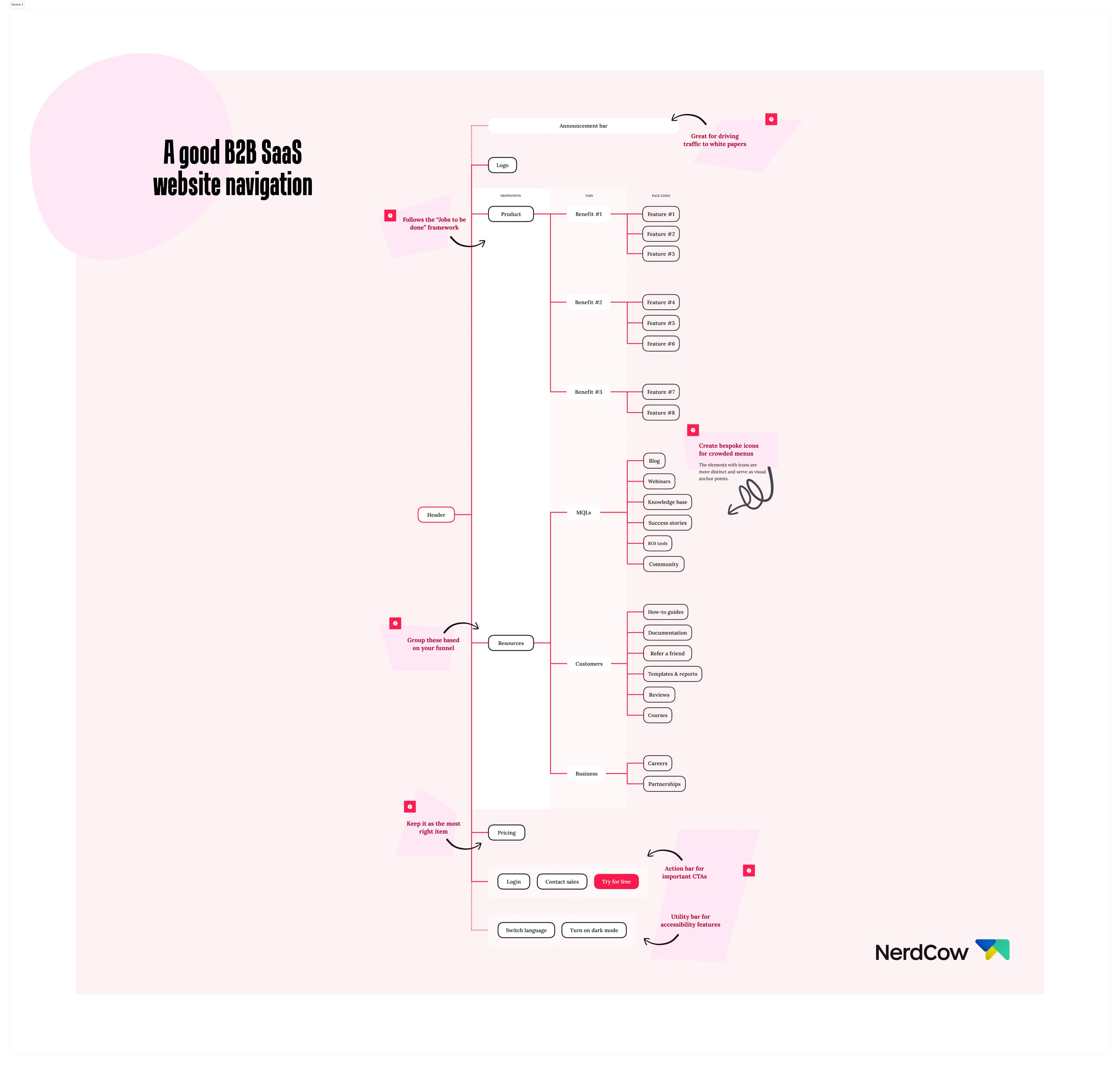
Open the SaaS website navigation example high resolution.
Five tips to optimise your SaaS website navigation
#1 Use “Jobs To Be Done” to write the menu labels
The navigation on Apollo.io takes a page from the “Jobs To Be Done” book. The words they use are a step above what you’d typically see.
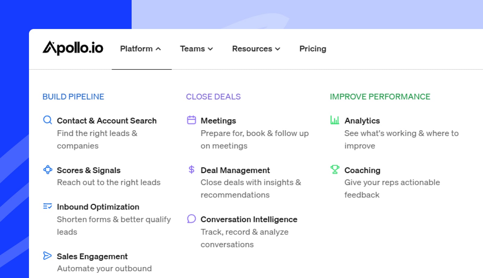
The short descriptions under the menu labels are subtle, yet they draw attention. That’s because they’re very descriptive and relatable. Using the JTBD framework, Apollo’s menu speaks directly to the user’s needs.
This is extremely helpful for their B2B audience. The process of buying the tool will often go through a buying committee. People involved in research and signing off on the purchase will know what their team needs, but it won’t be as obvious to them. With the slightly more detailed descriptions in the menu, those people can figure out at a glance if Apollo is the right choice.
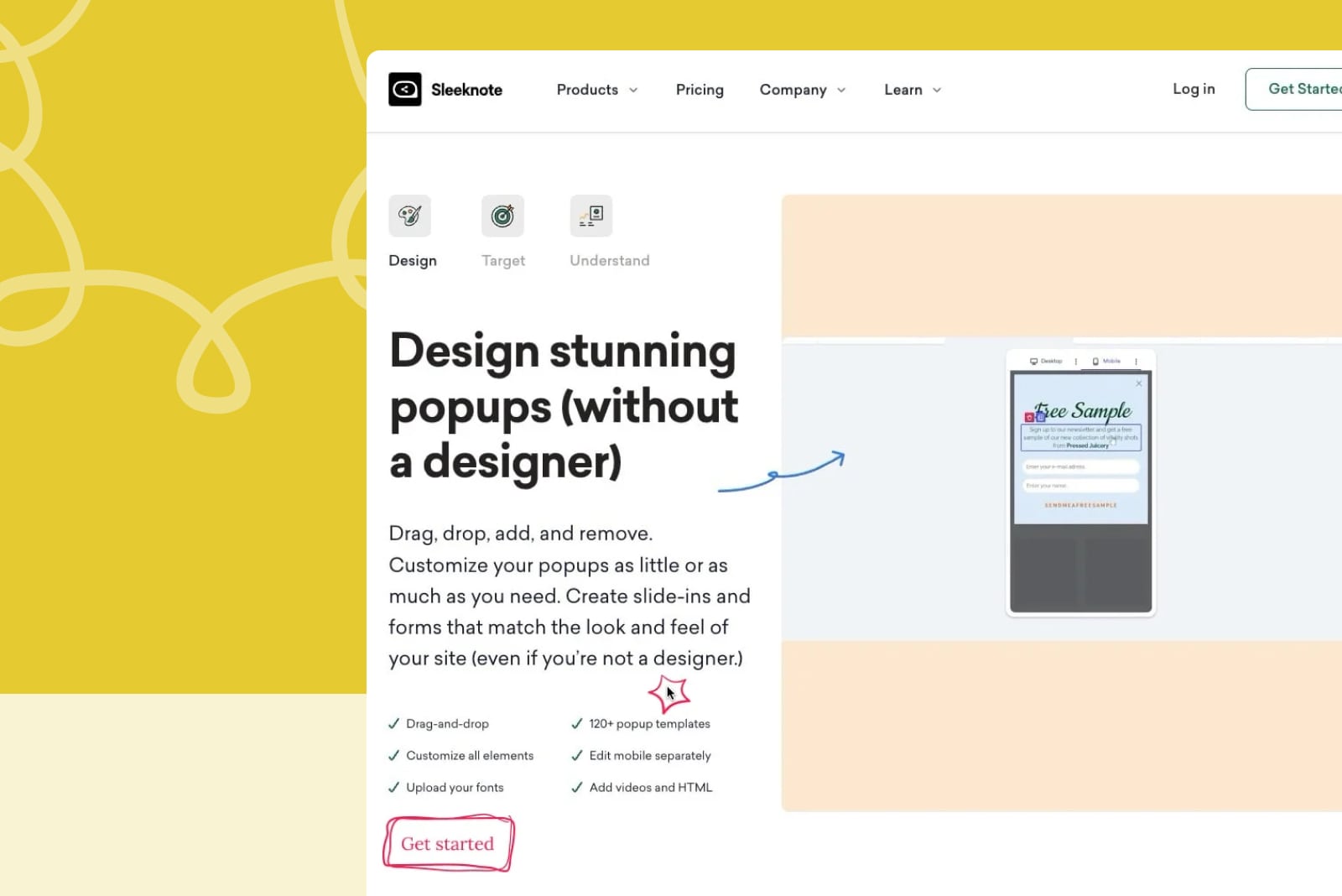
#2 Limit the menu to 3-4 elements
This was entry number one on our initial list, and for a good reason. Especially as a SaaS, the website navigation space is at a premium. You need to include your main call to action (sign up or request a demo) and a log in button.
In the case of HubSpot, they include a primary and a secondary CTA, and they still need extra space above the menu for quick links like “log in” and “customer support”.
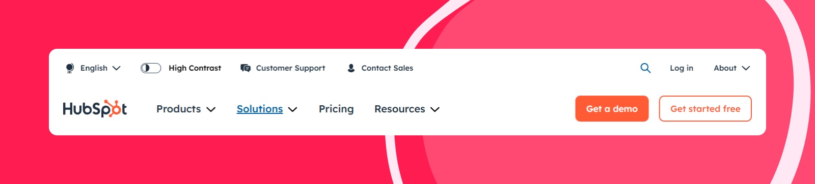
As you can see above, HubSpot alternated between three and four main navigation items while we were researching this article. This allows them to keep the menu compact and focused on the things that matter to the user.
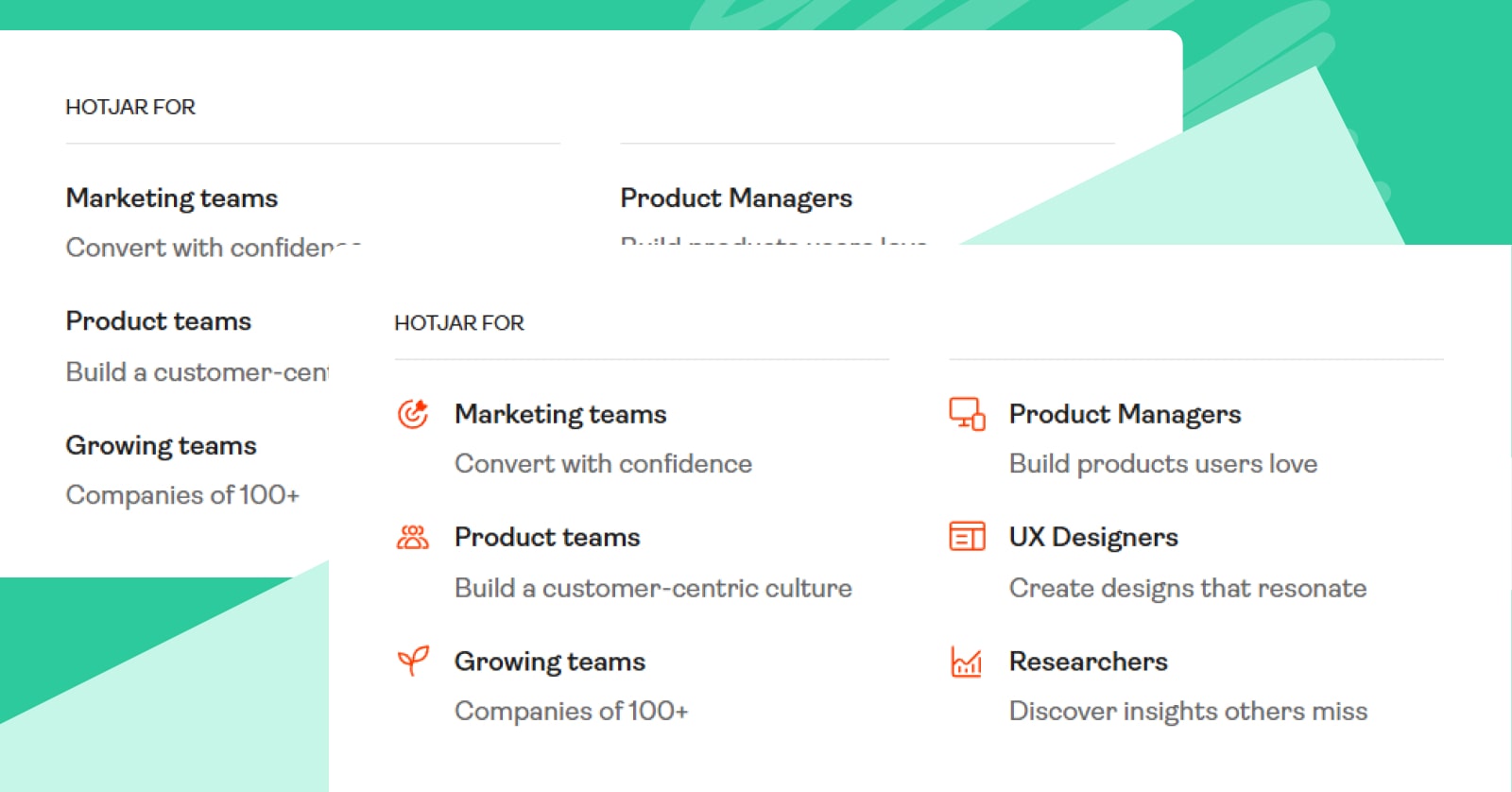
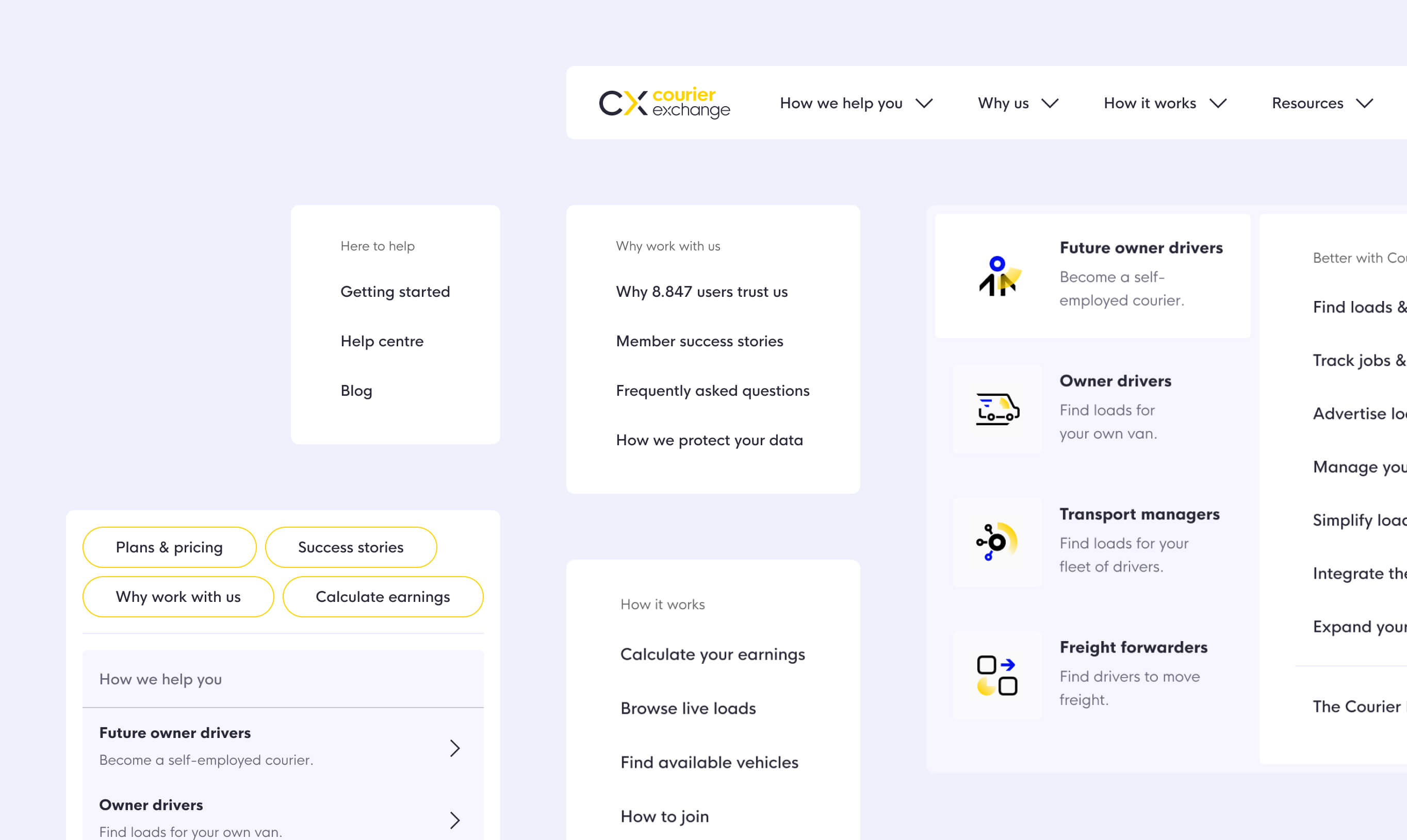
#3 Use icons inside complex dropdowns and mega menus
A SaaS is usually a complex product. This often leads to crowded mega menus and dropdowns on their websites. There’s nothing inherently wrong with that, but looking at this example of how Hotjar’s menu looks with and without icons, it’s a stark contrast:
Which one makes it easier to find information? If you’d go for the one without icons, that’s a bold one! You’ll have to run website navigation tests with your audience to confirm that.
Our money is on icons, though. The elements with icons are more distinct and serve as visual anchor points.
The benefits compound for returning visitors. As they get familiar with your menu, they start relying on icons more and more. This is especially useful for high-value purchases, where yearly subscriptions start at five figures. The buying process can take months and you should brace for repeat visits from your prospects.
#4 Don’t rely solely on the CTA in your navigation bar
Designers put primary call to action buttons in the navigation bar by default. But does it really make sense to have them there? And if not, what are the alternatives?
In theory, it’s a perfect use of the space. The navigation bars are short enough to leave space on the right. Having a CTA there, to be visible at all times, seems like a no-brainer.
But is your primary CTA that important for a new visitor? The blunt answer is “no”. It’s only relevant at one, late point in their journey. Sometimes they will visit your site several times before ever clicking it.
Most SaaS websites have a few user journeys, which you can spot using analytics. A CTA that’s always visible sounds like a good way to appease them all.
But at the same time, user journeys don’t work like that. There will be specific moments when people realise you have the perfect solution to their problems. It’s much more important to place the CTAs near those spots, rather than in a single, fixed place.
If you look at cursor movement research or notice how you yourself use websites, you’ll realise how far away that CTA is at any given time. It would make much more sense to identify the key conversion points and place the buttons in their proximity.
Instead of relying on that one button, research “hotspots” on your website. Place CTAs in the context where people are most likely to convert. This can be at the end of sections or in popups in the corners of your site.
At the same time, avoid putting a CTA everywhere. The user journey often goes beyond the scope of the current page and placing “Sign up now” buttons in wrong places might not be the right solution. For a SaaS, conversions often happen via buttons on the pricing page. You should be able find at least a few obvious spots where people are almost begging for a button to click.
#5 Utilise in-page navigation where necessary
We’ve all been frustrated with websites that drag us through meticulously designed funnels. “Read this, click that, interact with this, see the pricing, get in touch.” It’s always a pain to find the actual information you’re looking for.
Thankfully, you can avoid frustrating visitors with an underused in-page navigation component. Here’s an example from Braze:
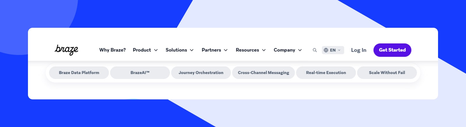
It’s a great way to shorten complex product pages and ICP landing pages. This way, you’ll create shortcuts to important content.
The concept reverses typical higher-level navigation on some websites. We explained that one using Disney’s website navigation as they example. They include smaller, cross-brand navigation on the websites of almost every play, movie, and brand they own.
In-page navigation flips the concept on its head, bringing people closer to their goal, rather than zooming out to the wider ecosystem.
Originally published Feb 05, 2025 1:26:23 PM, updated November 4 2025.

