Go back Close

Overview

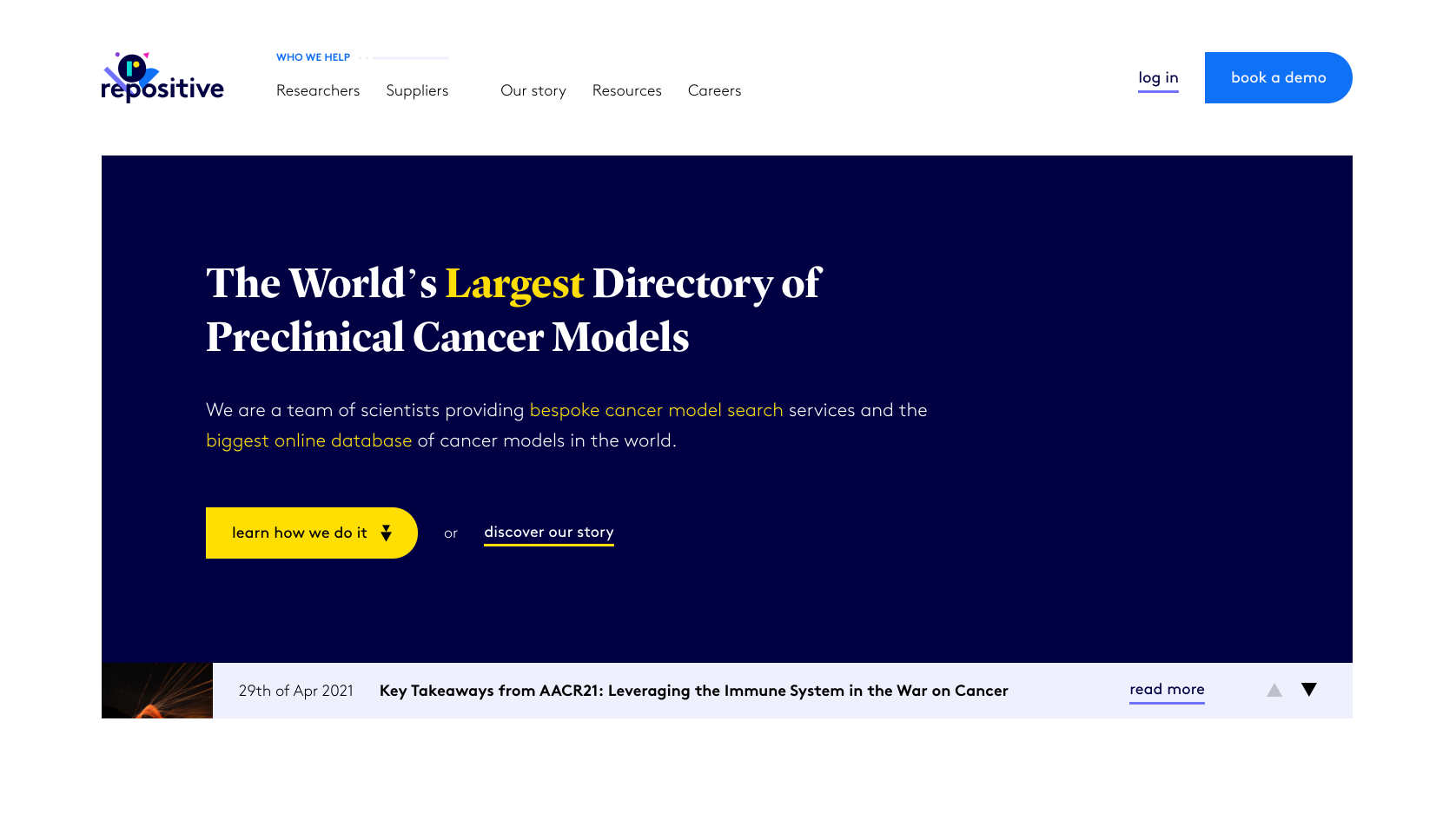
Repositive had set out on a journey to revolutionise the cancer research industry. It paired a playful brand personality with a great customer experience. Contrary to its competitors it focused on delivering bespoke services tailored by a team of experienced scientists rather than automation and algorithms. As a web design agency of record, NerdCow took on the challenge of creating a user-centred website that caters to the target audiences and inspires them to get in touch.

Following our unique approach, we ran a series of collaborative workshops with the client. The result was a market-tested website that quickly became an irreplaceable revenue channel. Considering the niche and fierce, established competition, the website scored 8 new leads in the first week since launch. In comparison, the previous website has never generated a single lead.

Thanks to NerdCow, we have been able to see our bounce rates lower as our conversion rates rise. The redesigned website also now has a faster loading time with a lower exit rate. NerdCow uses an agile approach to their workflow, and has been enjoyable to work with.
Justyna, Chief of Staff at Repositive

What we did

  • Design sprint workshops with four members of the Repositive team
  • Two rounds of user testing and three prototype iterations delivered in two weeks
  • Included an atomic design system with components reusable across digital & print marketing
  • Designed and developed the website using an agile approach
  • Used state-of-the-art headless architecture based on the Contentful CMS
  • Accessibility, web standards and SEO all baked in
  • Post-launch optimisation and lead generation tracking

Outcomes

8x

more conversions

2.5x

faster loading time

Watch a video about this case study

Takeaways

01. Focusing on the end-user and the business requirements

02. Mobile-first approach to website interface design

03. New headless architecture

01.

Focusing on the end-user and the business requirements

Foundation

We interviewed individual team members to understand what’s expected of the new website. This also helped us learn more about the existing pain points. We painted a bigger picture of the business ecosystem, digital activities, direct competitors, and much more. It helped us to better prepare for upcoming workshops.

Workshops

In the series of collaborative workshops, we aligned everybody’s vision of the new website. It was an important step to agree on the way forward. We voted on the challenges and potential impediments. With those at hand, we finalised the user journey with drawings of a website interface that might bring us closer to the goal.

User testing

Our creative process includes prototyping and user testing. Using the findings from the workshops, we assembled an interactive website prototype in less than 6 hours, then tested it with 5 people resembling the target audience. The gathered feedback helped us improve the prototype. We tested it again to make it bullet-proof and wrapped up the third iteration. It gave everyone the confidence to proceed to the production stage with a validated concept.

02.

Mobile-first approach to website interface design

Atomic design system

We are agile to the bone. It means all moving parts of our process need to play in line with the agile principles. That’s why we use the atomic design system to deliver the visual layer of every project. The tiniest part of the interface is an independent component.

Fancy a quick biology lesson? It goes like this. The smallest elements are called particles, these never change, e.g. fonts, colours, brand elements. Combine particles and you get atoms such as buttons, icons, form fields. These, however, form molecules or even organisms like navigations, cost calculators, or newsletters.

User experience

We recognise the importance of user experience. Since May 2020 it’s the most contributing factor in SEO. Everything we do is user-centred, hence our process includes testing the website prototype with the market.

For this reason, our designs are mobile-first. It’s much easier to add elements, compared to substracting from a desktop design. It also eliminates the need to compromise along the way.

03.

New headless architecture

Performance

We powered the website with Gatsby – a React-based framework. It means that the website generates static pages every as and when needed, instead of the traditional way of constantly connecting to a database. The result is a website that reloads instantly – as if you were switching between slides in a PowerPoint presentation.

Search engine optimisation

We restructured the architecture of information around the website, so it’s easily findable and understood not only by the users but also by crawling bots. SEO was baked into the bespoke headless implementation, and it was easy to manage for the Repositive team.

Questions? 🤔 We’ve got them, too!

What’s bothering you with the existing website? What’s the challenge you wish to solve with a new website? How will you measure the success of the new website?

Schedule a call with us, and let’s figure it out over a remote cup of coffee 😉