Examples of the best B2B SaaS product screenshots, images, and illustrations
Turn your boring screenshots into product images that drive MQLs. Our examples from the likes of Stripe and Figma will help you get rid of the old and tired "MacBook mockup" screenshots.
Written by Dawid ZimnyKey takeaways
- Avoid tacky screenshots inside of a computer mockup.
- Plain screenshots can be hard to identify as multimedia and attract dead clicks.
- Modern SaaS product images use collages, irregular layouts, animations, stock photos, and more.
- Stripe’s website is a good source of inspiration for a combination of the above.
Product screenshots can be almost as effective as other types of SaaS demos. In fact, they effectively address some of the issues with interactive demos.
If you’re looking for inspiration on how to replace plain product screenshots on your website, we’ve got you covered. We collected examples of SaaS visuals that go beyond the old “screenshot in a MacBook mockup”.
Apart from serving as inspiration, these examples will show you how to:
- warm up your SQLs ahead of the sales calls
- reduce dead clicks on screenshots
- make better use of your brand
#1 User Interviews product visuals
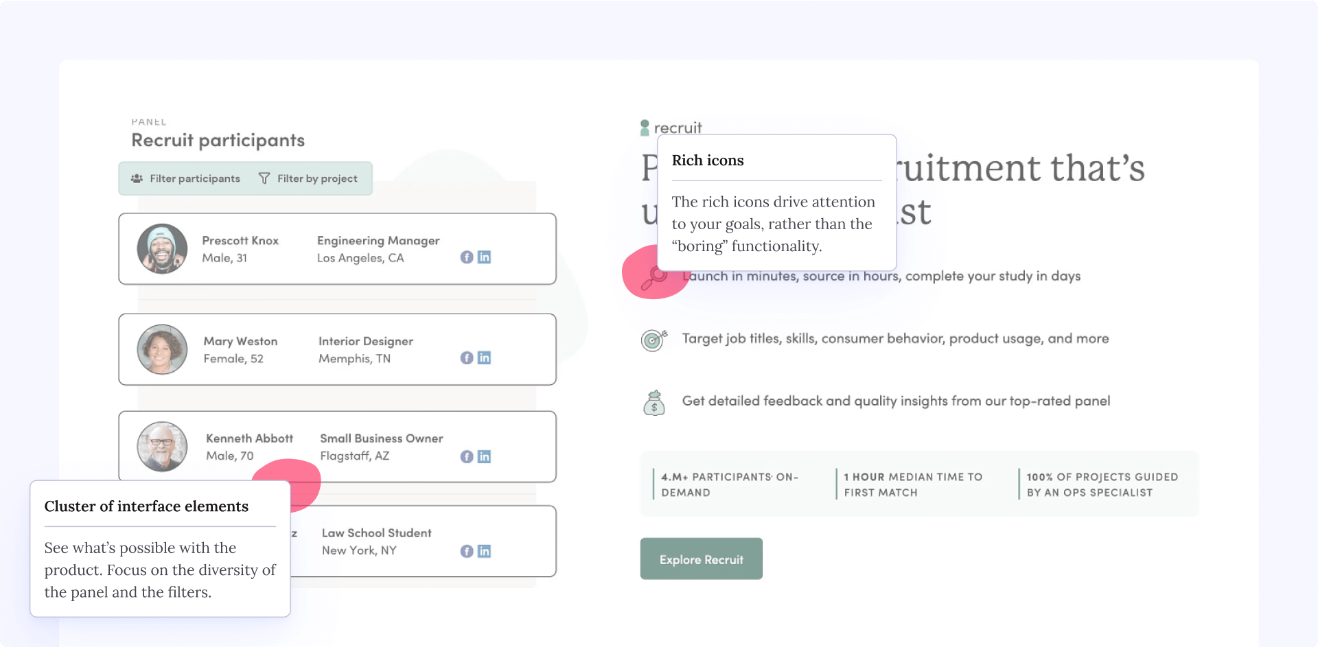
First up is User Interviews. They go for a cluster of edited interface elements – the filters and the persona tiles. The twist here is that they don’t show a complex flow that you have to go through. (We’re User Interviews customers ourselves.)
Instead, they show what’s possible in the product. The focus is on the diversity of the panel you can reach and the filters available to you.
The rich icons in the adjacent text drive attention to your goals, rather than the “boring” functionality. It sets expectations.
As a bonus, the image is animated, which helps User Interviews reduce dead clicks on product screenshots.
#2 How Stripe uses product screenshot collages to reduce dead clicks
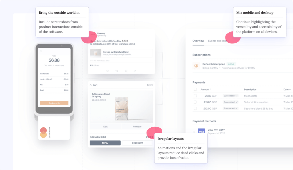
Stripe uses a lot of mind-blowing animations for their site. They’re famously known for spending TWO WEEKS of a full-time designer to animate just the icons on the Home page.
But here’s what they do in the areas with static product images:
- use irregular layouts
- put screenshots in collages
- mix mobile and desktop mockups
- include screenshots from product interactions outside of the software (e.g. social media, email confirmations)
This tells visitors that these are just illustrations and they shouldn’t try to interact with them. And they’re still manage to be super informative.
#3 Zapier chooses “flow illustrations” over product screenshots
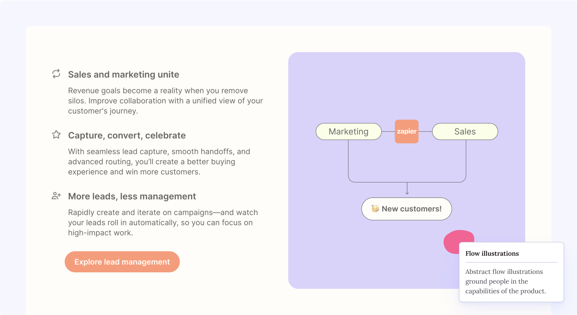
Zapier is a hugely customisable product. As such, showing the interface might be hit-and-miss. What works better is an approach similar to what User Interviews did. But for a change, Zapier shows website visitors abstract flow illustrations.
This grounds people in the capabilities of the product without relying on exact product screenshots.
It can be especially great for legacy SaaS which doesn’t look as pretty as the new kids on the block, or software that is just too complex to grasp from looking at static interfaces.
#4 Asana’s ICP product screenshots
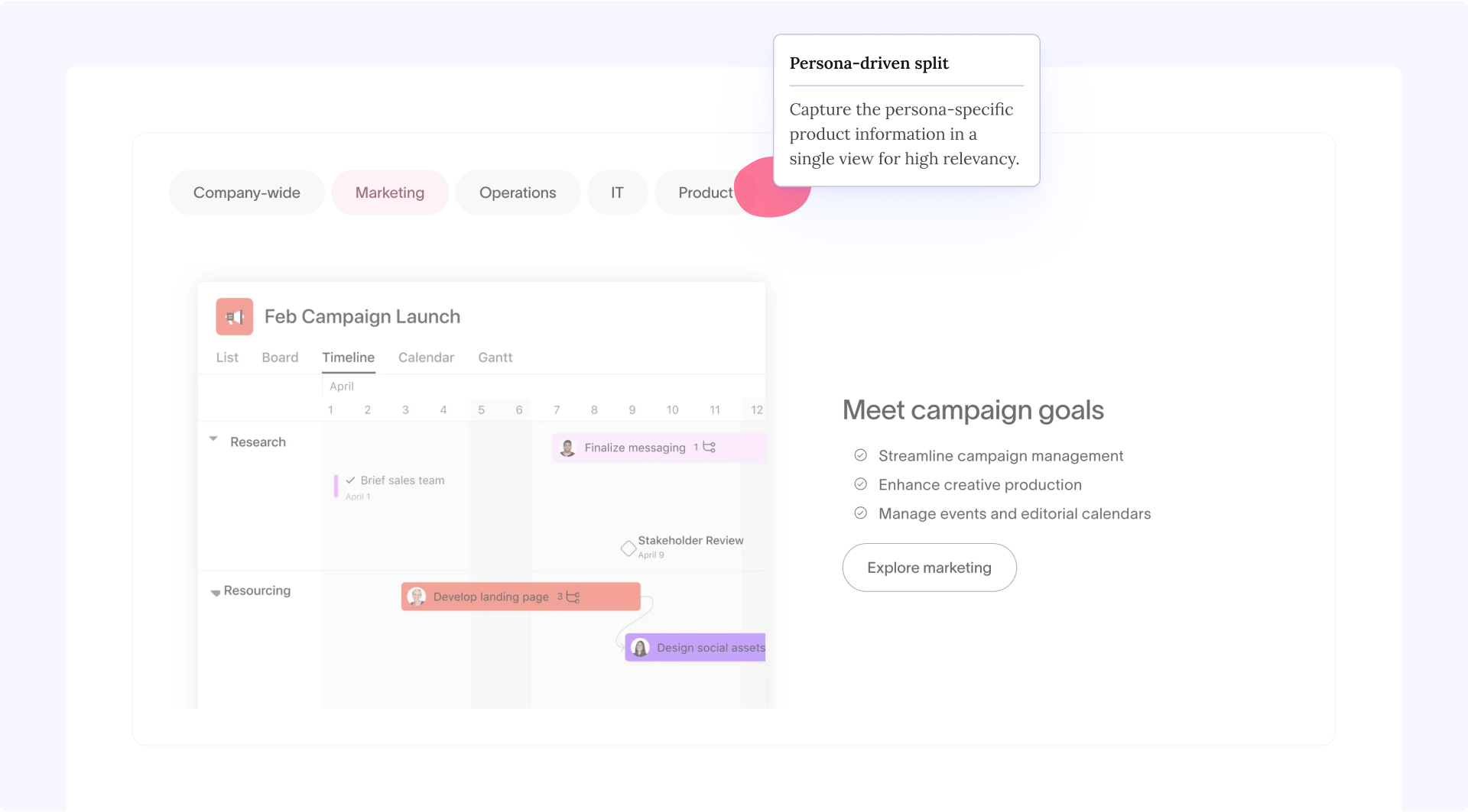
Asana uses a blend of product visualisations, actual screenshots, and mixing them up as collages. But one thing that stands out is their ICP-centric section.
In it, they show a snippet of the product that captures all the essential information for that specific persona. Remember, Asana is another tool with a ton of features that you can customise. Showing people everything wouldn’t be as powerful as showing a marketer a fragment of a campaign launch roadmap.
#5 Airtable’s user journey graphics
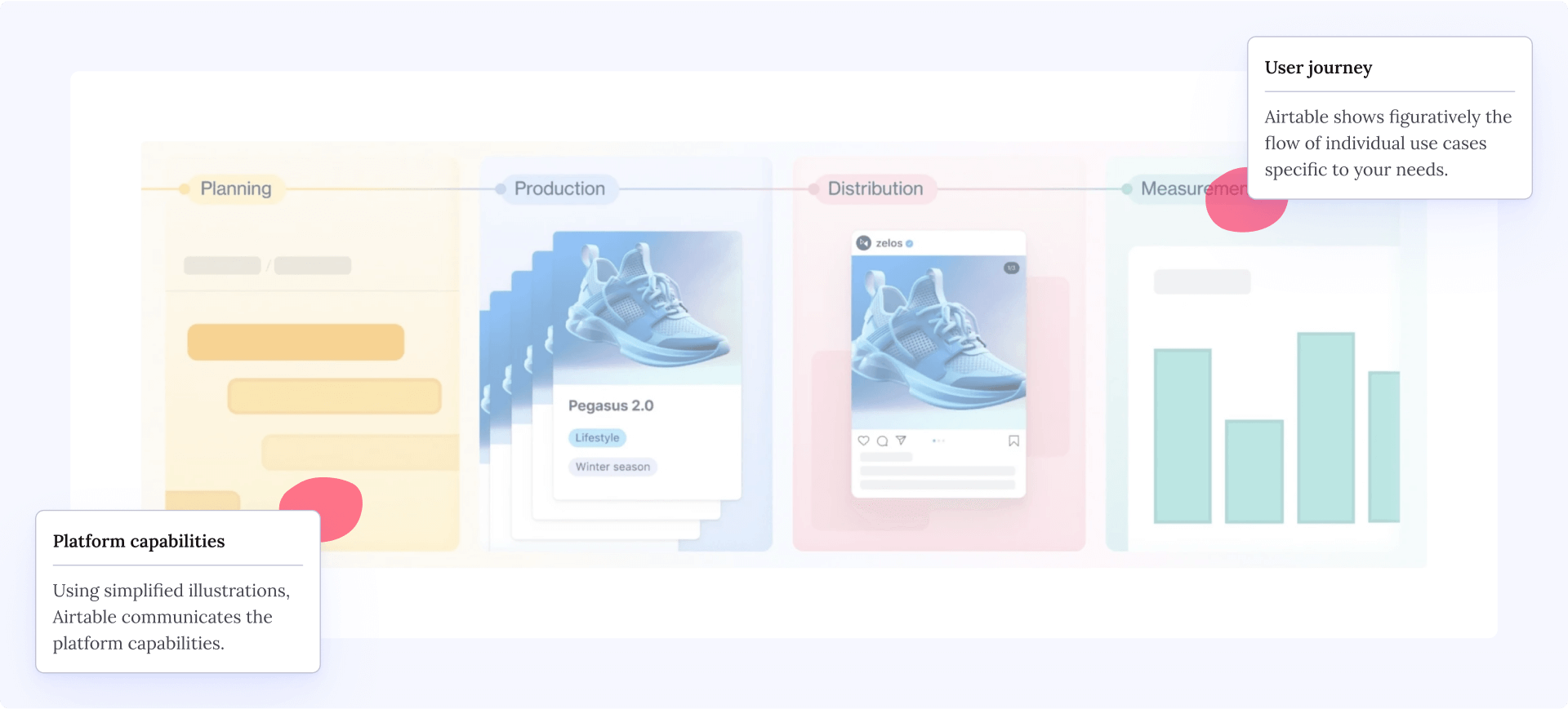
Airtable also uses a range of the tactics we already described. But one of the unique methods they use is on the Product pages, where they show simple timelines and icons to communicate the platform capabilities.
In this example, they go from high-level on the Home page (generic product screenshots) to very focused graphics on the Product pages, figuratively showing the flow of individual use cases specific to your needs.
#6 ActiveCampaign’s rich stock photo animations
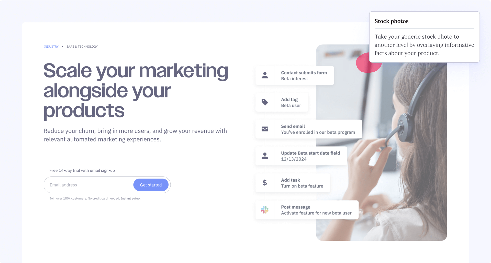
Have you ever had your Head of Marketing or other stakeholders ask for more people on the website? It happens all the time and it’s often a valid point. But the default solution isn’t to just use some out-of-context stock photos.
ActiveCapaign enriched their stock photos with visualisations of the workflows possible in their software. The stock photos anchor people to a use case scenario (“hey, that’s me!”) and then the overlay sets clear expectations for what they can do with the product.
#7 Product mockups we made for Courier Exchange
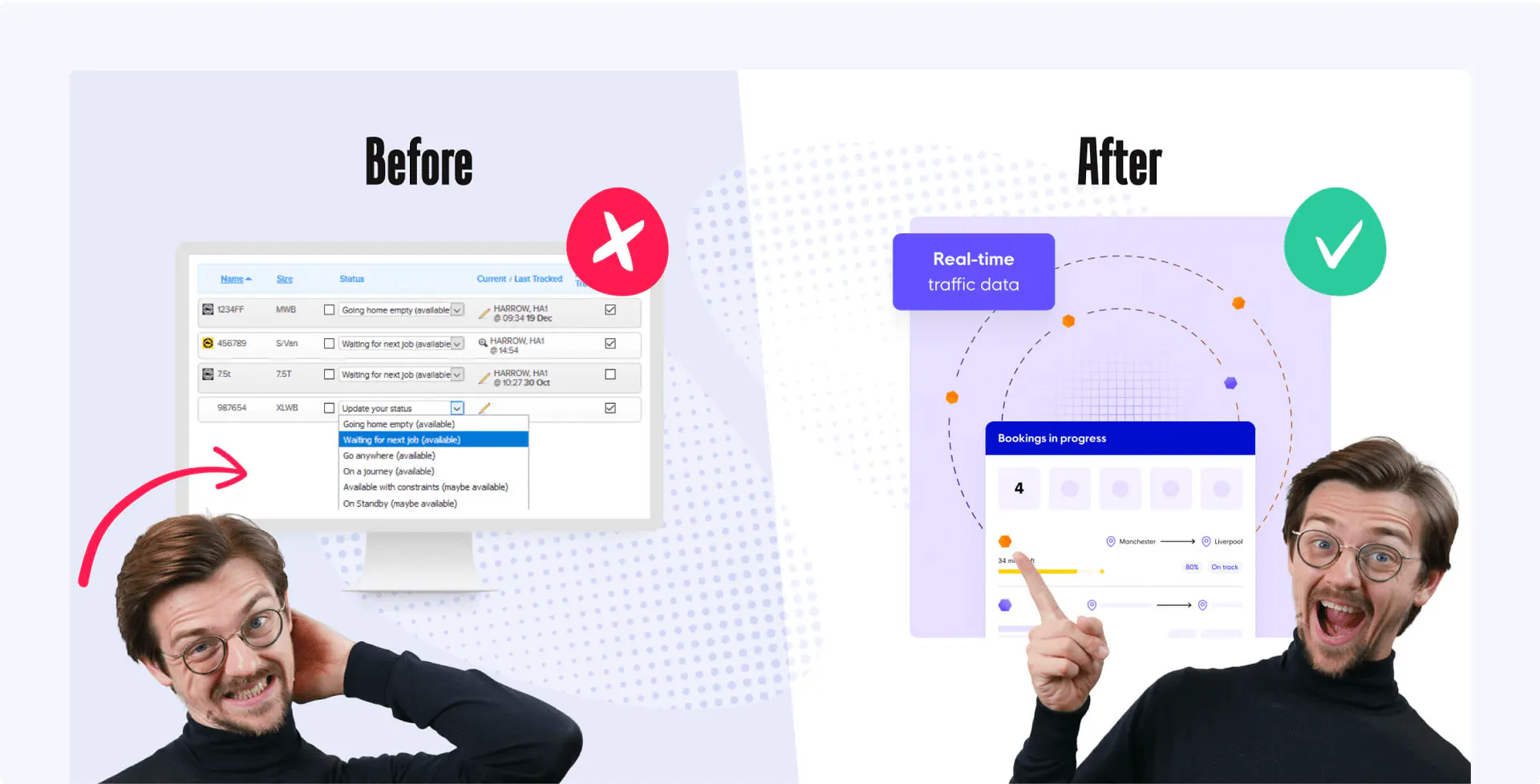
We’ve worked with Courier Exchange since around 2016, and their product changed drastically in that time. At some point, we needed to replace the old and tired “software screenshot inside of a computer screen” images.
We went for rich visualisations that combined user interface elements informing people about the platform and visual decorations. We have a case study showcasing the product screenshots from this project. It includes links to the client’s live website and even allows you to have a peek inside the design system in Figma.
Should you always include product screenshots on your website?
It seems obvious that people will want to see what they’re about to buy, but in some cases, product screenshots can work against you. There are a few examples, ranging from complex software that can’t be encapsulated in a static image, all the way to products which are just not visually appealing – and there’s nothing wrong with either! In one of our articles, we discussed when not to use product screenshots in more detail.
Originally published Dec 09, 2024 12:19:44 PM, updated March 16 2026.

