


4 tested ways to convert more on your SaaS sign up page
We've seen dozens of tips for Sign Up pages, but only a handful are backed up by valid tests. The four tips presented in this article have a several successful A/B tests behind them, and we tried them ourselves to confirm that.
Written by Dawid Zimny#1 Tease your product or outcomes in the background of any SaaS Sign Up page
Plain background behind a form often decreases the conversion rate of the Sign Up page. Adding a blurred screenshot of your app works as an anchor for people signing up:
- it sets expectations for what they’re going to get after signing up
- the blurred image makes us subconsciously more eager to unlock the full version
Software isn’t the only thing you can show off this way. If you think of Canva, it’s really “just” a design app. A blank canvas. It’s not exactly more appealing compared to other options – we all know what to expect. But their twist on this is to show off the outcomes instead:
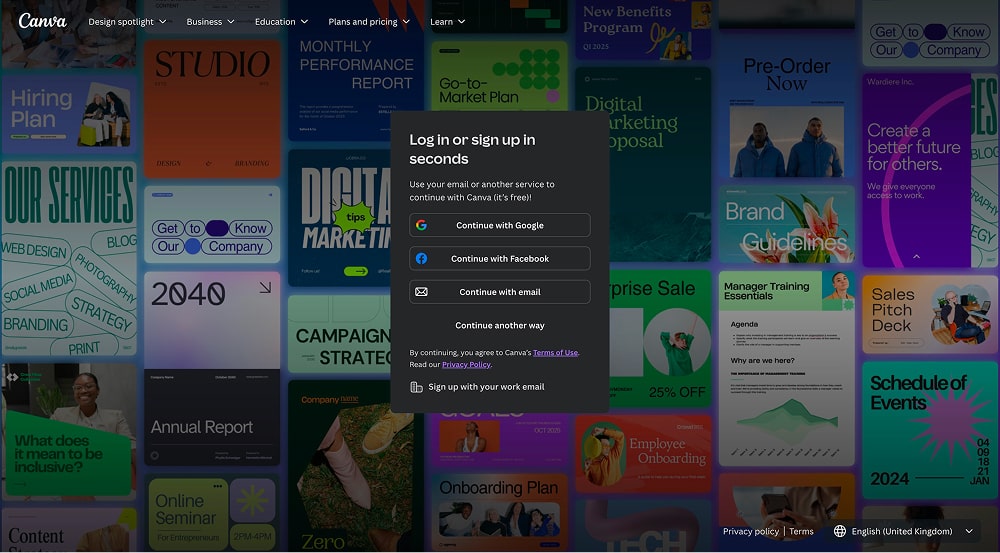
This achieves the same effect, showing people the designs they’ll be able to make with Canva and showcasing the breadth of options, from simple graphics to brand guidelines and annual reports.
Does adding a background to your Sign Up page increase conversions?
The results will vary case-by-case. For some companies, this brought at least 25% more sign ups. If you have the necessary traffic, we encourage running your own A/B tests. But at the same time, we have a high confidence in this – that’s why it’s number one on the list. 😉
#2 Try shorter AND longer forms
Filling out forms can be a bit of a chore. It’s no wonder that we assume shorter forms = higher conversion rate. But depending on the context, this could be very far from the truth.
The Expedia case study about removing “a single form field and making millions” is legendary by now. But most people don’t consider the full context – it was a payment form, and it was poorly designed. The length was never the issue.
We’ve tested longer forms with several clients. When done in a considerate way, it never resulted in a drop in conversions. It was net neutral at worst, but the “winning” factor was the fact that sales teams had access to more accurate data. And whether you like it or not, that benefits both the company and its customers. Did anyone ever complain about having a smoother sales or onboarding process?!
For us, long forms were winners when they made sense – the added fields related to compliance and highly related to the onboarding experience.
In the past, we also had positive results using longer forms for feedback-related activities. Once again, context matters. If someone is engaged enough to find your feedback form, why would the oppose one extra field – as long as it makes their feedback more useful?
#3 Start a multistep Sign Up by asking for just the email – especially if you have a freemium product
This might sound like stark contrast to the example before, but it’s actually further validation that the length of your sign up flow depends on its context. For many products, starting a multistep with just an email input is a brilliant way to increase the lead-to-sale and free-to-paid conversion rate.
You can’t exactly onboard or convert an enterprise client to a £10,000+/pa software via an email sequence. But you can do it if your product is available for free, or at a low cost.
In that scenario, your form should be limited to a single email input field. At worst, it should be a multistep form where you capture the email as the first thing. If people drop off before completing the other steps, you’re perfectly positioned to warm them up using email sequences.
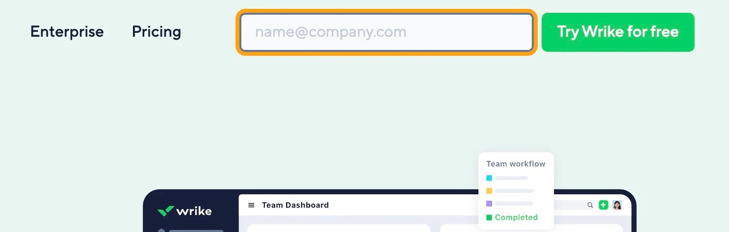
Here’s an extremely good example from Wrike. On their website, clicking the “Try Wrike for free” button pops up with an email input – without even redirecting people to a Sign Up page.
#4 Don’t use social proof on Sign Up pages
In general, B2B sales cycles are too long for this to matter. Larger companies will require at least a few touchpoints even after they decide to go with your company.
One person might submit a purchase order, another has to approve it, and the third one actually processes the payment. The people at the end of that sign up chain won’t care about social proof. They just want to do their job, in and out of your tool as fast as possible.
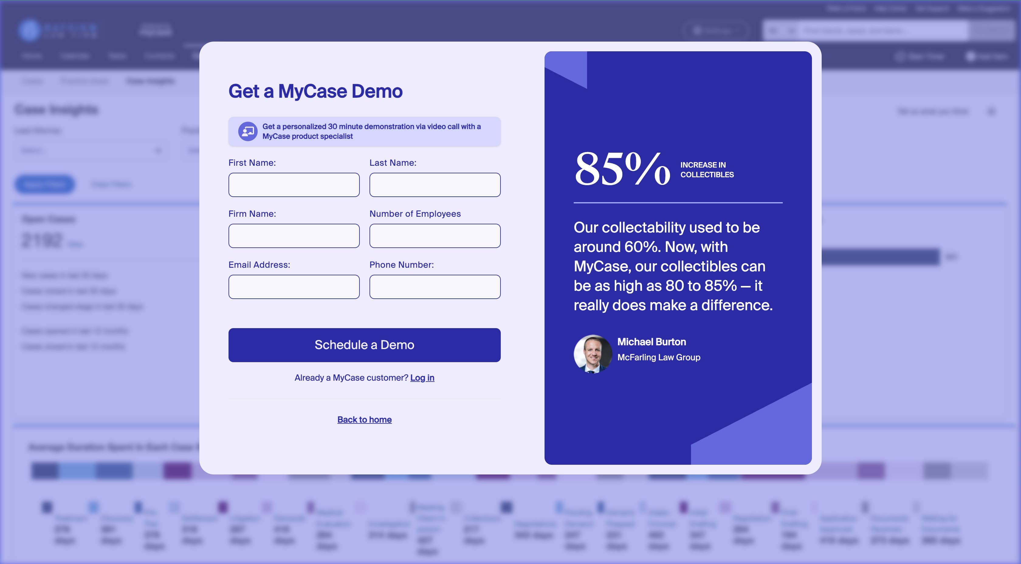
Note: this is different for pages like “book a demo”, as the target audience and intent shifts. As an example, MyCase uses our first suggestion but also includes social proof on their “Schedule a demo” page:
Test every suggestion before making it a permanent change
Our confidence in the suggestions is extremely high – otherwise we wouldn’t publish them. However, always test or otherwise validate these ideas before making them permanent on your website.
Audiences, products, and user journeys differ from site to site. Something that works for 90% of businesses will still fail for one in ten.
And if you’re interested in more ideas to test, check out the “Convert website traffic” category on our blog.
Originally published Apr 25, 2025 12:44:14 PM, updated November 4 2025.

