Design and content optimisation tips based on website scanning patterns
Among various website scanning patterns, the F-pattern is the most well-known. However, web designers tend to misunderstand its implications, ultimately wasting resources to conform to the pattern. We've compiled a quick summary of the area and an explanation of why the F-pattern is bad for your visitors and your business, together with tips on how to improve your design and content based on scanning patterns.
Written by Dawid ZimnyThe F-pattern is the dominating website scanning pattern, as researched by the Nielsen Norman Group. But why is it so popular and what are the implications?
When asked about the goals of visitors, web designers and website owners rarely give the perfect answer. Their goal is to maximise the benefit-cost ratio (BCR). Their goal is very contrasting with the goal of most websites, which is to provide the maximum value. This disconnection led to subconsciously developing scanning patterns that lowered the BCR.
The implications of F-pattern scanning
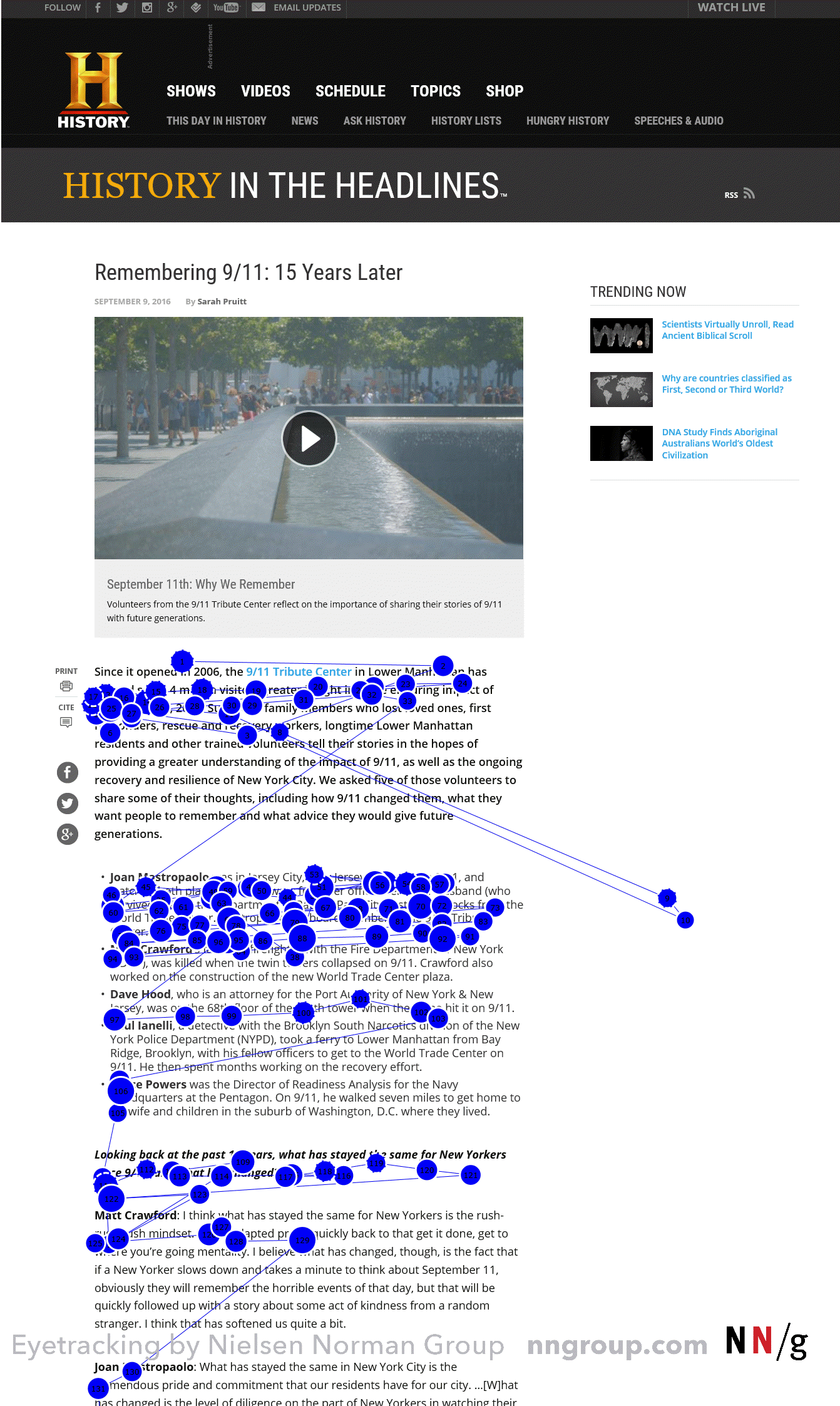
The aforementioned F-pattern is fairly intuitive – visitors first scan the sections at the top of the page, reading the first few headlines and sections. This forms the horizontal bars of the letter F on the heatmap.

But then they only skim through the left side of the content and that eye movement forms the stem of the letter. The stem isn’t always a perfectly solid stripe, as elements such as further headings and hyperlinks sometimes make the pattern less regular, occasionally even forming a letter E instead of an F.
This means two things are happening:
- people read the first sections of the page fully, expecting to find the most important information there
- the first words of subsequent sections are often the only words that are read in these sections
Designing for the F-pattern is NOT the answer
So what did most web designers do when the study was first published by Nielsen Norman Group back in 2006? They adjusted their designs to match the pattern.
To this day you’ll find articles about adjusting to the F-pattern, which is a wrong approach. It might seem logical at first, but if you think about it, this approach purposefully uses design and content that won’t get any engagements.
The wasted resources aren’t the only drawback. Previously, the F-pattern occurred because of the lack of formatting on a page (often described as a “wall of text”), because websites weren’t offering enough value to the visitors, or because they didn’t feel inclined to read the content.
This should immediately raise a red flag. The common denominator for the aforementioned reasons is poor website optimisation. Without data-driven web design and educated choices, visitors are forced to use the F-pattern.
But the F-pattern isn’t the most efficient website scanning pattern, it’s a subconscious behaviour forced by the website.
What’s even more concerning, when you consider responsiveness you’ll notice that the content changes shape based on the window size and the device type. When your visitor is forced to scan in the F-pattern, they will scan different parts of content on different devices.
Website design and content optimisation tips
We’ve established that conforming to suboptimal website scanning patterns is bad for both your visitors and your business. So what’s the right approach to designing your website and creating good content?
- Cut the unnecessary copy. Apply the “less is more” concept we’ve previously covered by shortening the copy of pages that aren’t supporting your content marketing.
- Get straight to the point. Include the most important information in the top sections of your site. Following the advice from #1 will make it easier since you won’t have an excessive amount of paragraphs.
- For long-page designs, start further headings with the most important phrases. The longer the visitor scrolls, the less likely they are to read the full heading.
- Avoid “walls of text”. Format your text accordingly – use headings, subheadings, hyperlinks, bold important phrases. Create lists to break the “wall”.
- Be informative. Nobody wants to click “here”. If you’re linking to an article about content strategy, include a relevant anchor text in your copy.
- Intertwine your copy with multimedia and design elements. Videos and images increase conversions not only by conveying your message but also by optimising the user journey.
- Highlight your value proposition in multiple sections. If your page has to be longer, reiterate your point in different sections. There’s a good chance that your amazing selling point will go unnoticed if you only include it in one place.
Test the patterns on your website
Universal patterns apply to most audiences, as they exist due to our nature rather than the specifics of your site. The latter, however, can be monitored using state-of-the-art tools. It’s a crucial part of our process and it’s important your business puts an emphasis on that.
Using analytic tools you can find out which areas of your website are the most popular, identify distractions and pain points, learn whether your visitors scroll deep enough to see important information, and many more.
Analysing your existing website and a new site post-launch will ensure your agency has made the right choices and allow you to build on that if something was overlooked.
This process is even more important considering that things will get overlooked. Creating a conversion-orientated business website is a very complex process, involving multiple departments across several businesses – the agency, your company, and sometimes third parties. It’s important to iron out these small errors, whether they’ve occurred because of a communication issue, a lack of knowledge about a certain audience preference, or other factors.
Give the visitors what they need
You’ll rarely ever notice the “commitment pattern”, which is reading almost everything on a page. However, the F-pattern is another example of unwanted behaviour. Instead of focusing to write in the F-pattern, identify F-patterns in your content and place important information in those areas.
Originally published Jul 18, 2019 8:55:01 AM, updated November 4 2025.

