


Dos and don’ts of B2B SaaS demos and interactive product tours
Interactive product demos are a key growth tool for SaaS companies. SaaS marketers and product managers love self-serve demos because they allow the company to scale without a sales team and it can replace part of the onboarding process.
Written by Dawid ZimnyDespite benefits for demo-to-signup conversion, the onboarding UX, or scaling without a sales team, interactive product demos have one dangerous trap. With tools like Supademo, Navattic or Storylane, you can create a demo without engineering skills.
In this article, we summed up some of the best (and wrost) practices to help marketing and product managers create better SaaS demos.
❌ DON’T force people into interactive product demos
Self-serve demos are great for some situations. They’re perfect for people that are savvy enough to make the most use out of them. But they also have a few issues:
- When the product is simple (e.g. Canva), a freemium model is more effective.
- Continuing a Canva example, when the value is in tangible outcomes (here, appealing designs) it’s better to show the end product than show off the software.
- When the product is complex and takes time to drive ROI (e.g. Salesforce), a self-serve demo won’t do it justice. It can be useful to evaluate the interface and choice of features, but that’s a more niche requirement.
- In B2B context, the buyer is often a committee, not a single user. Not everyone on that committee will benefit from a self-serve approach.
We recommend investing in demo account functionality when you’re somewhere in the middle in terms of product complexity. They’re also more useful the smaller the buying committee is.
✅ DO: Use self-serve demos whether you’re a PLG or an SLG
It’s a logical but not entirely true assumption that product demos are only for Product-Led Growth companies. And while in the “don’t” above we acknowledge that not everyone on the buying committee will benefit from an interactive tour… some people will.
The person tasked with buying the software isn’t always the end user. If that’s your case, you need to think of your product demo as a tool for other people in the buying committee. That applies to both deciding if you should have one, but also figuring out when to introduce it in the sales funnel. In some cases, it’s better to keep it hidden from the public and only introduce it later on in the process.
This is especially true for tech companies, where product choices sometimes fall on managers. They wouldn’t use your product demo while browsing the site, but might find it useful to forward to engineers – or better yet, to a Head of Technology, if they’re involved in the decision.
❌ DON’T lead with a product demo on the Home page
There are many case studies on the placement of interactive product tours, and Home page isn’t always the right spot. It makes sense if you think about it – this is the entry point to your website, where people are only starting to learn about you.
For that “cold” traffic, product demos have a huge interaction cost. It takes a lot of effort to use them, at a time when the buyer isn’t really familiar with you. That’s inefficient.
What many companies found works better in the early stages of the funnel are things like autoplay videos (no sound!), GIFs, and sometimes even static images. The cost of interaction is almost zero and it gives people the overview of your product in seconds. You’ll find a few examples at the end of this article.
✅ DO: Transition to product demos from “money” pages
As a direct follow up to the above tip, your product, persona, and other “money” pages are the best place to introduce a demo. Once you get people further down the funnel into these “money” pages, that’s where you’ll find interactive demos more useful.
On that note, it’s also fine to keep the link to your product tour in the navigation. Contextual CTAs in the body of your pages will be more intuitive, but this is still a valid option many companies choose. There’s rarely a case where this can be a primary CTA, though – but a link somewhere in the navbar is where you’ll often find these demos.
❌ DON’T make your interactive product demos too comprehensive
We often see demos that are virtually the full product, just with mock data. This isn’t always the right way to approach it. For quite some time now, products that allow you to stitch together a tour from screenshots have been gaining popularity. That happened for a good reason.
The demo is always there to solve a pain point, not just “get a fell” of the software. The more complex your product, the tougher it is for someone to realise that you’re actually able to help them.
Using the example of a CRM like Salesforce, you can’t even imagine the number of automations that enterprises are running. This is exactly something that a “free-for-all” demo won’t ever communicate. Nobody will play around with your tool to set up automations in an irrelevant dashboard filled with mock data.
For some features, demos aren’t the right tool.
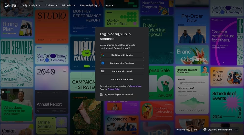
You can probably think of other examples where the feature itself isn’t what’s driving interest – it’s the output. A good example is once again Canva. They tease the product in the background of their Sign Up page but showing people the output, not the software itself:
✅ DO: Focus on the most common use cases in your product walkthrough
Instead of offering your whole product in a tour, zoom in on top use cases. It’s possible to create separate demos per use case or restricting certain areas of a generic product tour and guiding people to just a few key areas.
Alternatives to live and self-serve product demos
Exploring this topic, we learned that interactive tours aren’t always the best option. When people are only starting to discover your offer, they’re just cold leads. At that point, you’re better off looking into product screenshots or using videos and GIFs to replace product demos.
Here’s an example of Wynter using an autoplay video instead of a product tour in their Hero section:
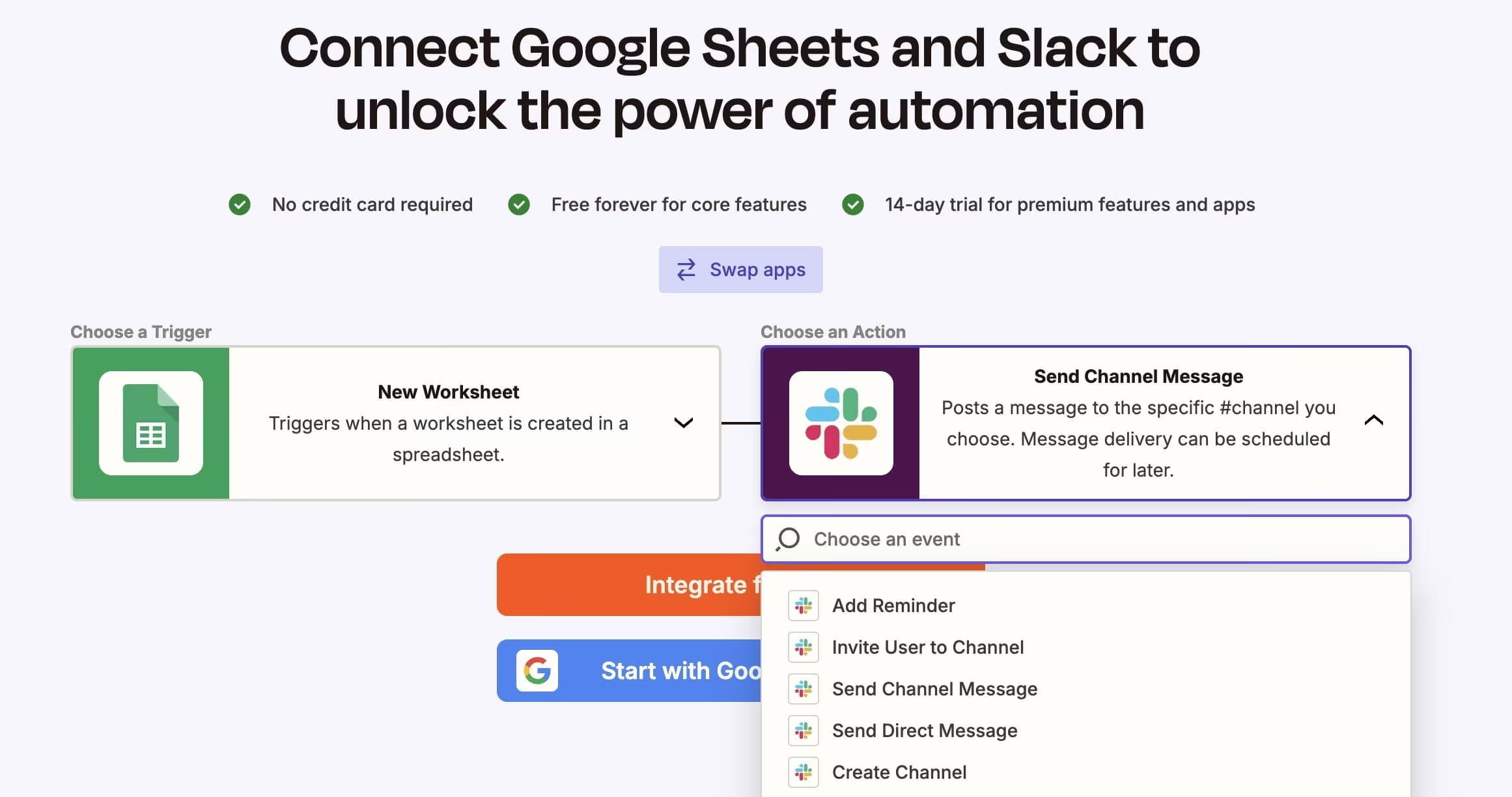
Zapier also uses videos, but they came up with another neat solution: you can preview any type of integration that Zapier makes possible. This is interactive and includes detailed descriptions, clearly setting expectations for what the product does without using a demo feature:
Originally published Apr 09, 2025 10:55:42 AM, updated March 7 2026.

