


CTA hierarchy – optimal website buttons for UX and CRO
CTAs are arguably the most important element of a website’s user interface. Without distinct website buttons for the key interactions, we would face a ton of cognitive load to figure out which links to click next. This impact on user experience is why having a clear CTA hierarchy is so important.
Written by Dawid ZimnyEvery link on a website is a call to action (CTA). These links are visibly different from regular text. They fight for our attention and suggest a possible interaction. Distinguishing these links further – as text links and buttons – creates a CTA hierarchy. That hierarchy is one of the most important things when it comes to guiding people around your website.
But the hierarchy of links on many websites lacks balance. Some websites use identical buttons for two different purposes. Others use variations of the same button label, confusing users. This has a direct impact on your conversion rate.
In this article, we explore the theory of CTA hierarchy:
- Different levels of links on your website
- Tips for maintaining a good CTA hierarchy
- How to document your CTA hierarchy
It’s not just “Sign Up” buttons – different levels of links on your website
Some website managers attempt to manipulate links. They will use them hoping people will never click to get various benefits, from trust to positive SEO signals.
However, when we say that every link on a website is a call to action, we mean it. They’re available for anyone to click and subtle differences like the above are important when working on your CTA hierarchy.
Please note that before you choose the place in the hierarchy for your link, you should consider the type and purpose of the CTA.
With that said, here are all the levels of links that you should know.
1. Links in the text of your website
Let’s start with the simplest one – links in your content. They’re surrounded by a ton of extra information. Because of that, their primary purpose is creating the structure of your site. Adjacent paragraphs give people a lot of context, so clicking on an in-line link like this is rarely accidental. This means that every interaction with a link in your content holds a ton of weight.
Links in your content are very important for SEO, but they also create loops and intricate user journeys if used right. If you can keep a person clicking on them and consuming more content, you just got yourself an engaged user – and that’s a heck of an achievement!
2. Primary CTAs
The most “in your face” of links, a primary CTA is almost always a transactional link on websites. It’s the number one action on that page, either from the perspective or the user, or the action that you want the user to take.
As is the modern standard, you’ll usually see a primary CTA on your screen at all times. Placing them in the navigation bar isn’t uncommon, although in SaaS, we’re seeing a slow shift away from buttons that go directly to the sign up page.
3. Secondary calls to action
Compared to primary CTAs, secondary buttons are usually transitional. They take users from one place to the other. In that sense, they’re similar to links in the content – but the context of a secondary button is much more narrow.
Secondary CTAs are usually the same shape as the primary ones, but use a less prominent colour from your Design System. A popular usage of secondary calls to action these days is adding them alongside your primary CTA in some areas of the website. We’ll give you examples of this later in the article.
4. Tertiary buttons
Depending on the complexity of your website, a third button level might be useful. Just like secondary buttons “like” to stick next to primary ones, we often see a tertiary button included next to a secondary CTA.
Their purpose is also transitional, and they’re often lacking the “button” shape and look like a more prominent text link.
5. Buttons that scroll the page
“Scroll to” buttons are a subcategory of secondary and tertiary CTAs. They only link to elements on the same page, so they’re transitional by default. The scope of these buttons is narrow and they’re usually used on text-heavy pages.
Tips for maintaining a good CTA hierarchy
Now that we’ve defined the levels of CTAs on a website, let’s establish a healthy hierarchy. These tips will help you improve the user experience and increase the conversion rate of your website.
Always have the (right) primary CTA visible
It’s uncommon for a website to not have a primary CTA visible at all times. You can typically find it in the website’s navigation bar, in the top right corner of your screen. On mobile, this is sometimes at the bottom of your screen, or hidden in the dropdown navigation to save space for content.
But the emphasis here is on the right CTA. While “Sign up” or “Book a demo” are considered no-brainers, they’re not always the best option for everyone. Here’s a fascinating move from Microsoft Teams, whose primary CTA is “See plans and pricing”:
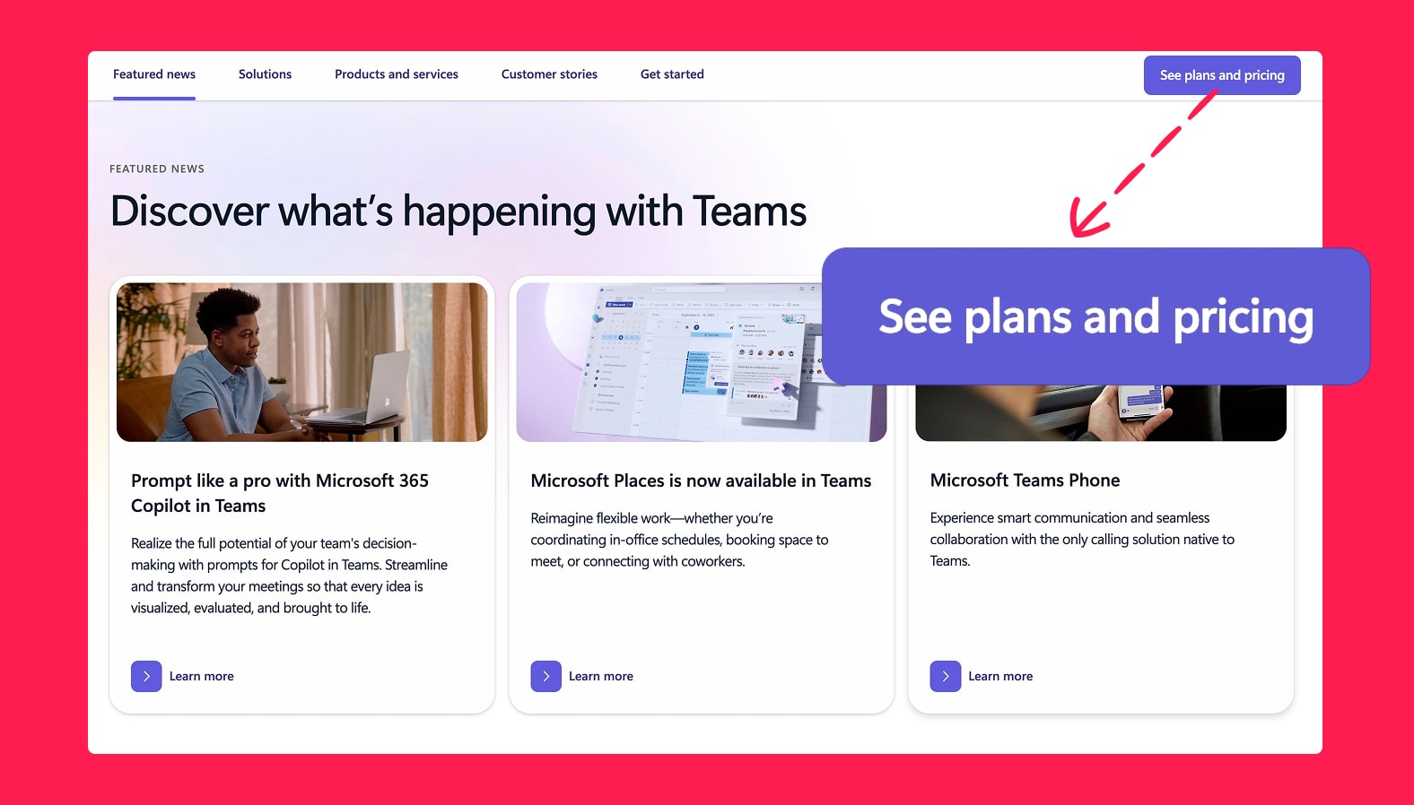
It’s reasonable to expect that more people want to see the pricing – this is just the nature of a funnel in any business. You shouldn’t jump to conclusions that it’s a better primary CTA label for you. It requires a specific user journey to pull off successfully. But regardless, it sets a precedent for changing the primary CTA from “Sign up” to something else. It’s definitely worth trying a different approach.
Focus on one, consistent primary action
Even though it might be tempting to mix up your calls to action, it’s best keeping them consistent. While “Sign up” and “Get started” seem like the same thing, to an untrained eye they can be confusing – especially if people can see them at the same time.
One of the worst examples we’ve ever seen is this Log In screen from East Midlands Railway in the UK:
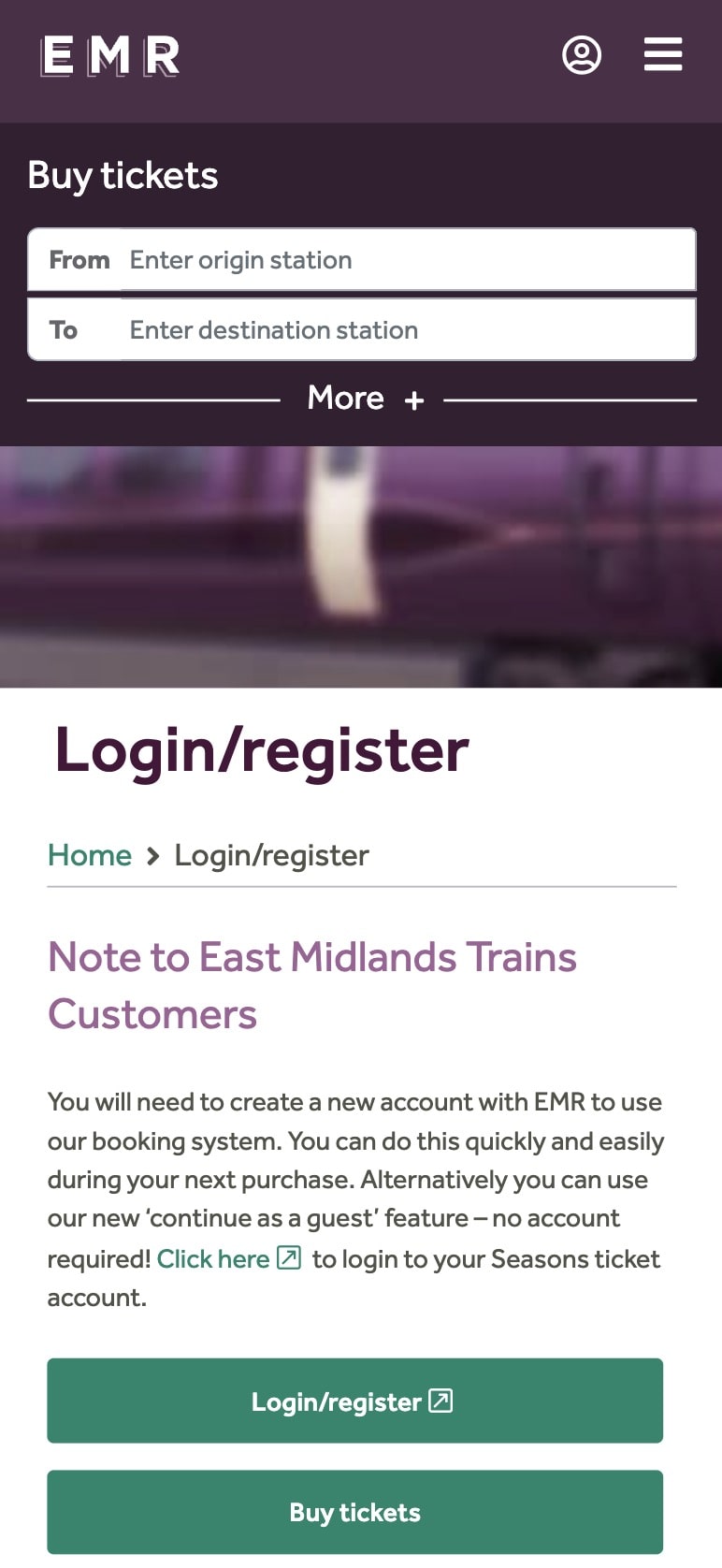
They complicated a simple interaction with an extra step that puts “Buy tickets” at the same level as the primary action on the Log In page.
How should this look instead? You might already know based on what we said earlier, but our next tip explains the solution with practical examples.
Occasionally, put primary and secondary CTAs side-by-side
In an example from East Midlands Railway, it would be perfectly fine to include the “Buy tickets” button as a secondary CTA. It should be a visually distinct option that’s clearly lower-priority but still there for people to use.
In fact, this is a common occurrence on websites. It’s a logical decision considering not every visitor comes to your website with equal context. Some might be heavily invested in your brand and have just seen an ad that won them over. Others might be encountering your company for the first time ever. They won’t buy from you on the spot, so a toned-down, secondary CTA can be useful.
Here are a couple examples from HubSpot and Slack, where they used it both in the Hero section, but also in regular website copy:


When is it okay to use different primary CTAs?
Your primary CTA can vary between pages and when it’s not in proximity to other primary buttons. As a rule of thumb, we think of “proximity” as buttons visible on your screen at the same time. There are some exceptions (especially when using high resolution displays), but this should be a good starting point.
Note that a primary button in your navigation bar is mostly exempt from this. It should always be consistent, so the fact that primary buttons in the copy of a page are different is acceptable.
The context of the primary buttons is important, too. Isolated elements of your website’s user interface can have varying CTAs. As an example, a section with three columns or cards with success stories of your customers can have three primary buttons with different labels. The context of those is dictated by the surrounding content, so it’s unlikely that the buttons will be confused with your primary CTA.
How to document your CTA hierarchy
In an ideal world, you as a marketer don’t have to do any work on the visual hierarchy of CTAs. It should be dictated by the Design System created by your web agency. In it, you would find all button variations:
- Regular links
- Links that scroll
- Links that open in new tabs
- Buttons, from primary to at least tertiary
- Buttons with extra icons
Here’s an example from a design system we made for a client:
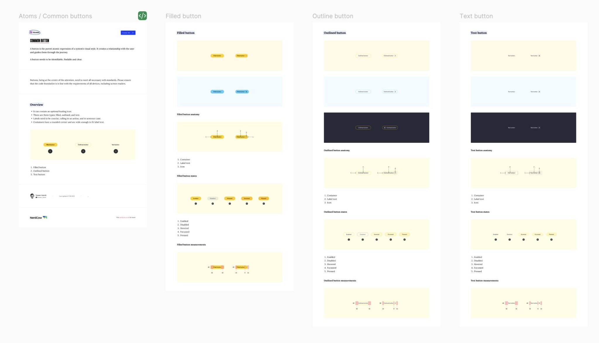
Design systems are often extended by website style guides, which go beyond visual aspects of the site. They’re usually created by UX designers as well, outlining when and how to use each button.
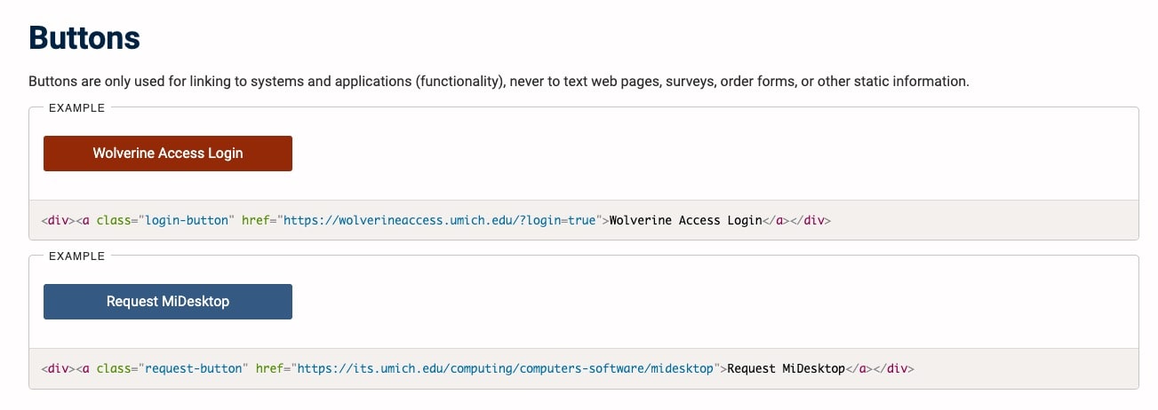
Our example of the buttons above actually introduces some elements of a website style guide to the design system. Here’s an example of a pure website style guide from the University of Michigan. In the snippet we’re showing you, they make a point that the primary CTA has a single use case and should not be used for anything else:
Originally published Jul 26, 2025 11:41:07 PM, updated November 4 2025.

