


Types and purposes of CTAs
CTAs are important for conversions, but it's not as simple as choosing the right label. I explore types and purposes of Calls To Action to help you choose the right one for your context.
Written by Dawid ZimnyKey takeaways
- Each CTA has its distinct type. Identify the desired type as a priority.
- Once you know the type of your CTA, this will dictate its label, placement, and even design.
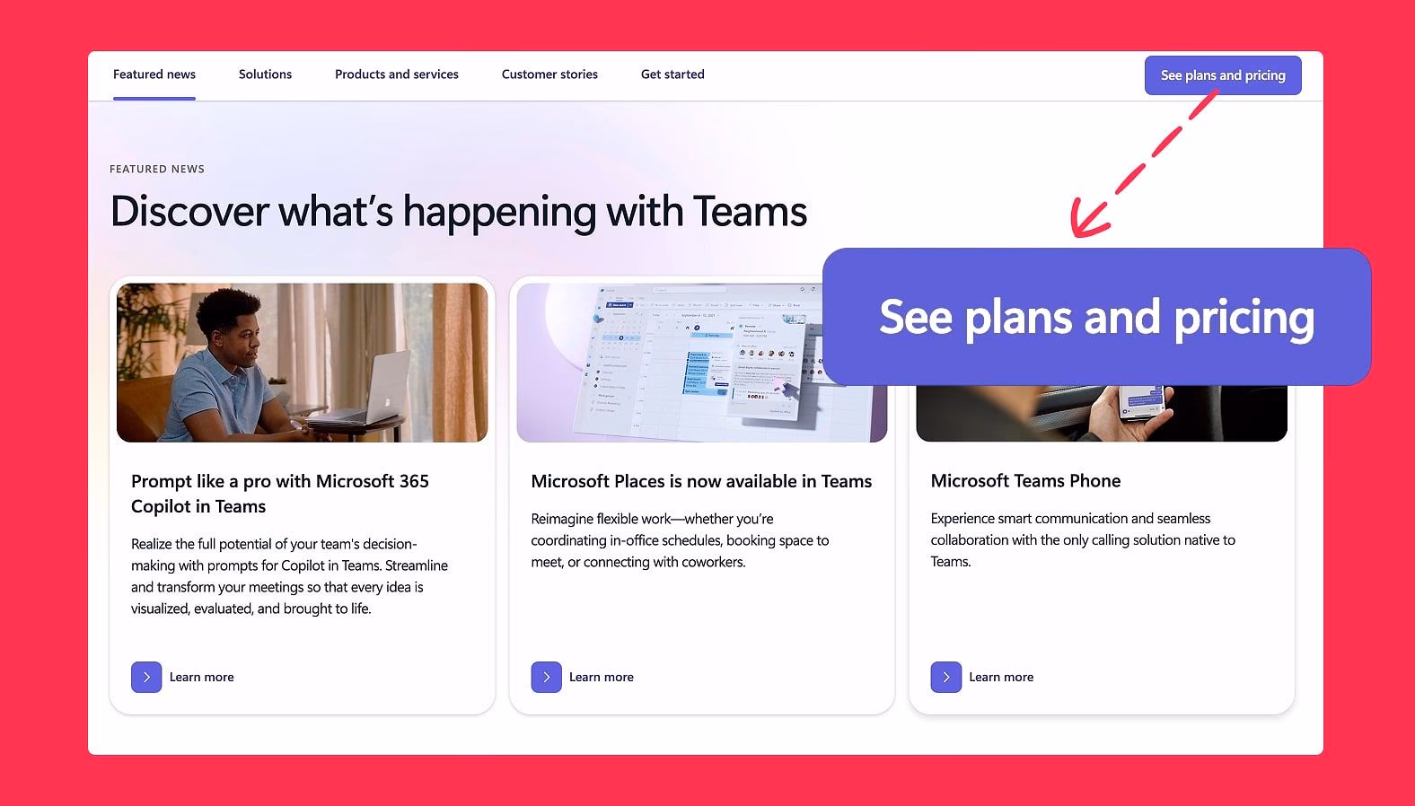
- A primary CTA doesn’t always have to be transactional. Microsoft Teams uses “See plans and pricing” as one of its primary CTAs.
The impact of CTAs on conversion rate is often overstated. Nonetheless, they’re an important factor. But creating a good CTA is challenging.
Before you write the button label, you have to set up a correct hierarchy. But even before that, you should pick the right type of CTA in the context. That last part is what I’ll teach you in this article.
Types of Calls To Action
Types of Calls To Action are often mistaken with the hierarchy of CTAs. They’re indeed closely connected. A primary button in the hierarchy of CTAs is perfect to guide people to lead gen forms. This coincides with the type of that button – a transactional CTA.
It might seem like a “primary CTA” and “transactional CTA” are always the same thing, but that’s not the case. There are primary Calls To Action that are not transactional, and there are even transactional CTAs that aren’t styled as primary buttons. Ecommerce has a perfect example of the latter – “Buy now” is a primary transactional CTA, while “Add to cart” is a secondary transactional CTA.
So what are all the other types of CTAs, and what do they mean for you?
1. Transactional CTAs
I already covered them to an extent in the intro, but a transactional CTAs exist to complete a business or user goal. This can range from actual purchases to completing a lead gen form.
Since the sole purpose of those CTAs is a transaction, they will be directly tied to measurable outcomes.
As teased in the intro, transactional CTAs aren’t always styled as primary buttons. They often exist in a secondary or even tertiary context, e.g. in newsletter sign up CTAs.
An important note here is that transactional CTAs shouldn’t be considered just in the scope of the last action in the journey. Clicking on a “Book a demo” link requires further action from the user to e.g. fill out a form to reach their goal, but it’s already a transactional CTA – it doesn’t have to be the very last “Submit” button on that form.
2. Transitional CTAs
This is the most common type of CTA on websites. Transitional CTAs simply move users further into the journey. This can be buttons leading to product pages or internal links in your text.
Due to a sort of “catch all” nature of transitional CTAs, they often appear to have multiple types. One example is having a transactional CTA like “Book a demo”. In some cases, this will go to a separate page that has a form for the user to fill. It’s an example of a CTA that is both transactional and transitional. You’ll find other such relationships as we continue learning about all the other different types. The important thing to remember here is that you should consider every type of CTA your link could be – this will often impact where it sits in the hierarchy or even what the label should be.
To back up the claim that primary CTA isn’t always transactional, here’s an example of Microsoft Teams using a transitional CTA as their primary one:
3. User Interface CTAs
These links are special in the way that they only trigger in-page level interactions. They’re never navigational in nature, so it’s the first case where this type of a CTA doesn’t double down as transitional.
The primary use cases are accordions that unfold more details, in-page links like table of contents, playing a video, opening a dropdown, and so on. On ecommerce sites, this can also be increasing the quantity of the product or CTAs like choosing the colour variant.
4. Utility CTAs
This isn’t a type of CTA I’ve seen discussed anywhere, but it’s important to mention, especially for SaaS companies. I see utility CTAs as a distinct sub-type of a transitional CTA. The difference is that rather than going to just any page, it leads to supporting interactions and even non-monetary transactions – hence I wouldn’t class it as “transitional”.
The examples include live chat and contact links (e.g. email or phone number), getting directions, but also borderline transactional CTAs like “Download brochure”.
5. Social CTAs
Probably the simplest type to describe – these are all links to social interactions like following, subscribing, liking, and commenting. Social CTAs include external links to your social media accounts and in-page features like a comments section on a blog.
6. Feedback CTAs
CTAs asking for feedback are underappreciated and misused. It’s often set up as a single floating button across the entire website. This is useful for some visitors, but the generic method isn’t the most efficient.
Placing them strategically, with very specific questions is a much better approach than just slapping a “Feedback” button on every page. You can learn more about how we do it in the NerdCow case study that Hotjar featured on their website. Here’s an example from that case study:

There’s also one more way of using feedback CTAs. This one is extremely common among SaaS companies, and that is the little “Was this helpful?” section at the end of Help centre pages.
7. System CTAs
Last but not least, I wanted to briefly mention system CTAs. These aren’t typically things that you control. I’m referring to actions like “Save file as…” when right-clicking an image, or even default video playback options in browsers.
While you generally can’t change system CTAs, they are often hidden or disabled on some websites. These sites use scripts or built-in settings to change the default behaviour. One common example is content websites disabling the ability to copy the text, or triggering a custom set of options when a visitors uses a system action.
Our recommendation here is simple – don’t do this. Leave the system CTAs as default as possible. They exist for a reason, and they have various limitations for a reason, too. The most common change people make is trying to force auto-playing videos with sound. The default system behaviour is to block this because it’s an incredibly invasive behaviour. Leave the system CTAs as they are.
How the types of CTAs affect your button labels and hierarchy
I teased it here and there when explaining the types, but the concept is so important it deserves a separate section.
The type of your CTA should be the first thing you consider when putting a link anywhere. It will directly affect where your button sits in the hierarchy of CTAs, and what is the right button label.
Example #1:
You want to link to a lead gen from in your navigation bar. This is a transactional CTA, which means it needs to be distinct from any other interaction in that area. Navigation bars typically have a mix of transitional and user interface CTAs – the transactional option simply can’t look the same. In most cases, the right decision is to make that CTA a primary button. From there, you can decide on the right label – see our guide linked in the previous paragraph for tips.
Example #2:
Here’s a harder option – you want to link to a product page from your blog article. How do you approach it? As a transitional CTA, the most common direction is to make it a secondary, tertiary, or even lower-level CTA. Why? In the context of most blog articles, visiting a product page is a rare occurrence. It’s simply not a goal that most people have when reading content.
From there, you have a few options: you can use a lower-level CTA button, you can create a small banner promoting that page, or you can use it as an internal link on a contextual bit of text. That last option is usually the best, as long as you can link to that page naturally. If I suddenly injected “web design agency” into this article and linked it to our service page, you would be appalled reading it. Context is key.
Example #3:
Last quick example. This goes out more to the designers than marketers, but it’s a good way of illustrating the thought process behind the types of CTAs.
Let’s assume you’re adding a dropdown to your navigation bar. It’s a user interface CTA. As such, you can immediately discard using any of the top-level button types. That’s simply not how dropdowns are ever represented. Of course, this is because the type and purpose of that CTA became common knowledge. It’s in the canon of web design by now. But it shows that regardless of whether the challenge is obvious or not, going through the effort of deciding the purpose of your CTA will help land at the right label and place in the hierarchy of that link.
Originally published 3rd November 2025, updated 16th March 2026.

