
B2B Web Design Agency That Actually Generates Leads
We’re a London B2B website agency helping SaaS and tech companies build websites that convert visitors into sales conversations. Workshop-led. Founder-involved. Results-proven.


We’re a London B2B website agency helping SaaS and tech companies build websites that convert visitors into sales conversations. Workshop-led. Founder-involved. Results-proven.
As a specialist B2B web design agency, we only work with B2B SaaS and tech companies

You’ve redesigned your website 2-3 years ago but it doesn’t generate qualified leads.
You’ve outgrown your current site and it doesn’t reflect what you actually do now.
Your last agency didn’t get B2B. They built you a brochure, not a sales engine.
We’ve heard this from every client who’s come to us.
Here’s what we do about it.

01
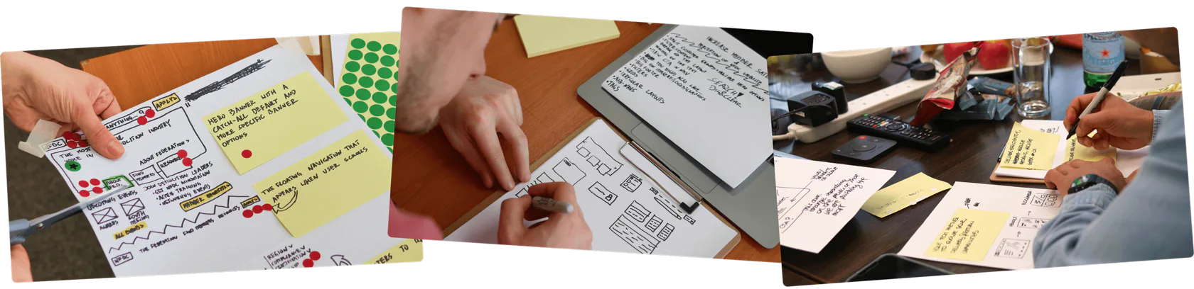
We start by understanding your buyers, not your brand guidelines.
02
4-week cycles. You see progress every week, not after 3 months of silence.
03
We don’t disappear after launch. Most clients stay 5+ years.
2x
lead generation rate
17%
more user engagement
From 0 to 3
sales calls per week
6 weeks
from kick-off to user-tested website

“NerdCow’s services have so far allowed our platforms to secure a lead generation rate that’s twice higher than usual.“
Luciana, Director of Marketing at Transport Exchange Group

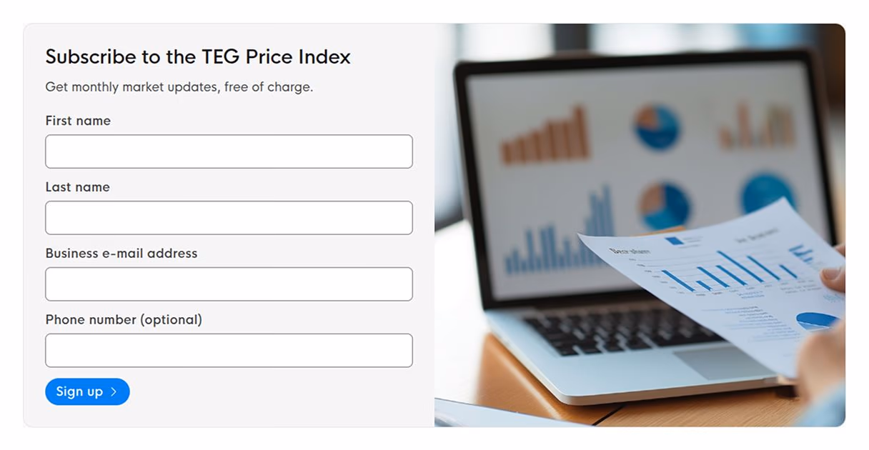
Tell us a bit about your project. No pitch decks, no pressure. Just a 30-minute conversation about your website.
Tomasz, our founder, will get back to you within one working day. No spam, no automated sequences.
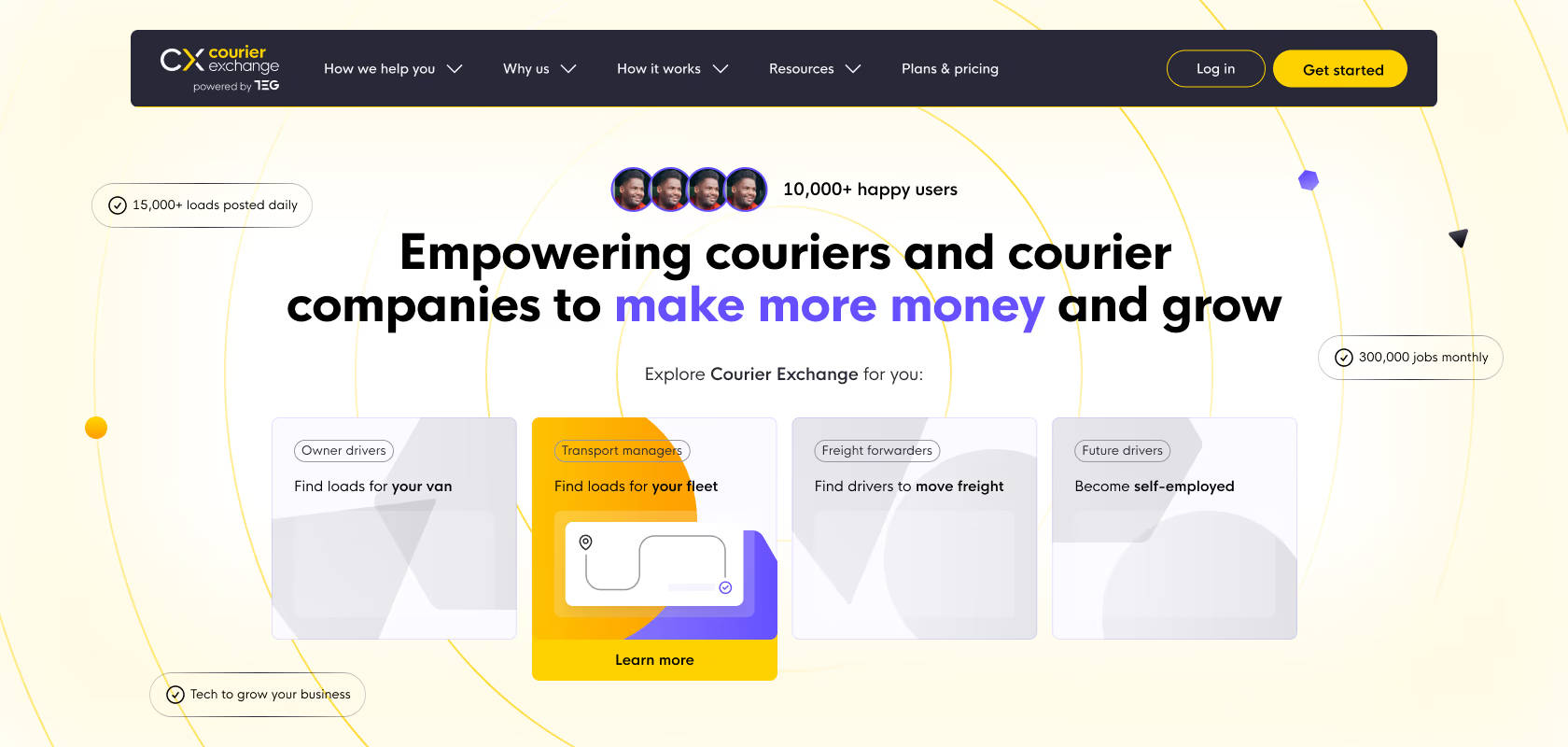
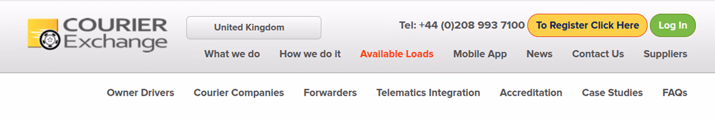
First established in 2000, Courier Exchange and Haulage Exchange are the leading freight platforms in the UK. Their platform offers drivers, courier companies, and freight forwarders access to a marketplace and a suite of SaaS solutions ranging from tracking integrations to payments.
As a household name for 25 years, the company brings in a ton of branded traffic through organic and paid channels. Their main challenge was always converting that traffic, and more recently, we’re ramping up the acquisition of non-branded traffic.
More than 8,000 businesses actively use the Exchanges these days. The brand is well-known in the courier & freight niches. People “in the know” make up the vast majority of the traffic to landing pages and money pages. To get more MQLs for the Exchanges, we had to solve two problems.
Multiple audiences are always a hot topic when it comes to website messaging and the user journey. In this instance, the issue was at a much higher level. The competing audiences weren’t split between different personas. Instead, the websites were aligned to be friendly for people who haven’t heard of the Exchanges before.
Using analytics, session recordings, and user tests, we observed that the majority of the audience is well aware of CX and HX. We suspected this was partially due to the strong, 25-year-old brand, but also because of the incredible work of the PPC and marketing teams. Their campaigns primed visitors for quick conversion, and that’s what we noticed in the data.
Especially on landing pages, people often convert without even scrolling the page one bit. We didn’t have to do much to increase conversions there – small usability tweaks to the top of PPC landing pages did the job.
On “money pages”, or for people visiting organically through branded search, there was a much bigger issue. They were faced with a long, multi-page user journey. The website was tailored to someone who’s exploring the Exchanges for the first time – but those people were a minority. We worked with the marketing team to drastically simplify the user journey. In the end, we were able to reach a 10%+ conversion rate with just 3-4 pages per session – that’s including the Sign Up and Thank You pages!
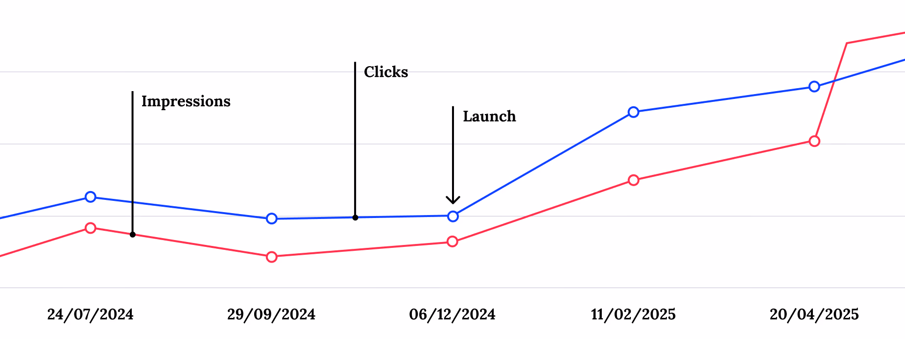
Even though we specialise in converting traffic brought to the site by marketing teams, we’re constantly helping the content and SEO team with technical improvements. Their efforts resulted in a 3.5x increase in impressions and 1.75x more clicks YoY.
Our contribution focused on optimising website performance, but also tackling one of the weak points of highly editable websites – managing debt. In this instance, the main problem was that the website had dozens of older landing pages. Some were saved for future use, but we needed to clean them up. This covered internal links and errors, deleting obsolete assets, and optimising images that slipped through the cracks unoptimised.
“NerdCow’s services have so far allowed our platforms to secure a lead generation rate that’s twice higher than usual.”Luciana, Director of Marketing at Transport Exchange Group
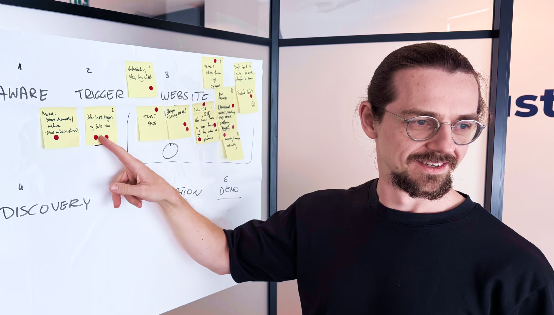
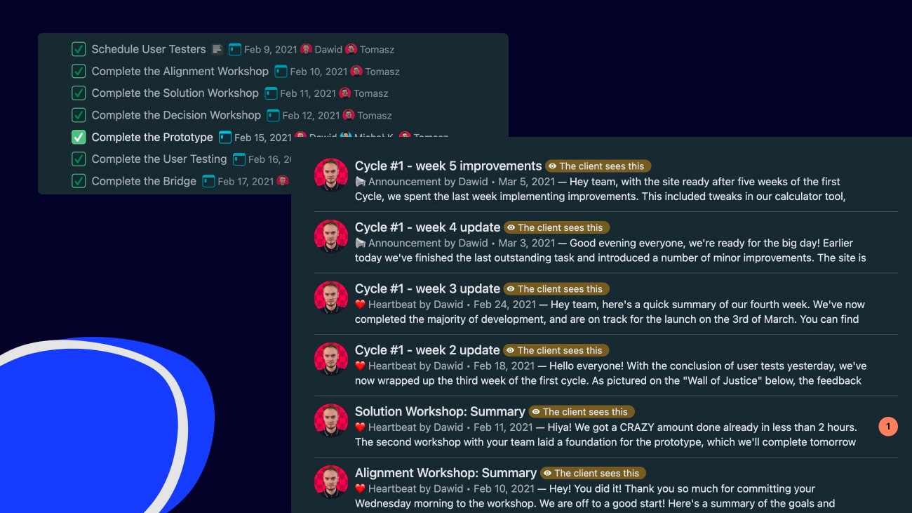
Working with the Exchanges team since 2018, our process has evolved over the years. Our most recent and most impactful work involved the 4-week cycles we use to optimise existing websites. The cycles allow us to strike a balance between a larger roadmap and quick releases. None of the features in the cycle are blocked for the full four weeks! They often launch within days.
Here’s an example of our first major cycle for the Exchanges.

We found that people converted early into their visit to the websites. Sometimes it was the first screen they saw, and it rarely took more than 3-4 pages. Briefing the team about this finding was crucial for everything we were about to do because without alignment, we wouldn’t be able to get buy-in for major changes.
The process we use for pitching includes sharing lots of data and detailed hypotheses. We avoid bias by not introducing detailed solution concepts – the goal of pitches is once again alignment. By pitching, we seek alignment and any extra input that we might’ve missed.
Since we involve as many stakeholders as possible in this process, an example of the team’s contribution could be that someone from Sales flags that over the last 3 months, lead quality is down. This would be an important thing to note, because shortening user journeys can affect the entire business.
This is where we fully take over the process and keep the team informed about the progress. The work starts the moment we approve ideas for the next cycle.
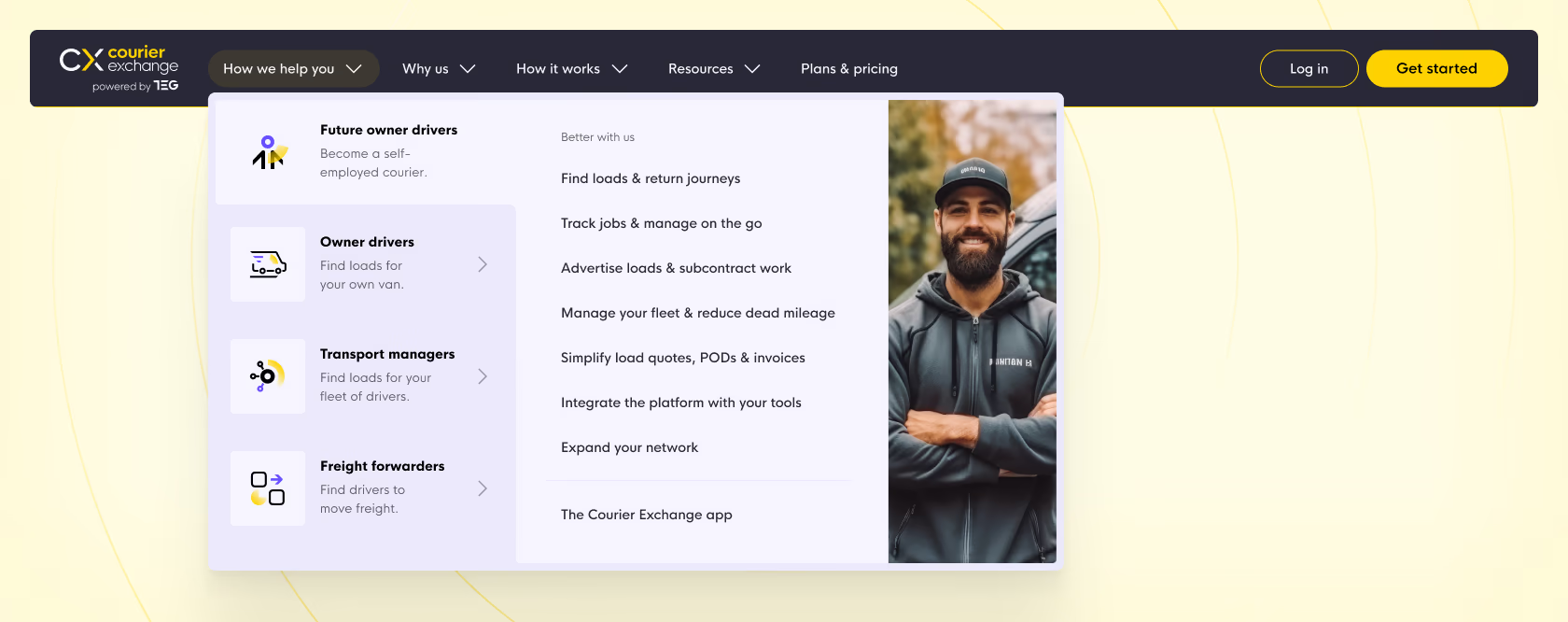
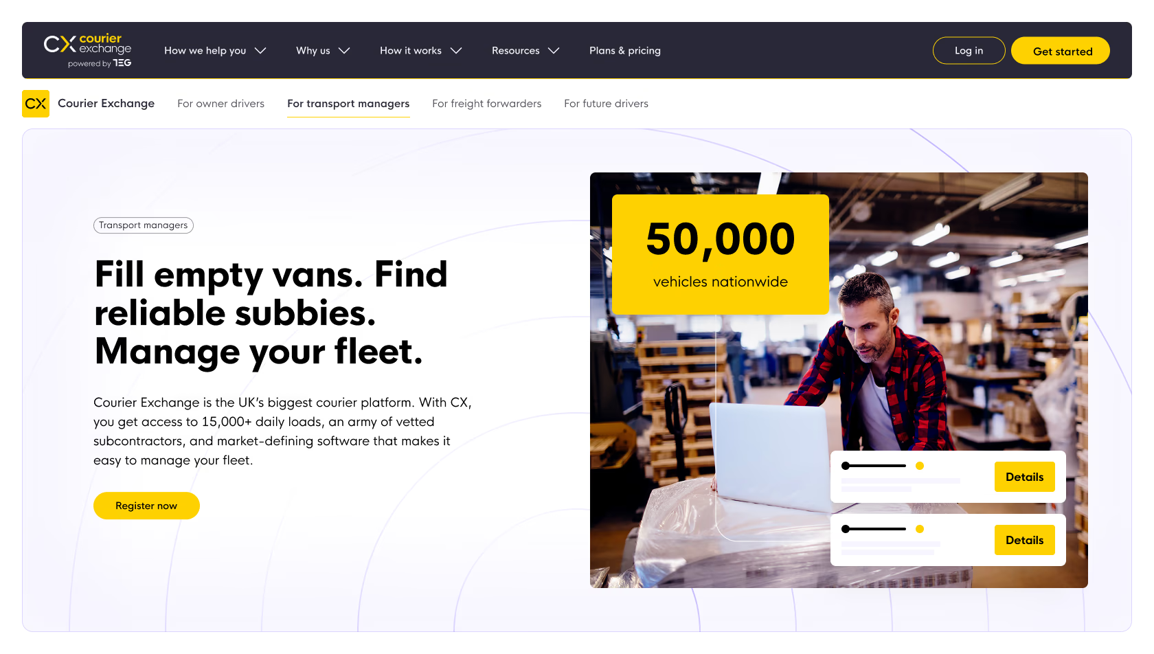
One of our deliverables for this cycle included a full redesign of the navigation. We went for a megamenu with persona-driven pages. They feature a ton of informative links, but to the point of shorter user journeys – all key information lives on just four pages, one per each ICP.
The navigation went through several rounds of user tests with an audience resembling the visitors of the Exchanges. We first launched it in an uneditable state to get real-world data as soon as possible. Once we confirmed it was worth the investment, we made it fully editable for the team.
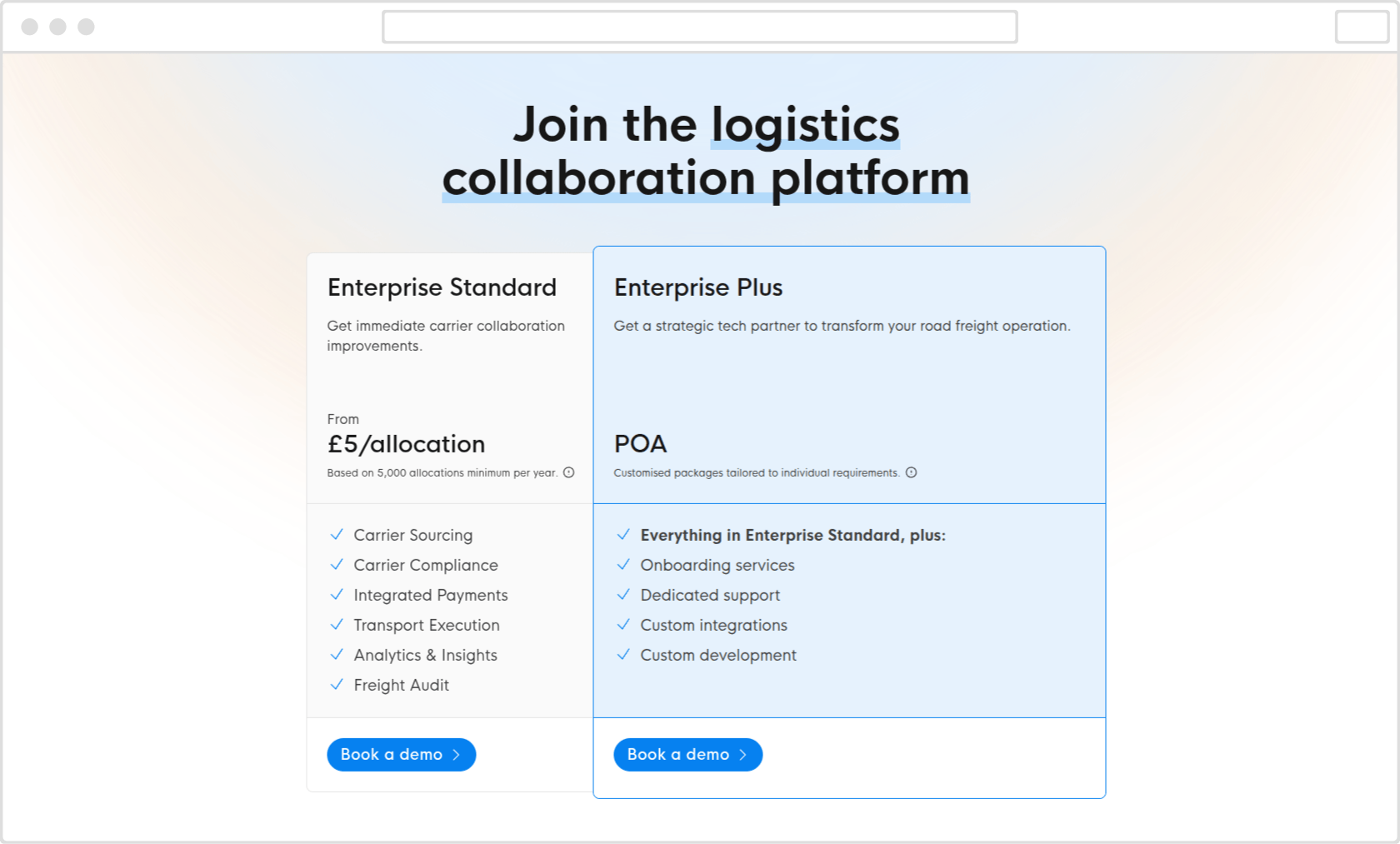
TEG is a logistics technology business targeting enterprises. Their small TAM and high-value purchases with long sales cycles were a unique website challenge. Prior to our redesign, it caused a lack of reliable data and made it hard to track conversions on the site.
The typical response to the challenges of a business like TEG is to build a brochure website that stays the same for ages, until the time comes for a redesign 2-3 years later. For an innovative company like TEG, this wasn’t an option. Since TEG frequently exhibits at events and has an active content team, we needed to launch a dynamic website that would help the team capture leads.
TEG is a corporate website, aimed at a tiny TAM of enterprise logistics companies. Understandably, the main focus for stakeholders was to nail the brand and information architecture. Together with the marketing team, we set out to treat the website as a proof of concept that it can generate leads on its own.
In an account-based marketing company, not everyone was fluent in editing WordPress content. To make up for that, we created an easily editable website. We did this by striking a balance between flexibility and rigidity – we stripped components of extra settings that the team wouldn’t use.
Not only did it make editing easier, it also reassured the team that the website will remain visually cohesive with the TEG brand.
Large events have one thing in common – they require portability. Whether you’re walking the floor or exhibiting at a booth, phones and tablets are your best friend. And what about people who want to check out your site during lunch break? Most of them won’t whip up a laptop in a crowded event space.
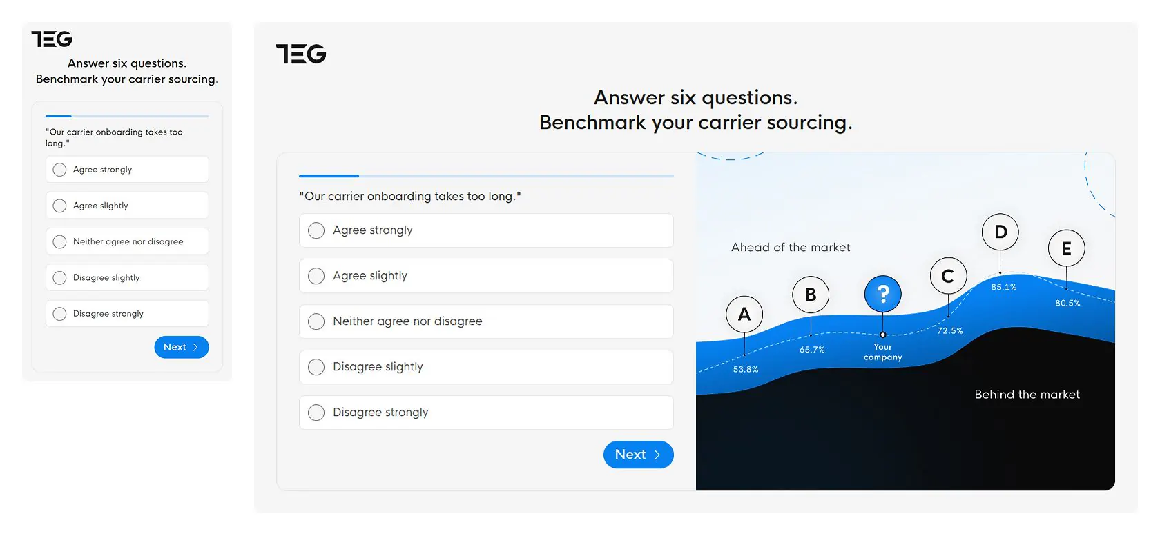
We designed a mobile-first website to accommodate exhibiting at events – and the 46.5% of mobile traffic to the site. Our work included landing pages and interactive quizzes, which the team can customise and use when exhibiting at trade shows.
We got a fast and modern website. It’s integrated with HubSpot and is easily editable by the team. Fantastic!
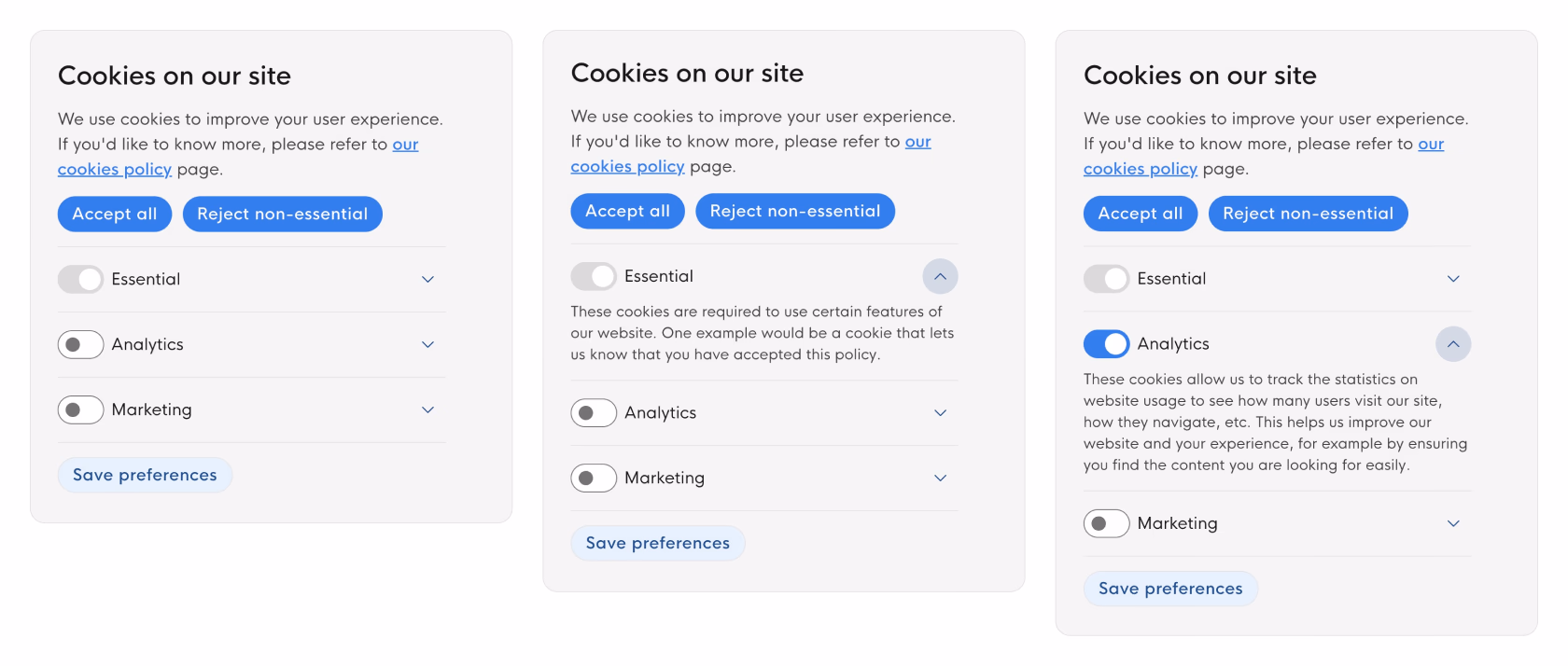
On B2B websites, people accept legally compliant cookie banners between 17-31% on average, based on several studies from 2024 and 2025. Since a lot of TEG’s products rely on compliance and identity verification, we’re dealing with an audience that is increasingly security- and privacy-aware.
Despite that, our bespoke and fully compliant cookie solution achieves over 50% acceptance rate, giving the team access to analytics data they would otherwise miss.
In 2025, the company took the next step in establishing themselves as leading logistics tech provider by rebranding to TEG.tech. We carried out the critical domain migration with just minutes of downtime and no SEO issues. The site retained 100% of the organic traffic shortly after the migration, and continued in the same fashion for the months after.
Repositive came to us with a website that generated zero leads. The entire pipeline relied on existing accounts and outbound activities. They had a sales team of one, a lone marketer working under the Head of Marketing, and a couple scientists from the Product team helping out with content. Relying solely on outbound wasn’t sufficient, so they turned to us for help with a new website.
Even though MQLs were the top priority of Repositive, we soon learned about a technical must-have. We had to develop a website integration for their product and maintain standards set by the in-house engineering team. The former was business as usual, but the tech team asked us to develop a headless website that would be easy to maintain for the internal engineering team.
Testing our work with people resembling the client’s target audience is a permanent fixture in our process. Despite Repositive’s hyper-niche audience, we were able to find enough participants for two rounds of moderated user tests. In total, it took us two weeks to run four workshops with the team, design a prototype, test it, and iterate twice.
We developed the website using the Gatsby framework, which worked for both our team and the engineers at Repositive. The headless website gave us near-instant page load times, and pairing it with CMS meant that it remained editable, accessible, and it ticked all the boxes for SEO.
Thanks to NerdCow, we have been able to see our bounce rates lower as our conversion rates rise. The redesigned website also now has a faster loading time with a lower exit rate. NerdCow uses an agile approach to their workflow, and has been enjoyable to work with.Justyna, Chief of Staff at Repositive
nPlan approached us with an extremely tight deadline for a new website. The challenges were more complex than in a typical redesign. Rather than doing a “facelift” with improved messaging, we had a list of painful challenges that they discovered from user and investor feedback.
We had two tough challenges. The first one was user-facing – developing an assessment tool to prove nPlan’s value in terms of savings from construction forecasting. The other was purely technical – we now work exclusively with WordPress, but in 2021 we helped nPlan in a less familiar environment of Webflow.
Normally, in-person workshops take up three full days – often with travel time for our team. In this case, remote workshops shortened this to just three 2-3 hour sessions. It left us plenty of time to speed up the legwork.
While there are pros and cons to remote workshops, the extra time was especially useful for recruiting participants for user tests. In niche industries like construction forecasting, finding the right people for a test can be long and/or expensive. We spent most of the saved time to fine-tune the panel for moderated tests of a prototype.
This is a standard for us – the prototype usually takes us six hours, give or take. It involves at least two people working together on design, copy, and assets. What was different this time was the extra preparation that remote workshops allow.
Even though the core parts of the prototype come to life after the second workshop day, we were able to gather basic assets from day one. A core part of this was coming up with a fake brand for the test, which was very important here. In micro-niches, user testers are sometimes aware of the brand we’re testing so a fake brand avoids skewed results.

