


5 SaaS website mistakes disguised as best practices
These common SaaS website mistakes sound like smart strategy - until you check your pipeline. Here's what to do instead.
Written by Tomasz LisieckiKey takeaways
- Don’t assume your ICP is ready to book a demo. Most B2B buyers are in the “research mode” when they arrive on your site so adjust the user journey accordingly.
- Educational content can contribute to lead gen, but only if you create a logical path from the articles to “money” pages.
- Don’t throw everyone into the same “ICP” bucket. Users visit your site at different stages of the buying process, so don’t ignore sub-segments.
- Simple pricing pages are good in theory, but B2B buyers need clarity. Make sure they have enough information to choose the right plan for them.
There’s no shortage of advice about SaaS websites. “Make it minimal.” “Just launch and iterate.” “The product sells itself.” Every SaaS founder, marketing manager, or head of growth has heard at least one of these. Probably nodded along, too.
I know, because I used to believe some of them myself. After years of designing websites for SaaS and B2B tech companies, I’ve watched these myths play out in the real world. They almost always end the same way: a website that looks fine but generates almost no qualified leads.
The worst SaaS website mistakes aren’t obvious blunders. They’re beliefs that start from a kernel of good sense and then get distorted through repetition until nobody questions them anymore. They sound perfectly reasonable while quietly draining your pipeline.
Let’s go through the five I see most often – and talk about what actually works.
Mistake 1: “If you build it, they will come”

This is the big one. The belief that a beautiful website, once launched, will naturally attract visitors and convert them into customers. It sounds like it should be true. You’ve invested in design, spent months on content, nailed the messaging. Surely the traffic will follow.
It won’t. Not without deliberate effort.
A SaaS website is more like a shopfront on a quiet side street. The design might be stunning, the displays might be perfect, but if nobody walks past, nobody walks in. The website itself is just infrastructure. What brings people to it is a completely separate discipline: content strategy, SEO, paid campaigns, community presence, partnerships.
I’ve seen companies launch a redesigned site and expect organic traffic to double within a month. When it doesn’t, they blame the design. But the problem was never the design. It was the absence of a plan for driving traffic to the design.
What to do instead
Think of your website as the conversion engine, not the traffic engine. Your content marketing, your internal linking strategy, your search rankings – those are the traffic engine. The website’s job is to convert the visitors those channels deliver.
Before launching a new site, have a clear answer to: “Where will our first 1,000 visitors come from?” If you can’t answer that, pause the launch conversation and start the traffic one.
Mistake 2: “Our target audience knows what they want”
SaaS marketers love to talk about ICPs and buyer personas. Good. But there’s a dangerous assumption hiding in all that research: the belief that because you know who your buyer is, you know exactly what they’ll do on your site.
Here’s the thing. Your target audience might know they have a problem. They might even know the category of solution they need. But that doesn’t mean they know your solution, understand your differentiators, or are ready to book a demo. Most B2B buyers are early in their research. They’re comparing, educating themselves, and building a case to present to their team.
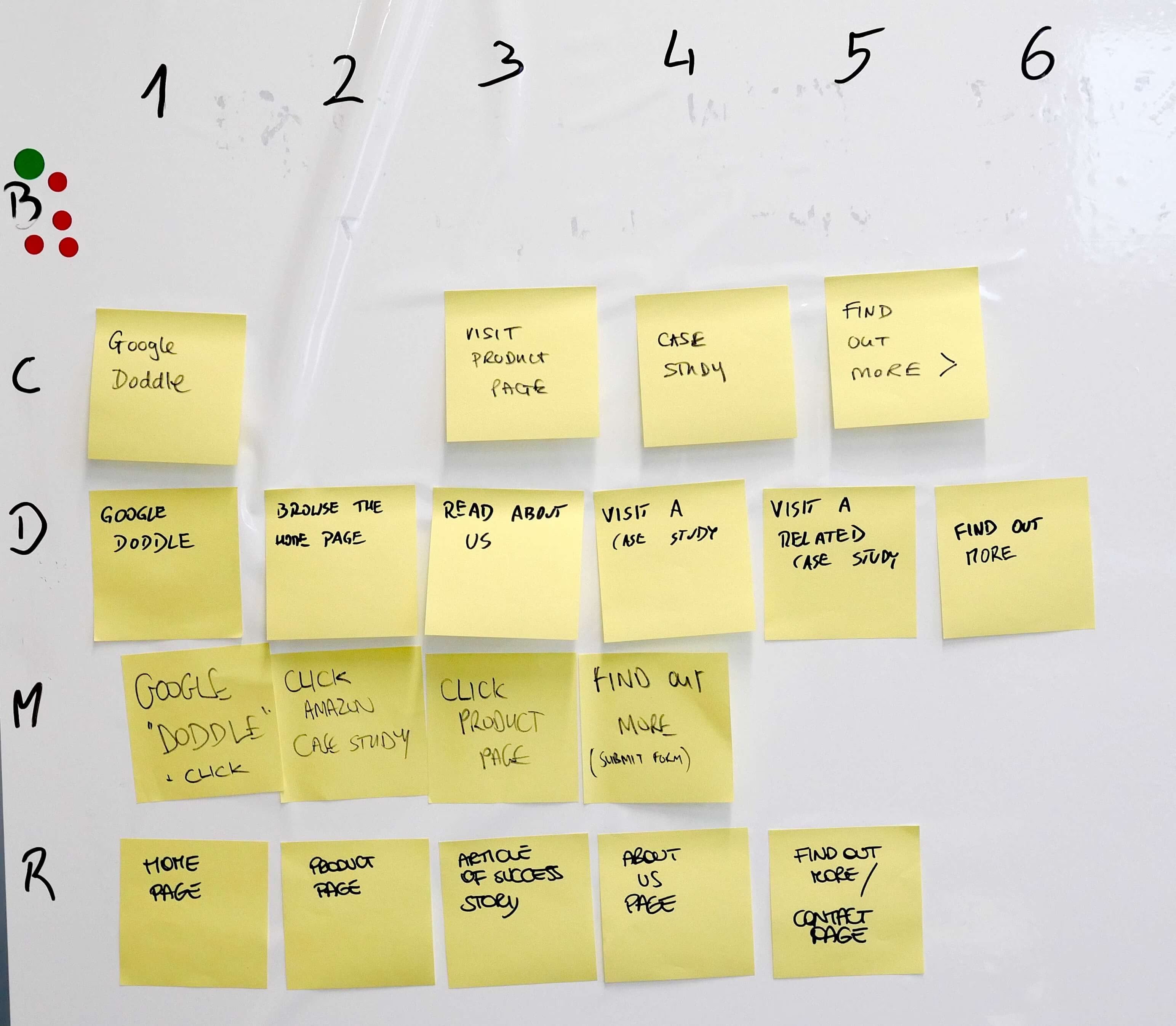
When you assume they’re further along than they are, you end up with a website that rushes them. Every page screams “Book a demo!” when they’re still at “Help me understand why this matters.” This is one of those SaaS website mistakes that’s hard to spot because it feels like good sales practice.
This is something we run into in practically every workshop we facilitate. Marketing teams have a detailed picture of their buyer, but when we map out the actual user journey, there’s a massive gap between “launch awareness” and “request a demo.” The website doesn’t bridge it.
What to do instead
Map the information your buyer needs at each stage and make sure your site delivers it. Early-stage visitors need education: what’s the problem, why does it matter, what does a good solution look like? Mid-stage visitors need differentiation: why you, what results, who else trusts you? Only late-stage visitors are ready for the demo.
Build your navigation and page structure to support all three stages, not just the last one.
Mistake 3: “Our website’s job is to get leads, not educate”
This myth is the evil twin of Myth 2. It comes from a reasonable place – your sales team needs leads, the board wants pipeline numbers, and the website should contribute. All true. But the conclusion that follows – “strip out the educational content and just push people toward the form” – is backwards.
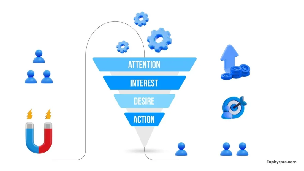
Education is lead generation. It’s just indirect. When someone finds your blog post through a Google search, reads it, finds it genuinely helpful, and then explores your services – that’s the content doing its job. The lead didn’t come from the form. It came from the trust your content built along the way.
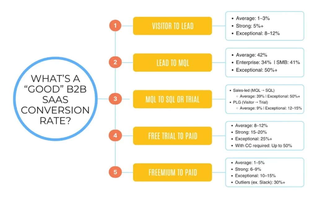
Gartner research consistently shows that B2B buyers spend the majority of their buying journey doing independent research, not talking to sales. If your website doesn’t help them during that phase, someone else’s will.
The trick is making the educational content work for conversions. A blog post with no call-to-action, no link to a relevant service page, and no content upgrade is a dead end. It educates but doesn’t convert. The fix isn’t less education. It’s better bridges between education and conversion.
What to do instead
Every blog post should have a clear next step. That might be a link to a relevant service page, a downloadable checklist, or a contextual CTA that connects the topic to your offering. The reader should never finish an article thinking, “That was helpful” and then leave. They should think, “That was helpful – I wonder what else these people can do for me.”
Want to see this in practice?
We helped Transport Exchange Group double their lead generation rate by redesigning their website with a conversion-first approach – without sacrificing the educational content that was driving their traffic.
Mistake 4: “Everyone in our ICP is a potential customer”
Your ICP describes the companies you want to sell to. Great. But within that ICP, you’ve got people at different stages of awareness, with different budgets, different levels of urgency, and completely different reasons for being on your site right now.
Treating all of them the same is a fast track to a mediocre website. If your homepage copy is written for the enterprise CMO with a six-figure budget, it’s going to feel intimidating to the series A startup trying to figure out if they can even afford you. And if your copy is aimed at the startup, the enterprise buyer won’t take you seriously.
I see this play out on pricing pages all the time. A SaaS company will show a single plan because “our ICP is mid-market companies,” ignoring the fact that mid-market companies come in wildly different shapes. Some have 50 employees. Some have 500. Their needs, their budgets, and their buying process are nothing alike. It’s among the most costly SaaS website mistakes because it silently repels the very people you’re trying to attract.
What to do instead
Segment within your ICP. Acknowledge that different visitors need different paths. You can do this with tiered pricing, with industry-specific landing pages, with persona-based content paths, or simply with clear navigation that helps people self-select. The goal isn’t to create a different site for every segment. It’s to create enough flexibility that nobody feels like the site wasn’t built for them.
Mistake 5: “The pricing page should be as simple as possible”
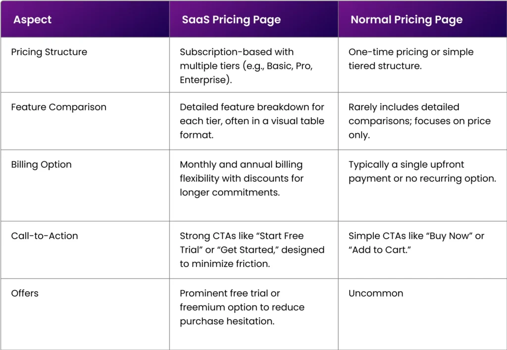
Simplicity is a good principle. But when applied to pricing pages without nuance, it becomes an excuse to leave out the information buyers actually need.
The “keep it simple” mantra usually leads to: three columns, three plan names, three prices, a feature comparison table, done. Minimal explanation. Minimal context. Minimal help in deciding which plan is right.
The problem? B2B buyers don’t buy on simplicity. They buy on clarity. And clarity sometimes requires more information, not less. A pricing page that says “£499/month” without explaining what that includes, who it’s for, and what outcomes they can expect is simple, yes. But it’s also useless.
The companies that get pricing right are the ones that treat it as a decision-support tool, not just a price list. They answer objections before they’re raised. They include social proof right where the money anxiety kicks in. They make the ROI case so the buyer can present it to their finance team without having to build the case themselves.
What to do instead
A pricing page for B2B SaaS should include: clear plan differentiation (who is each plan for, not just what’s included), a pricing model that makes sense for your market (per seat, per usage, flat rate), FAQs that address common objections, testimonials from customers at different tiers, and an easy path to talk to a human for custom needs.
Simple doesn’t mean stripped down. Simple means “I can understand exactly what I’m getting and why it’s worth it” without needing a sales call to fill in the gaps.
What happens when you fix these SaaS website mistakes
Let me tell you about Repositive. They’re a SaaS company in the genomics data space. When they came to us, their website was essentially a brochure: nice looking, explained the product clearly enough, but generated almost zero inbound leads. Zero sales calls per week. Nada.
During our discovery workshops, we identified that their site was built on several of the myths above. It assumed visitors already understood the genomics data management category (Myth 2). It prioritised product features over education (Myth 3). And it had a single conversion path that only worked for late-stage buyers (Myth 4).
We rebuilt the site with a different philosophy: educate first, segment by buyer awareness, and create multiple conversion paths. We added content that met visitors where they were, not where we wished they were. We designed the user journey to support research, comparison, and decision-making – not just the final “book a demo” step.
The result? Repositive went from zero to three sales calls per week. Not because the old site was ugly. Because the new one was built on what actually works instead of what sounds reasonable in a meeting room.
SaaS website mistakes are expensive because they’re invisible
Every SaaS myth I’ve listed here sounds plausible. That’s the danger. They’re the kind of ideas that get nodded through in strategy meetings because nobody wants to be the person who says, “actually, that’s not how it works.”
But the cost of letting them drive your website strategy is real. It shows up in the analytics: low engagement, high bounce rates, and a pipeline that doesn’t move. It shows up in the sales team asking, “Why aren’t we getting any inbound leads?”
The fix isn’t complicated. Challenge your assumptions. Map the real buyer journey, not the idealised one. Build a site that respects where your visitors actually are, not where you want them to be. And measure everything, because the data will always be more honest than your gut feeling.
If any of these myths sounded uncomfortably familiar, that’s a good sign. It means you’re paying attention. And the fact that you’re reading an article about SaaS website strategy tells me you’re serious about getting it right.
Questioning your website’s approach?
If your SaaS website isn’t generating the leads you expected, it might be built on assumptions instead of data. Let’s look at it together. Book a 30-minute process demo with me and I’ll walk you through how we’d approach it.
Originally published Feb 06, 2026 11:39:01 AM, updated March 16 2026.

