


Dead clicks on a SaaS website: where to find them and how to fix them
It's extremely common for people to click on non-interactive elements on SaaS websites. These dead clicks are natural, but in some cases, they can become a problem.
Written by Dawid ZimnyKey takeaways
- Dead clicks are attempts to interact with non-clickable elements.
- Most dead clicks happen when people try to click on software screenshots.
- Aim for less than 10% dead clicks, but context matters. Some dead clicks are worse than others.
- Not every dead click needs fixing. People often click around as a habit, so make sure you understand why you get dead clicks.
What is a dead click?
The perfect example of a dead click is when people try to interact with SaaS product screenshots. It makes sense, right? They showcase bits of the user interface and if used incorrectly, it might look like an interactive element.
Other types of unwanted dead clicks come from bugs and errors. Think about people interacting with elements that look like links, but actually aren’t. As an example, our links are the colour of our brand red with an underline – if we highlighted some other text like this, it could be confused as a link.
Finally, there are the dead clicks you can’t fix. They come from people clicking while they try to copy text, or from those who have a habit of randomly clicking around as they read – think of it as their fidget toy. 😁
What’s a good percentage of dead clicks?
Since some of the dead clicks are unavoidable, you’ll never get to 0% dead clicks. In fact, the acceptable number is much higher than you’d expect – it’s about 10%. The exact threshold depends on the type of the website and the type of dead clicks you’re getting.
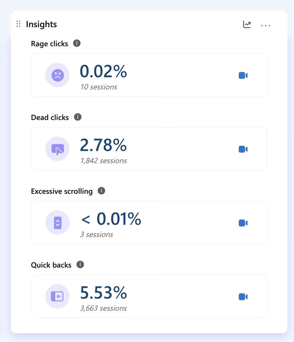
As an example, our website is around the 10% mark. But for one of our SaaS clients, it’s just 2.78% on a sample size of 66,000 sessions in the last 30 days before writing this article.
In 2024, their dead clicks were at 5.39%. So how have we managed to nearly halve it?
How to find out if there are dead clicks on your website?
There is a range of tools that you can use, including the well-known Hotjar. Our go-to is the forever free Microsoft Clarity. They flag dead clicks, among other issues, in an easily digestible way:
The other method, which doesn’t involve you having to watch the session recordings, is to analyse website heatmaps in the very same tools. Just pull them up and look for hotspots of clicks and taps on non-interactive elements.
How to fix dead clicks on a website?
The first step is categorising the dead clicks. To do this, we recommend using these four buckets:
- clicks on text
- clicks on images
- clicks on other interface elements
- clicks on the background of your website
From there, you’ll have to look for clues as to why people click there. Sometimes it will be obvious right away. Other times, you’ll have to watch session recordings and in extreme cases, you’ll have to carry out research (e.g. user interviews) to figure out the reason.
To make it easier for you, here is why dead clicks typically happen in these categories and how to fix them.
What to do with dead clicks on text
More often than not, this is a non-issue. People often click to copy the text and then they paste it into search engines. Sometimes they also interact with the built-in tools of their device, like when you select text in Google Chrome on Android devices and get the option to translate the text.
But there are instances where dead clicks on text require action. If the clicks often fall on the very same words or sentences, it’s likely that you’ve phrased it like a call to action. This is an extreme example, but saying “click here” without making it interactive is a sure way to get dead clicks on those two words.
We also have an example of dead clicks on a heading on our Home page, which might indicate people expect an interaction here:
The solution is to include a relevant link in the copy that people click too often for it to be accidental.
How to fix dead clicks on images
Clicks on images are the most notorious of dead clicks. They are extremely common for SaaS websites, where screenshots of the software appear like they could be clickable. It’s understandable, especially with how popular interactive demos are these days.
The old way of fixing this was to put the screenshots inside a clunky mockup of a MacBook or a monitor. It works well, but it’s not very gracious. The modern solution include turning your product screenshots into mosaics, adding illustrated overlays to them, or mixing product images with stock photos. There are even cases of websites that shouldn’t use product screenshots!
On our client’s website, we could only find dead clicks in one place. Coincidentally, this was the old style of images – none of the modern ones had any clicks on them. Here they are side-by-side:

Addressing dead clicks on the website UI
This is perhaps the toughest scenario. Solving dead clicks on website interface elements requires more UX and design knowledge than the previous categories. That’s because not every dead click on your UI is bad.
A common example of this are the article cards on blogs. You know, the ones that include the title, excerpt, sometimes an image, the author, the publication date, and a button. Here’s an example of our own blog card:
A common example of this are the article cards on blogs. You know, the ones that include the title, excerpt, sometimes an image, the author, the publication date, and a button. Here’s an example of our own blog card:
Should everything on there be clickable? There’s no rule of thumb. We decided that the only interactive elements are the button and the category label up top.
Others might opt for making the title or even the excerpt into a link to the article. Depending on how people use your website, it might be a better approach. It can also make no difference, or even detract from the experience if people don’t expect a link when clicking on the excerpt. Remember how we said sometimes visitors will click to copy text? Links can interfere with this behaviour. Understanding your audience is crucial here.
Dead clicks on the background of a website
Finally, probably the simplest scenario. As I mentioned in the intro, people sometimes click around the website while browsing as a habit. Think of it as their fidget toy. You can dismiss the vast majority of them as non-actionable.
In very rare circumstances, broken elements of a website might appear in wrong places. In your heatmaps, you’ll often see them as clicks on “nothing”, but in reality people see something in that spot and are trying to use it or get rid of it.
Here’s a recent example of this on the Royal Mail website, where a non-interactive chat window was appearing and covering a lot of the website on both mobile and desktop:

When should you ignore dead clicks?
While some dead clicks are acceptable, just being below the “magic” threshold of 10% doesn’t mean your website is perfectly fine. If you only have 2% of dead clicks but all of them are on images or interactive elements, it’s an urgent thing for you to fix.
Likewise, being at 10% with all clicks coming from people copying text or clicking on the background isn’t an issue at all.
Many of the fixes we suggested above are possible without engineering resources. Some of the require a bit of design knowledge, but they should be within reach for most businesses. There’s no reason to ignore these issues, especially when you can identify dead clicks using free tools. We use Microsoft Clarity for client work and it helped us double the conversions for Courier Exchange, so it’s a no-brainer.
Originally published 25th October 2025, updated 16th March 2026.

