What can we learn from Disney’s website navigation
Website navigation has more purposes than just being there to guide your visitors. It's there to give us virtual ground under our feet and reveal the content of the site. A good navigation tells us how to use a website and is one of the main factors new visitors use to judge your site. Written by Dawid ZimnyBecause of the importance of navigation, getting it wrong will be destructive to the user experience on your site. The competition is just a few clicks away and your visitors will leave your website after any minor inconvenience.
Website navigation is more than just the navigation bar
The navigation bar is one of the most important parts of a website. But navigation is way more complex than that and a lot of people haven’t acknowledged that.
Full-blown web navigation consists of:
- navigation bar
- search engine
- current page name
- local navigation (e.g. table of content)
- “you are here” indicator
- a sitemap
Website navigation purposes
Now that you know the types of website navigation, let’s learn more about its overlooked aspects. For each of the navigation purposes, we have prepared tips with some of our best practices.
A baseline for the browsing experience
Good navigation should make it clear that the website is cohesive and functional. Your visitors should never feel lost. Having intuitive, consistent navigation across the website is crucial.
Some companies even go beyond that. Disney owns multiple websites for their brands and they keep a part of the navigation bar universal for all of them.
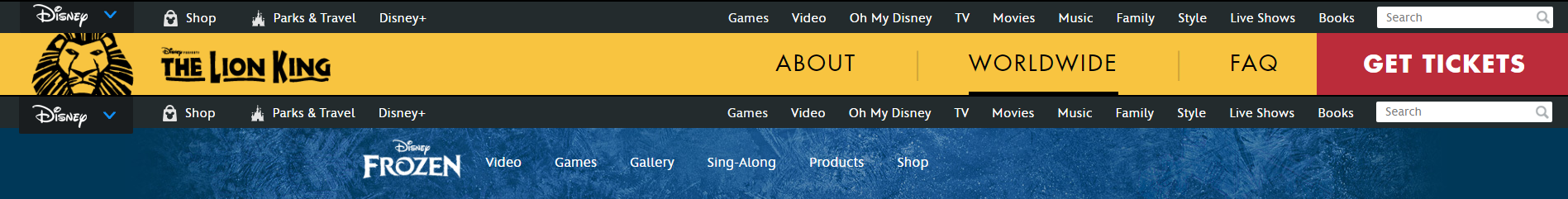
This is useful for bigger brands but serves as a good showcase of just how important it is to have consistent navigation. The universal nature of the upper bar isn’t the only thing that makes the Disney navigation great for them. You will notice that:
- The brand-specific bars contain 5 to 7 elements – this is the perfect amount based on brain studies. We will touch upon the size of the universal bar further in the article. For now, just keep in mind that its size is justified.
- The most important pages are the first and last elements of the navigation – this works both for the universal navigation, as well as the brand-specific one.
- The above is proof of the importance of the search engine – for Disney, it’s the rightmost element in their universal navigation bar. Pitting it against The Lion King’s internal navigation you can estimate the search significance to be close to the “Get Tickets” call to action element. It’s also the only element visible other than the logo and expandable menu on mobile devices and expanding the menu displays search at the top, which also brings us to the next point…
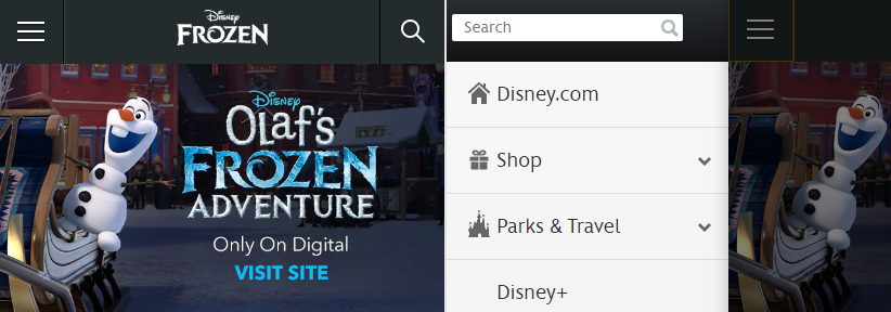
Your navigation bar should be responsive. The above image is an example of how a tiny screen still allows to include the same amount of options as in the huge Disney universal navigation.
Website navigation reveals the content
The navigation on your site is one of the first things that catch visitors’ eyes. It tells them what’s on your website and helps guide them to the content they’re looking for. How to make it easier for your visitors?
- Use simple, descriptive language. Be specific. Avoid format based navigation elements like “Photos”, “Videos”. In the case of Disney, this is what people are looking for and they already know their brand, but for SMEs it’s important to tell the visitors exactly “what’s here”. Take our site as an example. For a lot of companies, the “Websites” equivalent of our menu is worded “What we do”. This doesn’t help the visitor at all and has another drawback – nobody searches “what we do” in Google, but they search for, in our case, websites. In short, keep your navigation simple but don’t make it too vague at the same time.
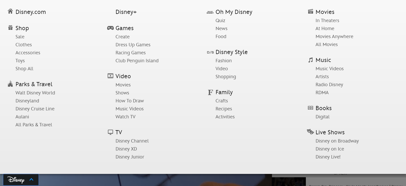
- Mega menus work for e-commerce and other content-heavy websites. They reveal the content and display almost everything to the visitor. This way it’s easier for them to find what they’re looking for compared to having to go through a series of subpages. They can find their content directly in your navigation bar. This is once again executed perfectly by Disney.
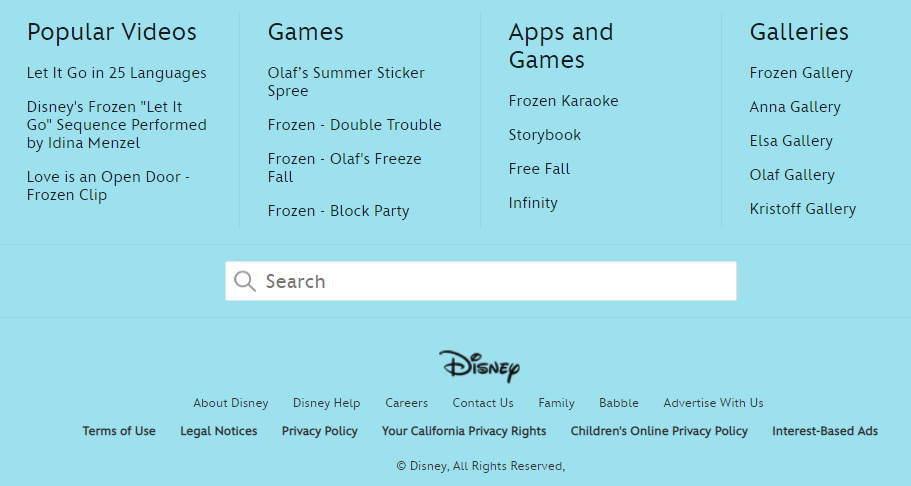
The same applies to footers. People often forget about them because they’re at the end of the website. People have learned to scroll, especially with many websites, pages and apps implementing the “infinite scroll” feature (honourable mention goes to Facebook). Leaving your visitors empty-handed at the end of a page might be disappointing. In case they didn’t find what they’re looking for, you have one last chance to keep them on your website.
Learn how we failed according to our navigation tests
The navigation tells visitors how to use the site
Your business has unique goals and the navigation should be tailored to help you meet them. Designing a user journey is an important step in web design. The navigation is there to take the user from their point of entry to the important pages – the ones they’re looking for and the ones that will convert them to clients.
The analytic layer of our unique website design process comes into play again.
- Track user journey in analytic tools. When your visitors navigate through your website, do they exit before reaching the desired page? You can observe this in for example “Behaviour Flow” in Google Analytics.
- A/B test your navigation based on your findings. Try different moving the elements that are underperforming or wording them differently. Some of the elements might need to be removed altogether because your menu is too big.
- Never guide your visitors into a dead end. Even after they completed the user journey you have planned for them, give them something to do on the website – a featured article, a case study, an option to sign up for a newsletter etc. It builds brand awareness and shows creates a good impression. Don’t make your visitors leave the site, let them decide when they want to leave.
Make your website navigation work for your visitors
Every website has a goal. While navigation has to help reach said goal, its most important role is to work for your visitors. They have to be able to find what they’re looking for. The sheer amount and size of websites are confusing enough. It’s crucial to have intuitive and consistent navigation. Is that the case for your site?
Why do GOV.UK, Google and IBM have a design system
Originally published Dec 06, 2018 9:08:16 AM, updated August 13 2023.


Join the conversation
Looking to share your feedback and join in on the conversation?